
Sandra used the text “The Star Thrower” for her broadside. This text is about a boy who is throwing starfish back into the ocean to save them from the heat of the sun. When an older man came up to the boy and told him that he was making no difference due to the short distance he was throwing them, the boy smiled and threw one farther into the ocean. He then replied with “It made a difference to that one”. With the whole story based around a beach setting, Sandra used an ocean display to put behind her typeface. In addition to this, she made the words go along what looked like to be waves. Therefore, it made a terrific visual example of the ocean. Not only was it visually appealing, but the words were still easy to read as well. Making this broadside an overall terrific composition. It gave off the mood of relaxation due to the hues of blue and the watercolor-like appearance. It also made me have a desire to go vacation on the beach and watch the waves roll in.
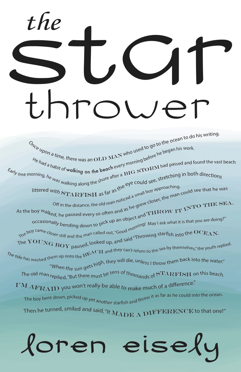
The Star Thrower – Broadside by Sandra Albertson
It’s easy to say that the visual hierarchy in this broadside is both the title and the author’s name. Since the title is on top, it’s the first thing the reader sees. Not only is it the first thing they see, but the font is bigger and more unique than the rest of the text. The same can be said for the author’s name. After reading through the story, one would naturally want to know who wrote it. Therefore, putting the author’s name at the bottom and in the same unique font as the title, it makes the whole broadside flow together. In addition to the title and author, Sandra decided to bold some words that were more important in the story. “Starfish” and “Old man” are just two examples. She seemed to highlight the words that were more important to the story. She also made them in all caps and a serif font, which stood out from the rest of the story that is not in caps and in a sans-serif font. By doing this, the reader is more drawn to these specific words, which help understand the story that is being told.
When looking at this broadside from a distance, my eyes are immediately drawn to the title. But when I work my way down and see the words aren’t in a straight line, I am intrigued and want to go up closer to the broadside to see what it says. Even though I see the title, the display of the main text is what would entice me to go in and read more. After approaching the broadside, it still kept my attention. My eyes wondered from letter to letter as I followed the “waves” of words. Even though there aren’t may “big parts” of the text, it still is stimulating due to the title and author with the larger texts and the mix of bolder serif fonts (which I mentioned earlier).
I think the type styles for this text are appropriate. The alphabet that Sandra made is very subtle and relaxing, which reminds me of a beach and the sand. I think the fact that she used a sans-serif font is also appropriate for the title since it usually gives off a more casual vibe. I also think by trowing in a serif “the” in the title was appropriate as well. Although the text takes place on the beach, it is still a story and therefore needs something like a serif font to make it look more professional. There’s something about serif fonts that scream books and old stories to me. She also did a nice job incorporating both sans-serif and serif fonts into the main bulk of the text. It’s easy on the eyes and isn’t too distracting. Since she made the sentences go in a wave pattern, she would have needed to use more simple fonts, or it would have been too much to look at (not to mention it would have taken away from her designed alphabet). The text of the story is easy to read because of this. I was able to follow along easily and was not distracted by the way the text was displayed. That’s a very hard thing to do, and I think Sandra pulled it off beautifully. The lines stretch almost to the end of the page, which i think goes along nicely with her background. If the lines were shorter, then I probably would have had a hard time following the story and would have gotten lost in the text. The line spacing is fairly even, even though the way she displays the sentences are not traditional. The letter spacing is also even throughout the text. Even while examining her title, I could see that the letters were spaced in accordance with one another. Kerning is the same as the tracking. Even and precise throughout. You can tell what the beginning of a paragraph is since she had indents throughout the text. The indents were noticeable, but subtle enough to not disrupt the wave-like display.
The broadside has a texture of water due to the fact that she used a good amount of blues that all blend in together. This also helped create positive and negative space. The blue colors being the positive space, and the lack of color at the top of the page being the negative space. By doing this, she was able to make the title stand out more. Also, by adding a lighter blue to the bottom, the author’s name stands out too. This creates an equal balance of colors and does a great job highlighting the important parts of the broadside. Overall, I really enjoyed viewing this design. The mix of colors, style of text, and the waves of sentences made me feel as though I was in the story myself.
