Broadside-Jenna Hayden

10806893_501062540033793_1264198309_n

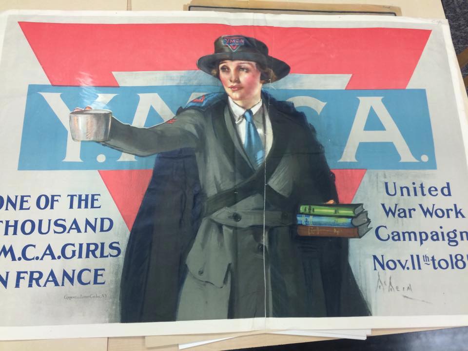
In Kyle Schlesinger’s essay, A Look At Some Contemporary Poetry Broadsides, he describes a broadside as “a form of street literature, a public work of art designed to be read outdoors, rather than in the library. Unlike the book, which can be perceived as a private, usually closed, one-on-one reading experience, the broadside is public, open (literally impossible to ‘close’), form of art that encourages a communal reading experience” He also says that broadsides are a single sheet printed on one side only. After reading his essay, the broadside that caught my eye from the MASC Collection was a Y.M.C.A broadside. This broadside has strong imagery that is an illustration of what the type on the paper says. There is not a lot of text on this broadside but some text is included. This broadside follows the statement Schlesinger’s statement about integrating images. Schlesinger says, “overlaps and intersections between text and image are often beautiful when examined in detail as they show us new things about letterforms as images and images as letterforms.” The broadside I chose is an example of this statement because the word Y.M.C.A is behind a woman standing with books, and then more text is to the side of her. Also, the woman is a description of the text. The broadside uses display type, which Schlesinger describes as larger than 36 points, through the Y.M.C.A that is shown behind the woman. Although the text on the sides of the broadside are smaller than Y.M.C.A, they are still very large, but that could partly be because the broadside is very large.

Posted in Fall 2014 Archive (338) | Tagged | Leave a comment

Broadside – Melissa Tsitsis

WSU MASC

WSU MASC

This broadside that I found in the MASC is an example of Integrating Images to Kyle Schlesinger’s essay. The text is the most prominent aspect of this broadside, but there is also the inclusion of illustrations, which helps emphasize and bring humor to the message that the broadside is communicating. I am not exactly sure, but I think that this broadside was created using a letterpress, since it was from the year 1915. Some type on this broadside is large which helps draw the audience (freshman class of 1917). Also, the introduction of just the color red helps grab passer-bys attention from the color alone. It calls out display type which are thee words like “Infants” and “your doom is sealed.” When I saw this drew me in to see that the finer print said and to my surprise it was very comical. When looking at the broadside up-close the illustrations compliment what the information on the poster. For example, a bunch of crying babies illustrates the word “infants”. Also another example of this is at the bottom the broadside. Once the rules are read there’s a finger pointing to an illustration of a man floating in the water with the words “the end” on his feet. This is also a comical way that the designer conveyed that these rules better be followed or the freshman class will be sorry. There are several different typefaces used and depending on the type and size of it creates how much kerning there is between each letter. For example, the word “infants” stands alone and is the whole width of the broadside and has a substantial amount of space between the letters when compared to the line that says “your doom is sealed” the letters are slimmer and there is less space between each letter.

Posted in Fall 2014 Archive (338) | Tagged | Leave a comment

Broadsides – Brian Tomsovic

The hazing posters in the MASC had little to no images, so they worked as examples of good use of Display Type. In particular the “Rule of Nineteen” one (seen below) was a fun read, so I decided to use that as my example.

IMAG0057

While the “Nineteen!” is certainly the heaviest pieces of text, what caught me first and got my attention was at the bottom, where it says, “OBEY! OBEY! OBEY!” now, perhaps because it was laying down and not posted, that affected what I saw first, but because of it’s size and because the leading in that section was further apart, it really separated itself from the rest of the broadside. As you work your way down the poster, the leading in general seems to get wider, giving it this feeling of thinning. It makes the top seem heavier, but the bottom stuff feels a bit more important because of readability. As though the goal were to make the rules seem overwhelming in order to intimidate the freshmen, but then to make the idea of Obeying seem simpler, to encourage a mind-set that life will be easier if the Freshmen just play along and don’t try to cause trouble.

The one criticism I have really, about how they used the display text was the making the first word of each rule so prominent… There are times to use a strategy like that, i.e. when all the rules start with the same first word, or when the words themselves work as a short hand reminder of what the rules might be. “Caps” Works, because it’s the rule about wearing your cap, but almost none of the rest work because their first word has little importance to the overall meaning. Especially always because the rule is a reminder to always remember to NOT do something.

Posted in Fall 2014 Archive (338) | Tagged | Leave a comment

Broadsides-Meli Barajas

Author: Erika Hunt Designer: Ana Cordeiro  Purpose: Writing Series Retrieved from: http://www.centerforbookarts.org/bookstore/broadside/detail.asp?pubID=283

Author: Erika Hunt
Designer: Ana Cordeiro
Purpose: Writing Series
Retrieved from: http://www.centerforbookarts.org/bookstore/broadside/detail.asp?pubID=283

Kyle Schlesinger covers the different types of broadsides in his essay. A broadside is usually defined as a large sheet of paper that is printed only on one side. Broadsides were normally used to announce information such as political movements. A description of total immersion broadsides is included in the essay. The image include in this post is an example of total immersion for various reasons. According to the essay, a broadside that depicts totally immersion is one where the “text can act as an image or an image can act as text” and together they work to portray a message. In this image one can see different objects; overall these objects look like books. Some of these are opened while others are closed. On this book there are pieces of writing; however, there is now direct order on how to or when to read each piece of text. Even though the lines of text are horizontally aligned they are somewhat scattered all over the broadside. The author is challenging the traditional way of writing a poem because instead of making the reader read the text from left to right and up to down it is challenging the reader to find a way to read the text in a way that makes sense. Also, if one took each piece of text they would be difficult to read on their own because statements or phrases are separated from the stanzas which they belong to. For example, with no direct sense of direction the reader may find it difficult to decipher when to read the phrases “closer than”, “inside condensed”, and “pointing upstairs”. When I first took a look at this broadside I when to the middle stanza, then read the phrases and tried to understand what the poem was about; nevertheless, it did take me a minute to understand what the poem was about and what stanza or phrase came next.


Posted in Fall 2014 Archive (336) | Tagged | Leave a comment

Broadsides- Sandra Albertson

WP_20141106_004

Food Broadside

One of the broadsides that captured my attention most while browsing through the MASC Collection was this, a broadside related to food. When categorizing this broadside, I wasn’t quite sure if it was Integrating Display Type, where the display type is so prominent and striking that there is no need for any additional imagery, or if it was Integrating Images where overlaps and intersections between text and image are beautiful when examined in detail. The word “Food” is obviously the largest and most eye-catching piece of the poster, but the image is successfully integrated as well. This broadside uses simple yet effective colors that properly capture the essence of the message. The word food is written white on a black background which creates a high contrast that draws our eye in. Then, the words, “The World Cry” are written in red, perhaps to convey a dramatic, passionate feel. And under that, “Keep the Home Garden Going”, is written in green, a fitting color for plant-related issues. Below the text, there is a United States Food Administration badge which looks like an official seal of approval. Above this text, the illustration uses a blue and green background further emphasizing the environment, and then sticks to neutral colors like grey and brown for the people. The people look like strong, stereotypical American men. Their general posture looks important and inspiring. The words “The Spirit of ’18” are written in white against the blue sky in the top left corner. This serves the purpose of contributing a patriotic, unified feel to the broadside. There is only one typeface used throughout, but the word “The” is always written in italic. The display type is almost so effective that you need nothing else, but the other words and images integrated together create a feeling of completeness in the poster. Using few and simple colors, the artist was able to effectively make parts of the broadside stand out that needed to stand out. The overall design of this poster is extremely inviting and eye-catching. The use of typeface, color, and design placement all contribute the success of the broadside.

Posted in Fall 2014 Archive (338) | Tagged | Leave a comment

Broadsides – Evan Matthews

Broadside from Manuscripts Archive at WSU

Broadside from Manuscripts Archive at WSU

Broadsides have been used for many different things: poetry, announcements, politics, etc. I chose a broadside announcing an event and this broadside is integrating images. To Kyle Schlesinger, “these overlaps and intersections between text and image are often beautiful when examined in detail”.

This is an announcement of an Opera that will be taking place in New York. This could be classified as a sign or a broadside, either will work. The broadside integrates images and text in an overlapping and connecting style. The text and images are not the same (the text isn’t used to display an image like the word tree representing an image of a tree)  although there is not a way to display these words in an image form through text since the words are not identifying an object. The floral design runs throughout and broadside and even appears in some of the letters. The floral design separates the images but also connects them in a way to make them flow. Text is displayed in different forms through the entire broadside.  Sometimes the text is disconnected and separated from the images, while other images have text overlapping throughout the pictures or along a banner that is woven in with the floral designs bordering the photos.

Posted in Fall 2014 Archive (338) | Tagged | Leave a comment

Broadsides- Marci Hohner

My broadside from the MASC collection embodies total immersion. The typefaces, their arrangement and alignment, and their contrast create the composition, imagery, and perceived message successfully and without actual illustration. The type is arranged to IMG_4267
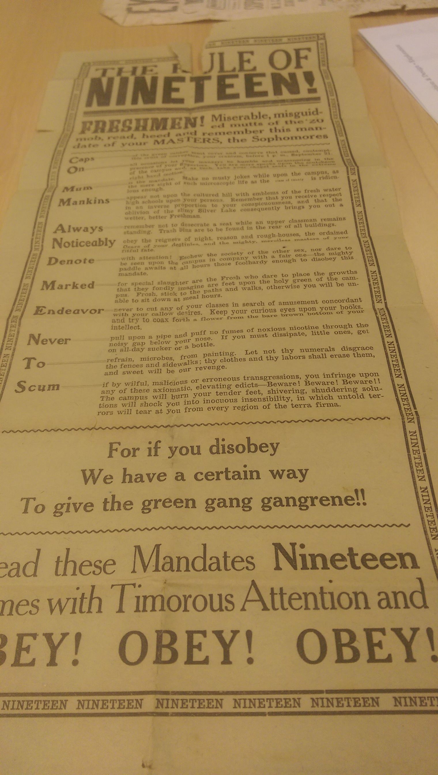
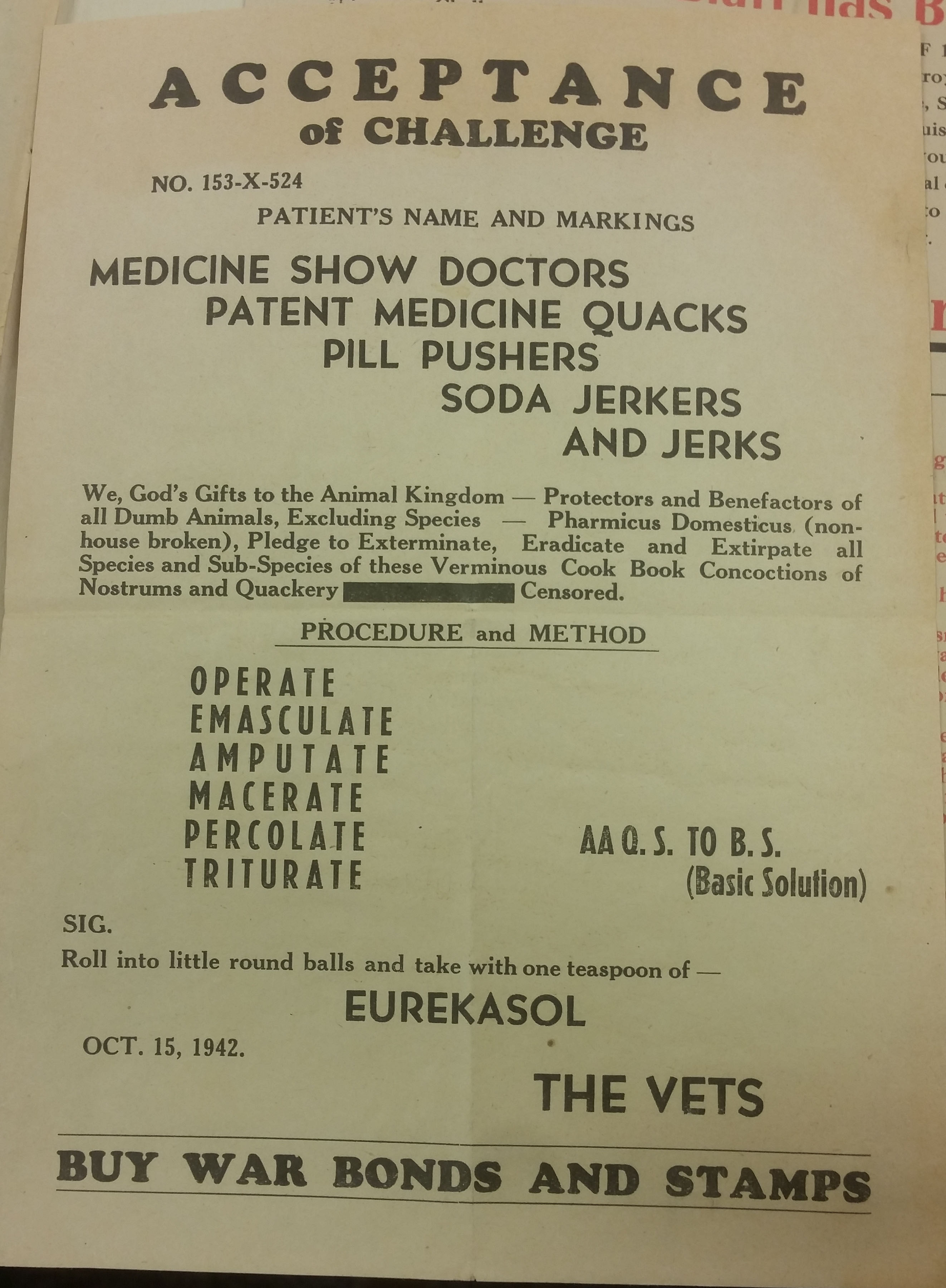
resemble some sort of informative poster, (I perceive it as specifically a WANTED poster) through simple use of typography. Though the words don’t form shapes, and negative space doesn’t present obvious secrets, the layout of the text is what is working effectively in this piece, and that is due to the total immersion technique. The words work together and become imagery rather than small pieces limited to the informative qualities of literal meaning. The poster is perceived as a whole, a shape, a recognizable piece. Without reading all the words (way too much text to be read by a simple passerby), the audience is still able to perceive meaning from this piece.

The major sections of text are divided by typeface contrast, like Victors piece from the reading, creating contrast and division as to make units. It allows the reader to take in the information in chunks, divided to fit with similar thoughts. Like Scheslinger says in the reading the text fits together like a puzzle to create a whole object, while aspects of it are divided and categorized by other visual features like typeface and size.

I appreciate text that works to create a whole, and was intrigued by this piece of work because of the successful yet simple use of words arrangement to create an entire feel and attitude, which like a warning poster, is a cautionary title to haze the freshmen and sophomores.

Posted in Fall 2014 Archive (338) | Tagged | Leave a comment

Broadside – Lauren Turner

The broadside I chose definitely embodies Schlesinger’s description of total immersion of text and image. This broadside is unusual because the text is arranged in an untraditional manner which aids the total immersion of the text it portrays. The movement and almost broken nature of the text makes the text appear as its own image. Its different factions and groups force the viewer to dig deeper behind the words and interpret why they are placed and put in the groups/locations that they are – much like one would with a picture, image, or painting. It is the complexity of this broadside that reinforces Schlesinger’s description of total immersion of text and image. In this broadside, the text has become the image due to the unique and yet complex hierarchy as well as the several decorative (though minimal) fonts. When examining the broadside up close, hey play against each other in forcing the reader to categorize certain themes in the text. When looking at the broadside from far away, the layout and arrangement of the text becomes an image. With lines, dots, planes, and texture. The list of verbs become a plane, the ‘buy war bonds and stamps’ at the bottom becomes a line, each letter of the word ‘acceptance’ becomes a dot. The negative space around most of the text enforces this while also making the text appear powerful and strong.

Broadside

Posted in Fall 2014 Archive (338) | Tagged | Leave a comment

Broadsides – Amy Koller

This broadside is a great example of Integrating Images. The text at the top of the page blends into the image. The character at the top of the illustration looks as though he’s creating smoke that turns into the text. The artist clearly used that image as inspiration for the text. Not only is the image integrating with the typography, but the title stands out to me more than the art and also does a good job of drawing the audience’s eye downward.

Mid Flame and Smoke - J.W. Turner

Mid Flame and Smoke – J.W. Turner

Schlesinger says, “Display fonts can look great with or without images, and in some cases, display type can be so prominent and striking that there is no need for any additional imagery”. In the case of this broadside, I agree with what he says. The font could stand on it’s own and I could still get the feeling of fire. The shaping of the letters, and the unique display they bring makes it easy for them to stand on their own. The coloring could also be taken into consideration since the dark black and various grays make the typography look like smoke even more.

The juxtaposing of the image and text was done well. Schlesinger talks about how the text and illustrations do not integrate or overlap, creating another element in some broadsides. The same could be said for this. They are integrated with each other, but they don’t overlap (other than maybe a little bit on the bottom). I think the artist did something great with the broadside by including the text with the picture, but not making them completely blend in together due to the positioning.

Posted in Fall 2014 Archive (338) | Tagged | Leave a comment

Broadsides – Danielle Clement

The broadside I chose to elaborate on from the MASC collection in Terrell Library represents Kyle Schlesinger’s definition of integrating images. I found this broadside very appealing in that it “overlaps and intersects between text and image.” At the top of the broadside,  there is a detailed painting of a caravan of U.S. Army vehicles making their way down a hill. Near the middle, there is a man directing the vehicles and next to him is a chunk of text carefully placed. This broadside does a great job at integrating image with text. The painting is great visual imagery and was the first element to catch my attention. This broadside utilizes visual hierarchy and uses the image to draw the reader in, and then directs they eye to the text–the second visual element. The man standing serves an important role within the broadside, not only a part of the visual imagery, but also serves as a marker to direct the eye to the pertinent information. The designer of this ad also did a nice job at using negative space to highlight the unique elements within. The chunk of text is aligned on the right side, providing ample space for the man standing on the left and creating a hidden, but assumed two column layout. I really enjoyed analyzing this broadside because it does a fantastic job at including illustrations that capture the current war-time and immerse into the text, providing excellent visual hierarchy. This broadside has a strong design layout and powerful approach to attracting readers visually.

20141106_140648

Posted in Fall 2014 Archive (338) | Tagged | Leave a comment