Broadsides-Karen Marten

WarBondBroadside                   20141106_144221

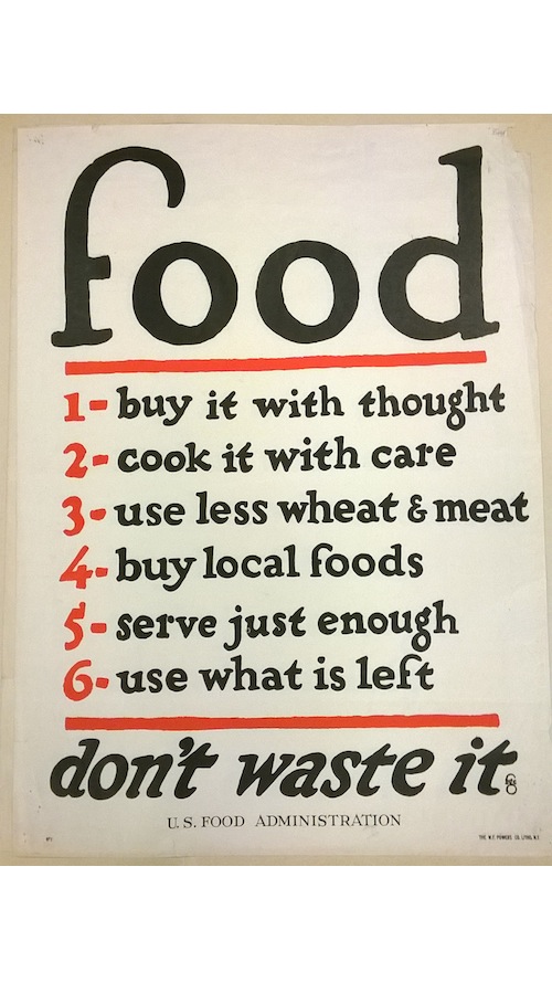
This broadside is probably not the traditional form as Kyle Schlesinger defines it in his essay. While it agrees with the OED definition ‘A sheet of paper printed on one side only, forming one large page” and also with John Carter’s definition; strictly to a whole, undivided sheet. It is a small broadside and by that definition could probably be considered a “handbill.” And while the page does appear to be an old   ad (the fact that the author of this advertisement cannot be found, speaks to the idea that it is an ephemeral piece of work, not meant as a everlasting work of art), it maintains a purpose by exposing us to a particular time in history and portraying an important ad campaign of that time: war bond promotions. During my first four reads of the broadside I was merely entertained by the name calling and eloquent vocabulary used in the text. After researching what it could mean and other broadsides I found that this broadside was probably not an ad speaking against real doctors administering cold medicine to children, but rather traveling carny doctors who claimed to have “elixirs of life” and oils that cure “neuralgia, gout, sprains and bruises.”


It appears that the broadside used letterpress to create the broadside or handbill. The fact that most of the text utilizes display type speaks for the character of the poster and deems it a legitimate broadside. The kerning between the letters varies between different display types, which allow readers’ eyes to remain engaged. The only type that isn’t display type is the short middle paragraph and a couple lines that appear to match old prescriptions. When these small, non-display texts are read they do not suggest much extra information or change the message of the ad, except to stroke the human ego a little. The negative space used around the list is helpful to keep the readers actively reading instead of just skipping over the whole broadside. The most eye-catching parts are the bold display types at the top and bottom of the page, and the words “Challenge Accepted” are sure to catch many eyes.

Posted in Fall 2014 Archive (338) | Tagged | Leave a comment

Broadsides – Hannah Croskrey

This broadside would fall into the category of Integrating Display Type. The text is all fairly easy to read especially “food” and “don’t waste it.” These two parts of the broadside appear to be the most important and strive to get their point across with their boldness and display level type. The list in the middle of the broadsidegoes into more detail but remains at a size that can still be read from some distance. There is no need for imagery in this broadside because the viewer is already drawn in by the other components so easily. The red lines and numbers create some needed contrast against the black lettering but they do not take away from the overall power of the broadside.

The font choice is very interesting because it is a sort of serif but does not have that sense of being old and strict. There is a form of playfulness about it that really catches the eye and makes a person want to stop and read it. Another interesting thing about this is its resemblance to a food label, short and plain, while it is telling people about how to make decisions about their food consumption. There is no layering or overlap which makes it very easy to read and shows that it is just trying to get straight to the point. The leading is pretty high leaving the viewer to look at each line as an important piece by itself.

I really liked this broadside because of its simplicity and straight forward message. The layout is very clear and the viewer has no room for confusion.

Posted in Fall 2014 Archive (338) | Tagged | Leave a comment

Broadsides- Shannon Heric

Poster shown in WSU Library Course Reserves

Poster shown in WSU Library Course Reserves

Based off of Schlesinger’s essay a broadside is defined as “A sheet of paper printed on one side only, forming one large page.” There is more to a broadside other than being a large sheet of paper. Schlesinger says, it “is a form of street literature, a public work of art designed to be read outdoors, rather than in the library.” He says that the selection of a particular paper or typeface can be illustrative or at least suggestive and by that he is correct. The visual image I chose is an example of a broadside using the design concept of integrating images. Integrating images in a broadside is, the “overlapping and intersection between text and image to make a beautiful composition when examined in detail ad they show us new things about letterforms and images and images as letterform.” As Schlesinger says total immersion is, “the text is an image and the image is a text”. The broadside I chose is a piece of advertising telling the people in 1917 to serve corn in every meal somehow because it is appetizing, nourishing and economical. The design of the broadside uses large display type, which is a larger size type usually 36pt or larger. Some of the display text is in a contrasting color regarding the purple and the yellow eye popping contrast to be seen from far away next to the bold white letters of “”Corn” to grasp the first attention of the eye. The size of the broadside is very large on about a 24 inch by 36 piece of a medium thickness paper. The letters of the headline “Corn” are the largest with wide kerning between the letters. There is an image of a woman making baked product with corn in them on the left corner side of the page and so the text follows the curve of where negative space is given from no part of the image being there. When the text fills that void of space where the image is missing, the text is emphasized by the alternating colors of white and yellow between each section of a different line of communication. At the bottom of the poster there in more text in display level font stating who the poster was for, the United States Food Administration. This poster uses three different types of fonts to show emphasis and importance of wording. The largest letting is on the top of the page and as the lines of letters move down the page they get smaller. The letters on the second line under the title is the same font as the descriptive words under the text that says “Serve some way every meal”. This broadside uses overlapping of the images to show depth in the image but the text that overlaps are the labels on the cans showing the ingredients the women is using of corn meal, grits, and hominy.

Posted in Fall 2014 Archive (338) | Tagged | Leave a comment

Broadsides – Katie Tufts

Filippo Tommaso Marinetti (1876-1944), founder of the Futurist movement, wrote this shaped poem, translated as “Tethered Turkish Balloon,” one of nine broadsides printed at the Arion Press currently on exhibit in “The Shape of Poetry"

Filippo Tommaso Marinetti (1876-1944), founder of the Futurist movement, wrote this shaped poem, translated as “Tethered Turkish Balloon,” one of nine broadsides printed at the Arion Press currently on exhibit in “The Shape of Poetry”

I chose this broadside made by Filippo Tommaso Marinetti as my example of total immersion because I felt it fit the description made by Kyle Schlesinger. What stood out to me were all the different orientations of the words. He chose the three words in the largest font and warped them into a circle creating a main point of focus on the broadside. Other words and phrases are coming out of this circle design and it repeats on these words as well. All the words combined as a whole make a visual image from the text. Schlesinger described total immersion as “the text is an image and the image is a text” and this helped me narrow down the broadside to use for an example. Although the author’s identity is clearly stated, the main text would be unclear without an explanation or description. The format of this broadside defies the traditional roles of a poster. Reading from left to right is difficult to do in this example and I am unsure is if some of these words are real words or just exaggerated for the visual look the creator was going for. It is clear by the size of the words and their placements which order Marinetti wanted his viewers to read his broadside. First my eyes see the text/image on the center of the page, and then to his name at the top which makes me also notice the black lines that separate all the text on the page. After that I finally noticed the small print on the very bottom. The confusing layout and unknown words make this broadside scream total immersion.

IMG_6360 IMG_6359

These two examples show how paper choice is an effective part of these letters/broadside. When I saw these in the exhibit it gave me some inspiration for my broadside. I like the way the typewriter typeface looks in the image on the right but I like the composition and layout of the type on the picture on the left. The distressed look of the paper gives it a sense of character and makes it look like a well loved letter which is a style I am sort of aiming for. When I make my final broadside my goal is to find a unique way to combine both of these examples while making it work with my chosen text. Both of these examples, although they are different from each other, give off the same mailed letter look which I think is interesting.

Posted in Uncategorized | Leave a comment

Broadsides – Alden Paguada

This broadside combines a poem by poet Mary Wehner, Color lithograph print by Cuban artist Pollyanna Fernandez

This broadside combines a poem by poet Mary Wehner, Color lithograph print by Cuban artist Pollyanna Fernandez

This broadside is a combination of a poem by Mary Wehner and lithograph artist Pollyanna Fernandez. I think this broadside is a good illustration of total immersion as mentioned in the essay by Kyle Schlesinger. This broadside is single sheet, letterpress printed in two colors on “dampened Somerset printmaking paper”. This broadside contains text in english and spanish making it more interesting for the readers to look more closely at the text. We can see that the text in the upper left hand corner is aligned to the left while the text in the bottom right hand corner is flushed to the right giving it a more balanced feeling. I perceive the image to be very powerful and very striking to the eye. Also the image partly overlaps the typography. Since image is text and text is image, I could say that the image serves as the focal point in the print since it draws your eyes immediately due the placement and color choice and how ambiguous the picture is. The font size is very consistent, very small  to create mystery in some way. Letter spacing is even, therefore creating a very attractive easy flow. Since the letters are very small and the spacing is evenly distributed, it portrays a feeling of lightness throughout. Also the warm color choice used makes it very welcoming to the eye.

Posted in Fall 2014 Archive (336) | Tagged | Leave a comment

Blog #6: Broadsides – Tim White

Typographies by Nicole Cooley fits into Kyle Schlesinger’s description of “total immersion” of text and image because of its abstract layout. The text is wrapped, flipped and twisted around the orginal poem, creating some sort of imagery which enhances and strengthens the poem. The formation of this broadside does not take any form of a shape, but it plays with different font sizes to emphasize the title of the poem. The distortion in the letters makes it hard to figure out what the piece is talking about, I think that may be the author’s intention, which makes the poem totally immersed in the plain background.

By Nicole Cooley Printed in an edition of 100 by Delphi Basilicato.

By Nicole Cooley
Printed in an edition of 100 by Delphi Basilicato.

Posted in Fall 2014 Archive (336) | Tagged , , | Leave a comment

Broadside – Daniel Smith

This example of a broadside reminds me of the dichotomy between text and images like the author describes. But to take it further, I think it would be appropriate to mention Rene Magritte’s “treachery of images” and Joseph Kosuth’s “3 chairs in one.” In these classic pieces of art, the viewer is prompted to challenge their beliefs and question everything they see. For instance, in Rene Magritte’s painting, he depicts a representation of a pipe while having French text underneath it that translates to mean “this is not a pipe.” What Magritte is trying to say here is that what your seeing is not a pipe. It is a painting of a representation of a pipe. Going along with that, Joseph Kosuth’s sets out to exhaust everything that a chair is. He constructs and installation in which he includes the dictionary definition of a chair, a photograph of a chair as well as an actual physical chair. How this all relates to broadsides, mine in particular, is that text and image can be one in the same. My broadside depicts a representation of a classic record player. The image of the record player is formed from the letters and words describing what a record player is and does. Doing so all with a single hue color scheme.

IMG_0443.JPG

Posted in Fall 2014 Archive (336) | Tagged | Leave a comment

Broadsides – Sean Jones

Kyle Schlesinger said in the article “A Look At Some Contemporary Poetry Broadsides” that total immersion could be characterized by “the identity of the author, artist, printer and designer not being always clear”.  In this case, “Knowing the Limits of the Earth” written by De’Lana R. A. Dameron can easily be considered a form of total immersion.  The method of printing is speculative however I think I can assume there is a mixture of different methods involved.  The broadside appears to be printed by letterpress,  printer, and possibly a human hand.  Although the overall shape and placement of the words and letters on the page are not quite as radical as a lot of broadsides containing total immersion, I believe it still is because of a few reasons.  First of all, the display type is relatively small because there are no gigantic letters and secondly I find it interesting because the way the yellow figure doesn’t fill up the full broadside (leaving space on the top and bottom) gives it a more improper look(also showcasing overlap and layering).  Also notice how the title of the poem is left almost dripping down the left side of the page to give it a different feel.  A lot of things are quite normal on the broadside like the letter-spacing, kern line, and base line.  One of the larger things that stood out to me on this broadside was the drawing of a skeleton of a peach in the yellow background.  I was trying to think of the meaning of this and I thought maybe it had to something to do with the title of the poem. “Knowing the limits of the Earth” is the title possibly giving some shade to the anti-environmentalist and maybe the dying peach has some resemblance of a dying earth.  That is my interpretation of it however.Broadside111

Broadside by DéLana R. A. Dameron
-Knowing the Limits of the Earth-

Posted in Fall 2014 Archive (336) | Tagged | Leave a comment

Broadsides – Emilee Shimazu

20310_idra_novey002
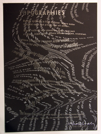
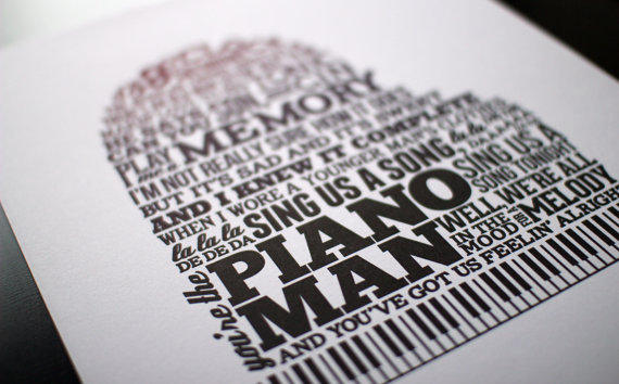
This poetic broadside shows a lot of what Kyle Schlesinger describes in his article as full immersion. The text is purposefully made small, and it is put within the shapes that make up the city skyline in the broadside, rather than somewhere outside of it. The text itself is very small scale-wise, and set on a baseline instead of dispersed across the entire canvas. There is no difference in size with the lettering, it is all the same letter spacing, making it all look as though it to be read as a whole.

The only overlapping occurs with the text and the imagery. The text itself does not overlap itself. Instead, it is set inside of the gray city image, making it feel immersed in the image rather than a separate thing from it. This piece seems to evoke no sense of chaos or disorder. Rather the imagery and the way the words are displayed make it seem like a quieter poem, with a very vertical display that makes the viewers eyes travel directly down instead of to many different places. The text is straight just like the buildings it’s being put inside of, rather than wobbly and in contrast with the imagery around it, making everything feel very uniform and complementary. The imagery does not cover the entire space of the canvas either. It is tucked towards the bottom as well as the text, making it seem even smaller than it already is.

Posted in Fall 2014 Archive (336) | Tagged | Leave a comment

Broadsides – Lacey Kido

Etsy. Topiary Press. Piano Man letterpress typographic broadside print. Link.

Etsy.com. Topiary Press. Piano Man letterpress typographic broadside print. Link.

Kyle Schledinger’s essay on broadsides was confusing at first with the multitude of examples provided but I hope I am understanding it a bit more every-time I reread his piece. Like his examples, the broadside I found uses a single sheet of paper and a heavy amount of words that create the shape of a piano. While this features more text than his first few examples of letterpress, my example utilizes the imagery aspect that can be seen in his third listing: “integrating display type”. The piece I’ve chosen was stumbled upon in one of my favorite sites and is proof that this art style is still being utilized despite my lack of knowledge before this essay. This piece, also, does not quite feature a poem but the words that comprise the piano shape do have meaning to any musical beings. I cannot be certain that total immersion, according to Schledinger, is occurring in this piece but I would argue that it is because of the text making up the image but also being readable as well.There is no overlay of text or images in this example which does not result in layering of any kind.

Posted in Fall 2014 Archive (336) | Tagged | Leave a comment