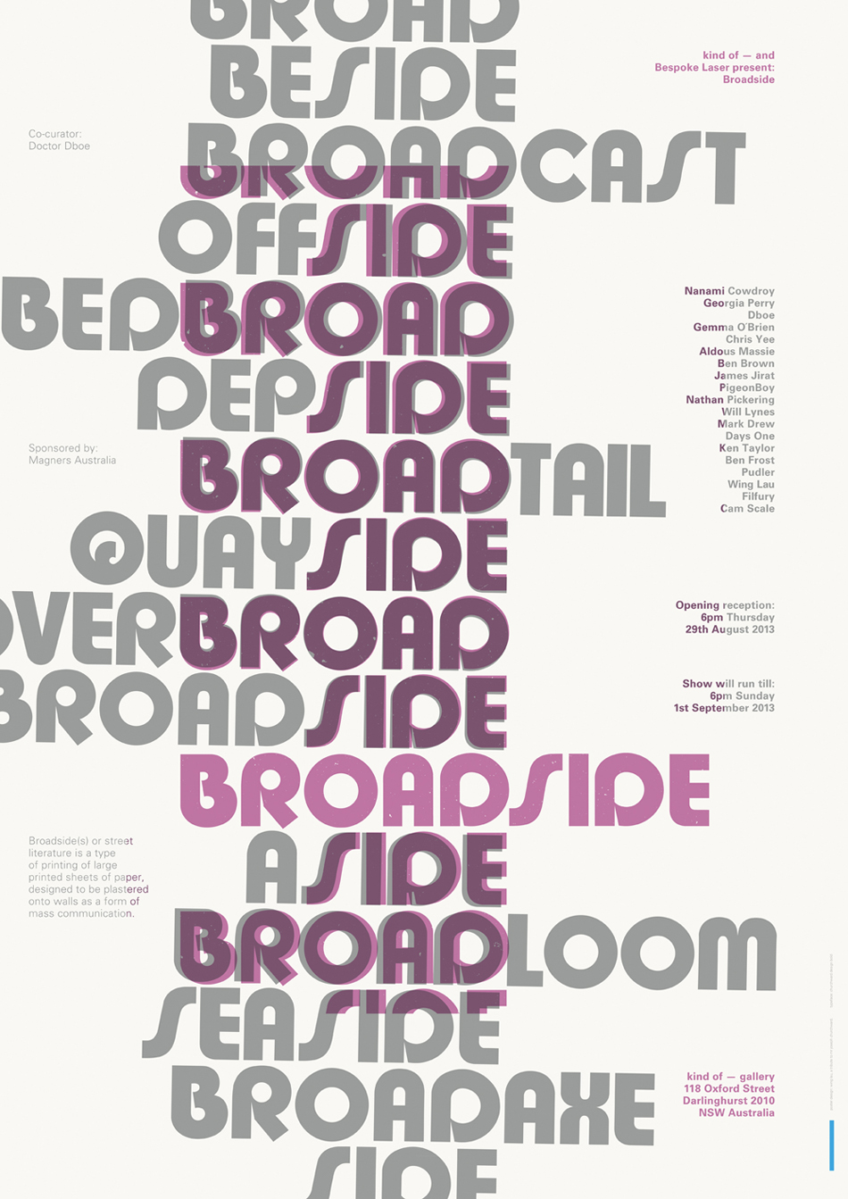
Wing Lau-http://www.kindofgallery.com/?portfolio=kind-of-gallery-and-bespoke-laser-present-broadside
This broadside was created Wing Lau to promote a gallery showing of other broadsides by numerous artists. However I think that it itself is very good example of a broadside after reading Kyle Schlesinger’s essay. It obviously fits the criteria for being considered a broadside and even offers the definition of what a broadside is. The poster uses letterpress printing and it is put together so that the first thing the viewer reads is broad and side repeatedly. Set behind the repetitive broadsides is alternating words, which either contain the words broad or side within them. Both elements are done in display type, but the foreground lettering is done in purple, drawing the eye to it first, while the background is done in a neutral grey. The display type serves as an interesting visual element on the poster and also communicates that the events is all about broadsides. It also serves as a barrier, which divides up the page, leaving the remaining areas to be filled with the necessary information to let people know the details of the event. It appears that Wing Lau used even kerning and letterspacing throughout the design. But the purple display type appears to have been done on a flat baseline, while the grey background display types looks as if it has been slightly tilted possibly to help separate the two elements. This gives the repeating broad-sides a 3-d effect and adds further interest to the poster. Overall the overlap and layering used in the broadside creates an interesting visual design that communicates first what the event is about drawing in the viewer, and then provides the information needed to attend the event.