
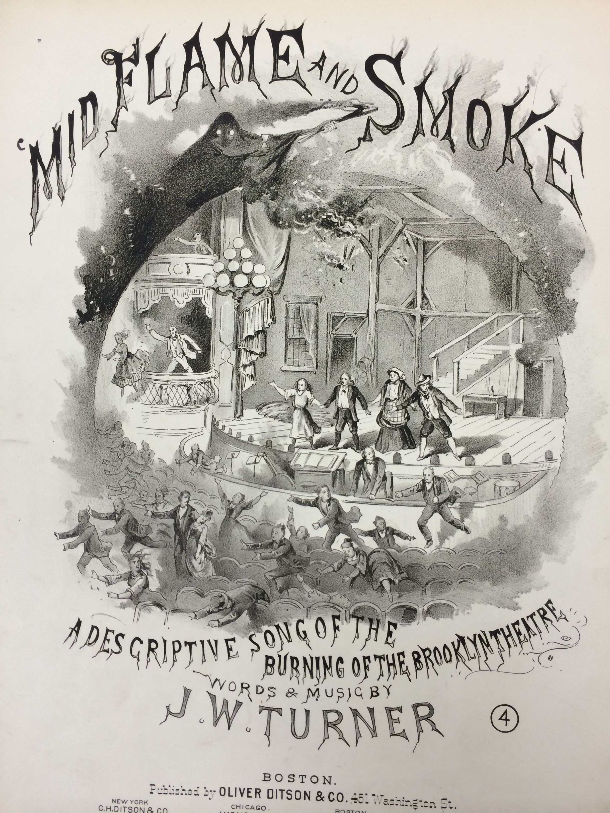
This broadside is a great example of Integrating Images. The text at the top of the page blends into the image. The character at the top of the illustration looks as though he’s creating smoke that turns into the text. The artist clearly used that image as inspiration for the text. Not only is the image integrating with the typography, but the title stands out to me more than the art and also does a good job of drawing the audience’s eye downward.
Mid Flame and Smoke – J.W. Turner
Schlesinger says, “Display fonts can look great with or without images, and in some cases, display type can be so prominent and striking that there is no need for any additional imagery”. In the case of this broadside, I agree with what he says. The font could stand on it’s own and I could still get the feeling of fire. The shaping of the letters, and the unique display they bring makes it easy for them to stand on their own. The coloring could also be taken into consideration since the dark black and various grays make the typography look like smoke even more.
The juxtaposing of the image and text was done well. Schlesinger talks about how the text and illustrations do not integrate or overlap, creating another element in some broadsides. The same could be said for this. They are integrated with each other, but they don’t overlap (other than maybe a little bit on the bottom). I think the artist did something great with the broadside by including the text with the picture, but not making them completely blend in together due to the positioning.
