Framing: Aaron Scofield

framing-image

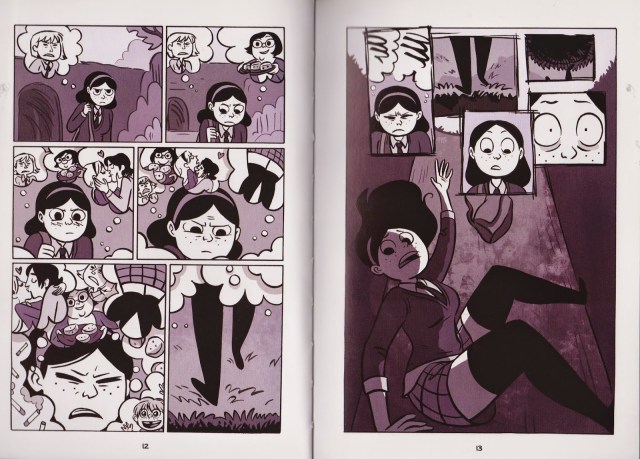
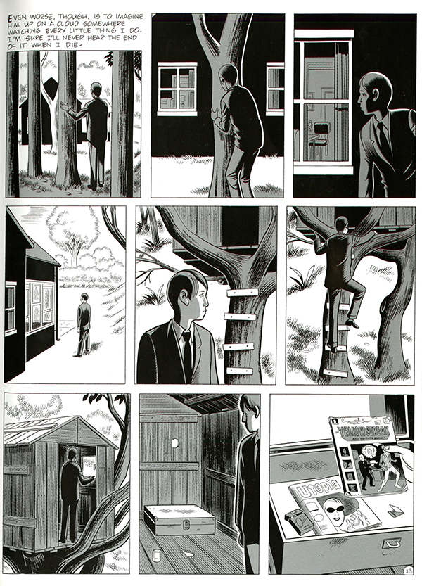
Page 13 from Daniel Clowes’ graphic novel, David Boring

In the book Graphic Design: The New Basics, Ellen Lupton and Jennifer Cole Phillips describe frames as what creates “the conditions for understanding an image or object”(117). I can completely agree with this because if I see a picture frame, all I’m really going to be focused on is what is inside that frame and what meaning that image has being inside a frame. Frames are all over the place and there are many different types of framing that don’t include an actual framed image. For example, the image above shows how framing can be used in a graphic novel. Clowes decided to go with a 3×3 frame layout and he gave all of the frames the same shape, however the frames in each row are not the same size. He uses this framing effect to offset the images and it ends up looking great on the page. What you can tell about this page in particular is that it hardly has any words on it. The majority of the frames are images that tell a narrative without using text. Throughout his graphic novel, Clowes uses text for most of his pages and on each page, he makes sure to leave the narrative text outside of the picture frames as you can see in frame one of the image above. Another unique thing about frames is that you can read frames from left to right or you can even read frames from top to bottom and then left to right. It really all depends on how the author or illustrator wants the audience to view their work. On the other pages of the book, the commentary between characters is kept within the frame and the narrative text is in alignment with every frame. A popular way for a graphic designer to use frames is by using borders around their images to help define the boundaries of the image. You can also put frames inside of other frames which creates a unique effect and many photographers and designers use that to their advantage as well. Some images have what is called implied framing and that is when the mind sees or implies that a frame is there because of the points that are in align that are creating that frame effect. Subtle framing is exactly what it sounds like it is, framing that less obvious. Cropping is another thing that goes along with framing because it can remake the borders or change the shape of an image by scaling the image differently. Perception of scale is how someone perceives a picture according to its’ actual scale.

Posted in Spring 2017 Archive (336) | Leave a comment

Scale: Toree Boutz

12

Page 12 of Craig Thompson’s graphic novel, Blankets (Top Shelf Productions, 2003).

Scale is not difficult to find in many comics or graphic novels. Often times, artists use scale to create deeper understanding of the written work and/or to add drama to the visual elements of a story. In their book, Graphic Design: The New Basics, Ellen Lupton and Jennifer Cole Phillips explain that scale can be seen in two ways, subjectively and objectively.

In graphic novels, the author may draw the elements of the story in a way that translates the real-life dimensions of those objects onto the page. This makes the correlations between the real object and the representation of it more obvious. This is objective scale.  Other times, the designer many rely more on the audience’s impression of an object’s size. This is subjective scale, which can make a comic more visually intriguing and thus connect with the reader’s emotions.

In his coming-of-age graphic novel, Blankets, Craig Thompson uses scale to convey the emotions of the main character. The story is in black and white, and Thompson relies on shading to create depth. In the portion of the story that is displayed (page 12), Craig and his brother have been fighting and their father comes in to scold them. The way Thompson has drawn the two boys in relation to their father is an example of relative scale. The smallness of the boys makes the father seem that much larger to them. The thin lines of the boys in relation to the massive arms and hands of the father, gives us readers the same feeling of fear and smallness that the boys are feeling. We can see this contrast very plainly in the last frame, as the father’s hand is huge, picking up his son by his shirt collar with ease. The shaded lines create depth and movement as we see his shirt being wrinkled and the lines of muscles in the father’s arm.

Posted in Spring 2017 Archive (336), Uncategorized | Leave a comment

Javin Nash – Framing

dsc_00281

What It Is Page 48 by Lynda Barry

I found this series of comics to demonstrate framing exceptionally well. There is implied  and point of view framing from a wide angle to a close up to the characters face. In class Ms. Becker said a “good design is invisible because it doesn’t get in the way of spreading its message and for this case that is true. I feel like regardless of how the page was structured I can still recognize the focal point of the comic. Also, I noticed the illustrator used cropping to their own liking to display less “garbage” (unwanted imagery) in one frame compared to the one after it.

Some of the boarders aren’t too thick which gives me a sense that this particular scene is happening fast or in the same setting. Since there is no huge shift in scale and all of the frames are alike this makes the comic feel less unique compared to ones that I have read before that have frames inside of frames. Maybe sticking to the basics is what helped me follow along the story line of the comic because had there been various frame sizes and positioning I would have been more interested in the design and layout of the comic itself instead of looking for framing. I know my eyes would have wondered around the page in search of other cool layouts instead of reading the texts and paying attention to the characters development.

Posted in Spring 2017 Archive (336), Uncategorized | Leave a comment

Framing: Cleana Broman

comicpic

Chris Ware

While framing can be used for dramatic circumstances and direct your eyes to create movement or focus, in Chris Ware’s case, he makes his stories in almost a grid like pattern. He also utilizes cropping in the example above, because instead of outlining each panel with black lines and obvious gutters, he simply crops the picture and against the stark white background the pictures make an implied gutter. I believe there must have been some more technical thinking behind the creation as well, because the top 3 panels from up to down and on the far right of the page, at the bottom of the pictures you can see a brown line which is from the window frame, and it looks intentionally placed there to make the contrast more stark and more balanced for the rest of the page. He also uses frames inside frames in a couple of the panels by showcasing a window equally margined inside the cropped panel.

Posted in Spring 2017 Archive (336), Uncategorized | Leave a comment

Framing-Henry Buehler

Framing in comics is key to both presentation and storytelling. This spread from Anya’s Ghost by Vera Brosgol shows the protagonist falling into a pit and the events leading up to it. This simple scene is framed very nicely, even without words: The first page makes good use of negative space through thought bubbles with thick lines that slowly take up more and more space as the protagonist gets closer in view, eventually falling. The way the protagonist is “pulled” towards our view is a very simple and effective way to display distance, motion, and lead her towards a key event in the story due to a visual sense of pacing. On the next page, this pacing is maintained through a small collection of framed events with frames composed of uneven, unfilled borders that are placed onto a splash page that shows the protagonist falling into a pit. For the splash page, we’re shown a side view of the protagonist that displays her scared expression and the our view is pulled back to show her entire body and the depth at which she’s falling.

001

(Vera Brosgol, Anya’s Ghost, First Second Books, 2011, pgs 12-13)

Posted in Spring 2017 Archive (336), Uncategorized | Leave a comment

Point, Line, Plane-Henry Buehler

I sadly can’t remember the name of the graphic novel I read or find it online, but it was a depressing story about a girl growing up with a perfectionist dad who secretly had sex with underage boys. The art style wasn’t very complex, but it was simple and rather dreary. The tone of the story was reflected in the color scheme, was black and white with bluish gray backgrounds. The dull colors made it so that the only positive was white, but that isn’t to say there was much of any negative space on the pages. The characters were colored in black and white and were of course, always in the foreground. The backgrounds were on their own plane and colored bluish grey. The outlines for each character were relatively thin as well. There was rarely ever any negative space, as most pages were filled with visual information such as characters, dialogue, and very distinct settings from the author’s life, especially since her father had a hobby of decorating. The focal points of almost every page were the characters and many pages also followed the rule of thirds in how those characters were placed on the page. There wasn’t any symmetrical balance or any visual symmetry that I found in how the pages were constructed, but the subjects of every page were always close in view and there were never any people or other distant subjects in the backgrounds.

Posted in Uncategorized | Leave a comment

Framing: Nikki Aviles

The photo I chose to represent Framing is from a graphic novel that was provided for us in class. The reason this page caught my eye was the variety in size that each frame was. Some are small, wide, not even a frame but a vignette almost, and theres one really long frame that spreads across the whole page. The boarders around each individual frame also varies in size, or are frames within a frame like in the bottom left corner. The frame I think is most interesting is the jagged vignette like style because it really emphasizes the shock of that moment and makes you really focus on just the man and his facial expression. The frame that spreads across the whole pages is used for a panoramic view of the car dealership that the man is in, used to show the whole space and what his environment so we get a sense of where he is. All these various sizes of frames make it more visually appealing and interesting because you wanna get down to that last frame to figure out what happened in that vignette frame. How does it go from being at home sad to a shocker kind of moment. screen-shot-2017-01-24-at-9-40-22-pm

Posted in Spring 2017 Archive (336), Uncategorized | Leave a comment

Scale: Tia Caton

comic_moomin_post-4

Page 25 of Tove Jansson’s graphic novel, Moomin

Scale is a very important concept in graphic novels and comics which allows for the illusion of movement, feelings of depth and a sense of tension. In the text book, Graphic Design: The New Concepts by Ellen Lupton and Jennifer Cole Phillips, scale is said to be considered objective and subjective. When scale is being referred to in an objective sense, one is speaking of the literal dimensions of a physical object. When speaking subjectively, scale is one’s impression of an object’s size. If you look at the comic Moomin, by Tove  Jansson, there are various examples of both objective and subjective scaling. In all of the frames there are the Moomin characters and a small child like character. When comparing these, you could argue that objective scaling is present. Moomin, the main character, was once referred to as being a Hippopotamus and also looks a lot like one. If you were to compare the size of a small child, like the one in these frames, it would appear to be a lot smaller than a hippo. Objectively, they are much like that of a scale model to real life objects. Looking at the first frame in the last strip, you could argue that there is subjective scaling taking place. With the Moomin characters in the jungle and various foliage, the reader can safely assume that they are nearly the size of a hippo because there are clues that can be related back to a real experience. For example, if the reader has been in a forest like area before they can compare that to the image and give it a certain sense of scale.  Scale can also be relative. This means that depending on the size, placement and color of an object it can appear to be closer or further in a scene. A perfect example of this is in the third frame of the first strip. The small child character is much smaller while the Moomin characters are slightly larger, creating the appearance of the girl having run further into the distance than the others.  By contrasting the scales in this image the author has successfully added the illusion of depth and movement into her graphics. By just changing the size scale and placement of objects both depth and movement can be created.

Posted in Spring 2017 Archive (336) | Leave a comment

Framing: Hak Do

comic

Page 1 of Tove Jansson’s “Moomin Falls in Love”

In Tove Jansson’s “Moomin Falls in Love” there are various types of framing going on throughout the book. The most notable ones are the implied frames. One notable way of making frames creative would be to use what is going on in the actual story itself to create a frame. Such as frames 5-7 have the rain drops created an implied frame. It fits in with what is going on with the story currently and it gives a unique and creative aspect to those frames. As you can see Jansson’s frames are all touching each other except for when the page ends and a new strip has to be made. This allows for various different methods for creating implied lines. Another example would be when the characters are outside, Jansson removes the bottom line from the frames to imply that they are on open ground, however to the audience it still feels like a frame. The scaling of the frames in this comic isn’t that complicated. Jansson increases the width of frames as she needs to, however she never increasese the height of the frame which calls for the need to be more creative with the width of the frames. Also she would put her name on the bottom right corner of every strip to create an implied line. One thing I have to say is how the frames and the implied frames all fit the style of the comic. I feel like if there were frames within the frames or different thickness of frames it would ruin the whole style of the comic as all the characters have the same thickness of the frames.

Posted in Spring 2017 Archive (336), Uncategorized | Leave a comment

Framing: Makenna Coxey

I am unsure the name of the comic that this photo comes from, but it did come from when

img-034

Book from the CDSC

we went to the CDSC and look at the variety of books. The reason that I thought this one applied really well to this chapter was because of the very literal framing that is shown in these pages. Although the pages are very different from each other, they are similar in so many ways. The color between the two pages’ correlates so that you know it is the same idea or concept, but the orientation of the frames are different. There is a margin all the way around the outside of each page to indicate that each page is a frame. Not only are there margins however, but there are individual frames on each page that illustrate different things happening. Something that I thought was particularly interesting about this is that some of the images actually run outside into the margins of the page. I think that this is a point of focus, something that your eye is drawn towards. I particular like this style because of the use of a black background and the white space to create images. This page really uses the technique of cropping, each frame crops the picture in a specific way to focus your attention on that part of the picture. This is a technique that is explained in Lynda Berry’s Graphic Design The New Basics. But I felt that it really applied to Framing and this page in particular .

Posted in Spring 2017 Archive (336) | Leave a comment