Framing: Leandra Choy

img-077.jpg

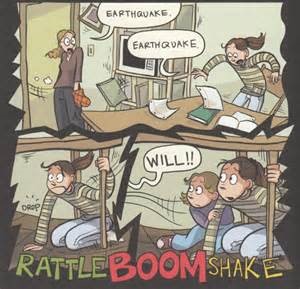
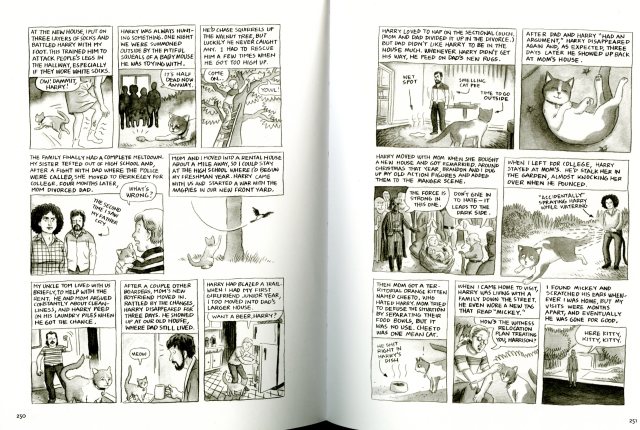
pages 250 and 251 of Thirteen Cats of My Childhood by Jesse Reklaw from The Best American Comics 2006 by Harvey Pekar and Anne Elizabeth Moore

With all graphic novels a key characteristic is framing.  Framing helps bring attention to certain scenes or emphasize parts of the story. Not only does framing consist in just graphic novels, but also in other parts of life like picture frames, your laptop screen, etc. Frames can show up in less obvious ways as well like when you crop an image. The cropped image has an implied frame which makes your eye focus on the new image. In comics, it is important to have good framing so the reader can easily follow the story. The two pages I chose from Thirteen Cats of My Childhood by Jesse Reklaw is an example of easy framing. When I was reading this comic it was pretty easy to read through because the framing layout was simple. Each frame had partial bleed to the picture (the drawings seem to continue off the page) which makes things more interesting to the comic. The partial bleed shows when the image “bleeds” off the sides from two or three sides but either the top or bottom of the image has a border or blank spot for text. You can imagine the whole scene instead of just focusing on the characters. The scene helps to understand the story. Some parts don’t have a literal frame, but an implied frame like the small section in the middle on page 250. However, that small scene is framed by the other frames around it and the page margin.

Posted in Spring 2017 Archive (336) | Leave a comment

Point, Line, Plane: Leandra Choy

war-of-the-trenches

Page 5 from It Was the War of the Trenches by Jacques Tardi

In Graphic Design the New Basics by Ellen Lupton and Jennifer Cole Phillips the chapter on “Point, Line, and Plane” explains how all three of those principles are like the foundation of design. While at the library yesterday and looking through different graphic novels, all use point, line, and plane on different parts of the graphic novel. The terms point, line, and plane all have multiple meanings, but for now the terms will be defined in a graphic design view. A point can either be a literal dot or a central focus on something. Points can either make up a line or also used to make texture. For example, the page I used from the graphic novel It Was the War of the Trenches by Jacques Tardi utilizes points as a form of texture for his graphic novel on the scenery, characters, and other details in the novel. When defining a line, it can be very literal or abstract. A line can either be a connection of multiple or two points, the path of a moving point, or it can be implied (in writing the margins in text are lines.) The page from the graphic novel have both literal and implied lines. Each frame on the page have lines within the images like the barbed wire fences, lines on the airplane, even between each of the frames, but those are more like implied lines. A plane is really complicated to describe. It’s related to line, a surface with height and width, and could also be described as a shape. It was really hard to find an example of plane, but I guess a physical plane would be the ground where the story is taking place.

Posted in Spring 2017 Archive (336) | Leave a comment

Point, Line, Plane: Makenna Coxey

blogpost2picture

Smile by Raina Telgemeier

The comic that I chose to write this blog about today was the comic smile by Raina Telgemeier. The reason that I chose this was because it seems more “traditional” and to me demonstrated the concepts of point, line and plane very well. While most of the pages are classic looking with distinct frames and flow to the page. Each frame is composed of multiple points and lines, but the whole thing as a collection is a plane. The clear separation between frames can be lines. From Graphic Design: The New Basics by Ellen Lupton and Jenifer Cole Phillips it talks about the concept of point, line and plane as being the building blocks of any design. I wanted to touch on this concept because I think that this is very true and different designs use more or less lined to make a point stronger in their design. With the particular page that I chose, my eye moves very fluidly through the page from top left, to bottom right. The page is broken up into 7 frames which as I mentioned those can be considered planes but also the page as a whole is also a plane. There are a few different pages throughout the piece, that look visually different than the rest of the book. These pages appear different because something drastic is occurring.  One in particular that I wanted to point out is the page where an earthquake occurs they use jagged lines and all capital letters to show the reader that something crazy is happening from as soon as you first look at the page.

Posted in Spring 2017 Archive (336), Uncategorized | Leave a comment

Formstorming: Leandra Choy

image1.JPG

Page 32 from the graphic novel “What It Is” by Lynda Barry

Formstorming is the process of thinking visually to come up with original new ideas on how to present something. In Graphic Design: The New Basics by Ellen Lupton and Jennifer Cole Phillips formstorming is described as “a tool for designers to unlock and deepen solutions to basic design problems (13.)” When a designer goes through this process, they tend to do different exercises that involve repetition, patterns, and originality which helps brainstorm several nuanced ideas. Within Graphic Design: The New Basics, some example projects of formstorming include “A Plus” where the designer created one hundred different images representing the letter A, and “Record a Day” in which the designer creates a new album cover every day based on his music collection.

What It Is by Lynda Barry consists of questions like “what is an image?” and struggles with the issue of having little imagination as an artist. Each question has a collage of different images and different forms of texts that expand on what she is asking. One question that caught my attention the most was “how do we recognize something?” on page 32. It made me really think about how we use our minds to recognize something. After the main question was asked, there are different texts asking more questions that expand on how we recognize something like ” Where does it come from?”, “How do we know?”, etc. Also on this page, there is a small picture of Abe Lincoln with text saying ” Do you know if this is him?” We would all say “yes of course” because we recognize him by seeing pictures and learned about him in a United States history class. Barry was able to formstorm the question “how do we recognize something?” by restating the question through different ways and texts and through familiar images asking how do we recognize that. Basically she made different representations of her question by using her imagination, which helped to see different ways a formstorming process can go whether they be abstract, direct text, or images.

Posted in Spring 2017 Archive (336) | Leave a comment

Formstorming: Makenna Coxey


what-it-is-page

Lynda Berry’s book What It Is. Page 16

While reading the first fifty pages of What it is by Lynda Barry I was confused by everything at first, but as I read on I started to see a trend and understand what she means by all this. In some of the pages it seems dark, gloomy and depressing. And some are happier and more light and airy. As the book goes on through the 50 pages I realize that not only is each page demonstrating formstorming but also the whole book is. From asking questions like “what is an image” to “where are images found” and continually progressing to “what is a memory” and “can we remember something that we can’t imagine?”. Formstorming from reading Graphic Design: The new basics by Ellen Lupton and Jennifer Cole Phillips means to brainstorm evolving ideas until you come up with something that is more sophisticated. You start with a simple term or image and continue until you get rid of the obvious ways of thinking and uncover the more creative and innovative ideas. One of the examples in the book is 100 iterations which really stood out to me. And formstorming really applies in page 16 of What It is by Lynda Barry, the page starts out with a statement “when images come to us”. This page is a collage of pictures some of which look to be hand drawn and others seem to be printed. On this page, you can really see the evolution of thoughts with all of the different that images come from, which to me best demonstrates formstorming.

Posted in Spring 2017 Archive (336) | Leave a comment

Framing: Angelica Tibule

image1

McSweeny’s Quarterly Concern: Issue Number 13. pg. 202. Lynda Barry. 

Looking at this comic, you might recognize the style of characters and collage theme, in relation to Lynda Barry’s What It Is. This comic is indeed by Lynda Barry, who is featured in the 13th Issue of McSweeny’s Quarterly Concern, an American literary journal that contains different comics, short stories, etc.

If you have noticed, Lynda Barry doesn’t use the traditional comic format of using panels and speech bubbles to separate each scene and dialog. Sometimes It can be quite difficult to figure out where the story starts and how it transitions, because of how close the different scenes are to each other. There isn’t any border or line to separate the scenes. Although, just like reading a typical academic book, we always read from left to right. Finding the point of interest can be quite difficult in this comic, because of how busy it is.

Since the story of this comic is about her waking up early and writing a bunch of letters, she uses a filler paper as the background of her comic. Even though she does not use panels for her comic, the paper is considered a frame. Framing is used to allow the viewers to focus on a certain character or scene.  The use of the filler paper separates the composition from the white margins around the page of the book. I also think that the bottom left scene of her printing has somewhat of a frame, by the line that separates the printing and bed scenes. She also frames the text in the top right scene of the character holding a shopping bag. In addition, unlike What It Is, Lynda Barry does not use color in this comic. Lastly, because of how busy the comic is, Lynda Barry also uses cropping to focus on the character and how her day is going.

Posted in Sample Posts by Students, Spring 2017 Archive (336), Uncategorized | Leave a comment

Framing: Cassidy Krahn

Last week I had the pleasure of reading parts of Jimmy The Smartest Kid on Earth by Chris Ware. It was an odd story to say the least. But that is not what I want to talk about, framing is the subject of the hour. Framing is an outline that place or encapsulates an image. This

jimmy-the-smartest-kid-on-earth-img-025

Jimmy the Smartest Kid on Earth by Chris Ware

was one of the most interesting pages in the novel. On the left side there was a partial bleed page. Within the larger partial bleed frame there are several little frames, which tell part of the story. I want to also point out how the third column in there are 3 frames that go vertically instead of left to right. This is an interesting framing choice because it changes the meaning of how we read it, I read this section more quickly because it gave me the impression it was happening all at once. The author does this other places as well, still giving me the same impression. Lastly on the left page I want to point out the larger frame captured the tops of a tree with a dark blue background. By framing the tree this way, it gives me the feel of a dusky, windy, spooky night where this screen takes place.

The right side has less framing. The top time-lapse image has half borders to separate the movements, but still interconnected like a film strip. Then the image in the bottom left of this page has a tiny framed image show us the what the robot is standing in and why he is seeing these other images. The large images in the middle of the of page want to be moving, much how our eyes and the robot would see it. However, they are capture, as by a camera, and are still. Also the images are quite larger because they would be for the robot, so we see them larger as well. Even though the images don’t seem to be framed, they are. They do not extend outwardly from the filmstrip and does not dip far below the bottom of the small images in the left bottom corner. Our eyes don’t see the frame, but our brains do!

How cool!


Posted in Spring 2017 Archive (336), Uncategorized | Leave a comment

Framing: Jon Williams

With this page from Chris Ware, the framing is straight forward with little overlap. There are a few frames that have overlapping imagery that makes the comic feel more natural and scalable. The flowers stem on the top half is implied to be where the frame is, which is part of the margins and bleeds technique. As the comic needs to, the frames become frames within frames, making them smaller and making it easier to tell the story in a small amount of space. The title being centered in the paper draws the eye as it is the biggest part of the page, and after the viewer reads the title, they will naturally move to the top left corner.

Once the comic moves on, it get’s darker to match it’s more serious tone, and the scale of the frames starts to become more varied and duller in color. This sets a tone that tells the reader what was once a potential happy story is now a more realistic story. The cropping of the frames and the way the frames are set, there is little else to focus on aside from the characters. When the larger text shows on the screen, it draws the reader’s eye and makes it so there’s a parallel to the first part of the comic. What could have been a simple story that has been told a hundred times was crafted in such a way that it is interesting and compelling.

the-best-bee-in-the-world

Branford, the best bee in the world by Chris Ware.

Posted in Spring 2017 Archive (336) | Leave a comment

Framing: Cora Kline

The image I chose for framing is an excerpt from It’s a Good Life if you don’t Weaken. One of the most obvious examples of framing is the literal margins around each picture, separating each beat/moment. Each set of text is placed across the top of each panel,

framingcomickline

“Life is Good if you don’t Weaken” by Seth,  Pg 94 

including the dialogue. This text is shown to be with a specific panel due to the margins within the page as well as a solid line the same color as the text box around every panel except the first. The first panel is framed in a less definitive manner, as there is no solid lines around the image.  This particular shot isn’t from the perspective of the main character.  He doesn’t see and may not hear the events going on in this panel.  In every other panel with solid line framing, you see what the main character sees.

There is also the use of cropping.  In the center and last panel, the focus of the main character is on an object that appears in the next/previous panels at a farther distance. With the close up crop, you are looking at the objects through the main character’s eyes.  With the longer shots, you see the environment around said object, establishing the location.

The way the character is framed within the panels is incredibly significant. In the fifth panel, he is less than one third of the height of the panel with nothing but an empty barn yard around him.  This is the point when he feels the “smallest” or most insignificant.

Posted in Spring 2017 Archive (336), Uncategorized | Leave a comment

Framing: Jasmin Negrete

img_3379

Page 1 from Richard Sala’s comic “Strange Question”

In the first page of Richard Sala’s comic, “Strange Question” the author uses various forms of framing. There are five different frames throughout this page that each frame a certain point of the story. Each of these frames are outlined by a  yellowish border line that is also part of the background. What I like about the framing in this comic is that the frames are not complete squares, the style of framing varies from different shapes. In the top left corner of the page there is a triangular frame that is framing the title of the comic, however within this frame there is also another frame framing the actual text, this is considered frames inside of frames. To emphasis the title of the comic in this frame the author adds a border around it to make it stand out. Throughout the rest of this page you can also see that the author creates a text box for each frame, this is called text over image. Each frame has its own border around the text separating it from its image underneath. Throughout the frames in this comic there is also a shift in scale between the frames. In the top frame there is (what I consider) a medium shot, there are two characters and you can see a bit of there surrounding. Then in the next two frames the scale shifts and there is a close-up of the main character, emphasizing what she is doing.  Followed by another shift in scale, which zooms out and shows a figure creeping into a scary looking house.Overall, I feel like the different form of framing seen throughout this comic make it more appealing and interesting to the reader.


Posted in Spring 2017 Archive (336) | Leave a comment