Framing: Allyssa Puett


img-027

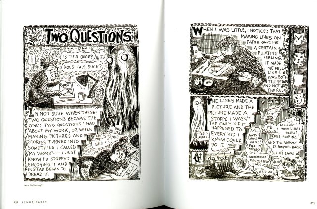
Two Questions by Lynda Barry. Page 252 -253 from the graphic novel The Best American Comics by Harvey Pekar and Anne Elizabeth Moore

In Graphic Design, framing is described as a way to form the viewers understanding of an image or object. Most comics utilize borders to separate each panel or frame from each other.

In the comic Two Questions by Lynda Barry, she frames the panels in a doodle, cramped sketchy kind of style. Like the example on page 123 in Graphic Design, Barry meshes together image and text in a way that both are of equal importance in framing each other. Each panel is also framed in a way that is reminiscent of a decorative painting or photo frame. It works well with the story in that it’s like an illustrated journal or a kind of internal monologue.

The framing is art in itself. It works as a way to both separate text and images as well as being integrated into the comic. While each panel is distinguishable from the next, it isn’t always done in a clean and precise way that many other comics are done. As you read, it’s not always clear which block of text should be read next but it can give insight to the tone of the story. The intense condensation of content illustrates the character’s (Lynda’s) thoughtful and conflicted mind.

While the comic itself is extremely busy and almost chaotic, the wide margins provide some relief and emphasize the great detail that went into the design, organization, and framing of each panel. In a way, the large margins of the page are used to unconsciously frame this comic.  If the margins were much narrower, this already active comic would feel overwhelming to look at.

Posted in Spring 2017 Archive (336), Uncategorized | Leave a comment

Framing: Cesar Rubio

img-015

From Richard McGuire’s “ctrl”, found in McSweeney’s quarterly concern. No. 13 pages 190-191

I think that the concept of framing is well demonstrated in this spread. There are of course the literal frames that make up the comic. Something interesting about them is that they are all the same dimensions and are organized evenly in a 4×4 grid throughout the entire excerpt.

There is also the reoccurring use of implied frames. At the end of each two-page spread McGuire presents either leaves, bread crumbs, or dirt within an implied rectangle shaped frame. This brings the story together, since there is no dialogue. It gives the reader a peak of the tendencies of the character and their personality. It also reveals a certain irony of the main character’s death.


Posted in Spring 2017 Archive (336) | Leave a comment

Framing: Eva Guillen


the-best-american-comics-65

page 65 from the Graphic novel The Best American Comics by Harvey Pekar and Anne Elizabeth Moore

This page from the graphic novel The Best American Comics is a great example of the use of framing. The framing used on this page has the individual graphics in different sized framed boxes. The framing done in each individual comic strip helps demonstrate the importance done in each individual strip. The cropping done is some of the images helps create a framing on some of the characters of the story. It helps emphasize the importance in the emotions, this can be shown in the image of the upper right of the man. The organizational design possibilities offered by framing allows for the reader or viewer to have an easier way to read. This formatting also allows for a more precise and clear reading format, that demonstrates the traditional left to right, top to bottom reading. Having margins around the framing allows the readers or viewers eye to be directed straight to the images in the middle. The margins allow for a direct eye sight on the actual content. Then the margins between the individual images allows for a neater and more organized form to demonstrate the content. It also helps with having a clear and concise comic that the audience can easily look at or read. The framing used on this page also helps demonstrate where the story ends and continues. Like I mentioned earlier the images change in size and the framing done, thin borders, help the eye follow the movement of the story. Overall the framing used in this page from the graphic novel does a great job of demonstrating, especially 0n what the concept and design do to organize a story.

Posted in Spring 2017 Archive (336) | Leave a comment

Framing: Logan Quaranta-Rush

framing

Page 4 from Marjane Satrapi’s comic, “Persepolis

While creating a visual landscape for a viewer the designer, artist, or even author as this can even be necessary in one’s writing must find a way to frame one’s work so that the viewer is drawn to the focus and not bombarded by information from the image. Focusing on comics we can see in each one the use of frames to separate the different images that cover the page. In Persepolis by Marjane Satrapi we see the use of very bold outlines around each image to separate one frame from the next. But the frames do more than separate the frozen moments in time, they enhance the content inside. Looking at page four of Persepolis specifically, we are filled with different feelings and thoughts by the way the images and words fill the frame. In frame 1 we see children running and playing with each other, a margin on top for the words, and a large field of view as the image does not focus on one thing but many different subjects. Frame 2 brings it in a little closer so that we begin to focus on the expressions of the children, margin still on top, helping keep the reader focused in the center of the frame for the black shirts and crossed arms start to draw our eyes down but the faces stop us. Frame 3 the mood starts to change as we are now focused on a single face, a man, and unlike the children this face does not look playful, the margin is still at the top. Only this time an added speech bubble under that creates a triangle between the margin and the man’s face, pulling our eyes down to connect with the eyes of this new character. Frame 4 is pulled back out to include the some of the audience and again no focusing too much on one subject. Frame 5 is the most powerful as the frame only includes part of the man’s face and focusing only on his expression, we have no outside static beyond the frame to draw us from the powerful image we are looking at, while there is writing within the frame our eyes go nowhere. Frame 6 is pulled out and more people are added to clutter and relax the viewer after the strength of the frame before. Frame 7, a lighter frame in content and in color, giving us closure to the story.

Posted in Spring 2017 Archive (336) | Leave a comment

Framing: Andrese Collins

Framing is our key tool to separate, organize and guide the reader to focus on specific parts of a scene, image or background in order to follow the story that we want to illustrate. Framing can help us display the elements and messages that an artist may want to imply within their art. When designing the frame of art, artists may use the frame to focus on exhibiting the various elements being used, such as lines, colors, contrast, shape, and texture.

img-028

Page 27 of Craig Thompson’s graphic novel Goodbye, Chunky Rice (pg. 27, Top Shelf Productions, 1999)

Notice that on page 27 of “Goodbye, Chunky Rice”, Craig Thompson used framing in multiple ways to create a short montage of various scenes in order to show the residential activities that are occurring in the neighborhood. The center image is the focal point of the page while the surrounding images as a border show a focus on each character that appears in the main image. The cropping of the main image helps the artist being able to fit all of the desired scenes while building up the border. Dew uses a great form of “frame within a frame” technique in order to lead and guide the direction of the reader’s eyes from photo to photo. While all the surrounding photos are available, there is still the largest image on the page which serves as the main picture that all the other ones refer or reply on in order to make sense to the viewer.

Last, page 27 has about 3 to 4 different scales to sized images available. The different sized frames help the reader understand the order that the images are forming. The boxes being the same scaled size on each side of the page, is a way to show the reader that the images are all flowing into the same scene which then leads to a continue in the story.

Posted in Spring 2017 Archive (336) | Leave a comment

Framing: Noah Martin

The image I have selected is a page

comic image 2.jpg

page from “Zoo” by James Patterson and Michael Lewidge

from the graphic novel “Zoo” by James Patterson and Michael Ledwidge. This image uses framing in multiple ways to effectively present the images in a unique way. The page has black and white imagery with black borders surrounding each panel, and a white margin along the outside. The simple black border effectively separates the images into a story board without causing distraction from the images, and the white margin allows each image to stand out. The black border also appears to convey emotion or the mood in the story because the lines of the frames become jagged around the edges when the monkey is angry and yelling and are uniform when he is calm. Not only are the  lines themselves jagged but the shape of the frame also changes and overlaps other frames which makes the image seem more intense or hectic which fits with the imagery in the story. The top right and bottom left images have black frames on parts however the image bleeds off the page on their top and bottom creating an implied frame and the effect that the image is jumping right off the page at you. The subtle changes can almost go unnoticed but add a lot of emotion and depth to this image.

Posted in Spring 2017 Archive (336), Uncategorized | Leave a comment

Framing: Alexa Berg

Frames are very important when it comes to design concept. Frames are everywhere and create a condition for understanding an image and according to Ellen Lupton and Jennifer Cole Phillips in their book Graphic Design: The New Basics “bring attention to the work and lift it apart from its settings”. Frames affect how we perceive information and therefore, are a part of the fundamental architecture of graphic design.

I had the absolute pleasure to take a look at issue 5 of the graphic novel Daytripper by Fàbio Moon and Gabriel Bà (highly recommend) and check out their interesting and creative design choices when it comes to framing. The first thing I noticed they really highlighted on was being in the scene. They were able to do this by using a technique called a partial bleed, where the image begins to bleed off three sides of the page while the bottom margin provides a partial boarder, still allowing

17

Page 17 of the graphic novel Daytripper by Fàbio Moon and Gabriel Bà

the picture to remain full of life. I feel this really involves the reader in what the current scene is providing, as it then begins to act as a boarder to the inside frame work which contains the actual body of the scene. This is an example of implied framing. They were also able to use the technique called cropping in order to fit all the necessary scenes within one page. We are introduced to the full scene by the use of a partial bleed, but then are forced to evaluate the actual moment by the cropped images that break down the very special moment. These images are separated by boarders that help us acknowledge each frame as its own masterpiece. These boarders are very subtle in order to create the illusion that the images are all apart of the whole “moment”. One of the last things I noticed about the style was the shift in scale. The image starts out taking up a third of the page, and then begins to scale in size as the images go from full to stretched to large.


Posted in Spring 2016 Archive (336), Spring 2017 Archive (336), Uncategorized | Leave a comment

Framing: Alex Gutzwiller

This image appears on David Lasky’s Portfolio- Comics Art at: https://davidlasky.carbonmade.com/projects/4415769/14017962 


screen-shot-2017-01-23-at-8-14-05-pm

David Lasky’s illustration for “The Ocean Has a Brain” (page 8) written by Lisa Marlowe.


This comic illustrates the affects that framing has concerning how we perceive the content of a comic. The individual pictures within this design are each frames separated by borders allowing each piece of work to draw it’s own attention and be lifted apart from the other surrounding images. According to the Ellen Lupton and Jennifer Cole Phillips, in their book, Graphic Design: The New Basics frames are  “subservient” to the design they surround yielding to the image but also shapes our understanding of that image. In this comic, the borders of the frames are white, which do not draw attention to their lines making them disappear and “subservient” to the images allowing for the content to stand out. The white borderlines also make these frames implied separating the content subtly drawing attention and lifting the designs apart from the setting. Lasky uses frames within a frame concept by illustrating the ocean dream of the author filling the whole center of the page with an ocean image that appears to be within the “brain” of her head (as dreams are). I see the movement of the ocean waves and feel connected to the dream that includes an image of car floating within the water as if traveling with the dream. The lower 3 frames make up parts of the author’s face showing a nose, mouth and ear. With the use of white borders I see past the individual lines of the frames as if they are invisible creating an entire image of Marlowe’s head creating the frames within a frame element. Lastly, the top of the comic shifts in scale where 4 smaller horizontal frames containing clouds and script. This shifting of scale helps to shape the understanding of this comic because not only do the clouds appear within these frames but also the horizontal lines help to show layers of clouds that are seen in the sky. Typically, dreams are often described as coming from above and within the thoughts of our minds. The script within these horizontal frames sets up the idea for the comic and places the viewer within the scene because the dream is explained here and seems to flow down from the top. With the use of shifts in scale and the frames within the frames the comic is more visually understood by the reader and allows the viewer to relate to the image in an interesting way as dreams are common to us all and often we all try to examine and remember our dreams, just as Marlowe recalls the dreams of her childhood.


Posted in Spring 2017 Archive (336) | Leave a comment

Framing: Alexandra Borders


lynda-barry-book

Page 23 from Lynda Barry’s “Picture This.” Barry, Lynda, and Kevin Kawula. Picture This. Montréal, Quebec: Drawn & Quarterly, 2010. Print.


Framing is important in art pieces, but even further, it is an important component of life. Frames works to help our understanding and perception of specific content, essentially being found everywhere and in different aspects of life.

This is a page taken from Lynda Barry’s Picture This. Her style is interesting, and I think this page acts as a prime example of framing, seeing as the picture is essentially made up of various frameworks. Though cropped, it can still be seen that there is a blue margin around the picture, the blue atoning to the theme of the page, blending with more than separating the picture. This frame works more cohesively with the picture.

In two places there are sections where text and swatches of blue are put against a white background, these places are framed to set them apart from the larger blue background, and actually work to demand attention to the different shades of blue. The framing of the text in this picture is set off from the images, instead of overlapping or obstructing them. This helps pull focus to the picture as a whole, which seems collage-like and might explain why Barry’s framing is prevalent in this piece.

With the other framing, Barry also has a picture zoomed in on a character, which looks as if it has been cropped from a larger picture, presumably one of the girl sitting in a theatre. This works to scale the picture, making it seem bigger than it might have before. Another part of Barry’s framing on this page is her use of borders in a darker blue around the picture and sections (or on the edge of the inside of the smaller pictures). Even though these simple borders are indeed blue, they are dark enough to separate the parts of the page and offer another way of calling attention to the piece as a whole.

Posted in Sample Posts by Students, Spring 2017 Archive (336) | Leave a comment

Framing: Mikah Chan

watchmen.jpg

Page Six of Watchmen #1, created by Alan Moore. Illustrations by Dave Gibbons  (DC Comics, Sept. 1986)

Framing is the condition in which a piece of work is presented to viewers in a design specific way. Everyday we see framing all around us, whether it be the design of a website or a advertisement picture in a magazine, and as a part of design practice it is an important tool to have. Though frames can be hard to identify when looking at a picture, you just have to look outside the context of the work to find how framing has influenced your interpretation of the content. Designers use margins and borders to separate the frame of the page from the content on it, while cropping can emphasis a specific area of a picture by cutting off all the unneeded parts of the image and creating new borders for the image. From the Watchmen page, you can see how the page is organized through margins and borders. The bottom half of the page contains four separate images that all have small, black borders around them, while the spaces between each image and the space below the page’s text are margins which help balance the design of the page and give concentration to each individual frame. Framing a framed image, with your hands holding the image or laying the image on a surface, is called reframing. By giving an image a frame that already contains a frame, the ability to add more context and detail to your content is available. Frames within frames can be seen in the Watchmen example above. Notice how the window in which the masked man climbs through gives a frame to the content, while the borders around the content provides a frame on the page itself. A last note to make on the framing of this page, is how the designer organized the text. While putting the text and images with each other on one page, the designer had to create a specific frame. Notice how the designer used the text as a border between the larger image and the four smaller images in the bottom half of the page. By putting the text between the top and bottom images, this implied framing gives balance to the page. Where the top image bleeds out of the frame, and is a heavy element within the design, the bottom four images give balance through numbers. Borders surround each smaller image, unlike the top image, which in turn through framing gives importance to the top image, while also emphasizing each smaller image through framing. Again the text here gives an implied frame to the page by providing space between the top and bottom images, while also giving context to the page/story through the organization of the text.

Posted in Sample Posts by Students, Spring 2017 Archive (336) | Leave a comment