Framing: Sophia Price

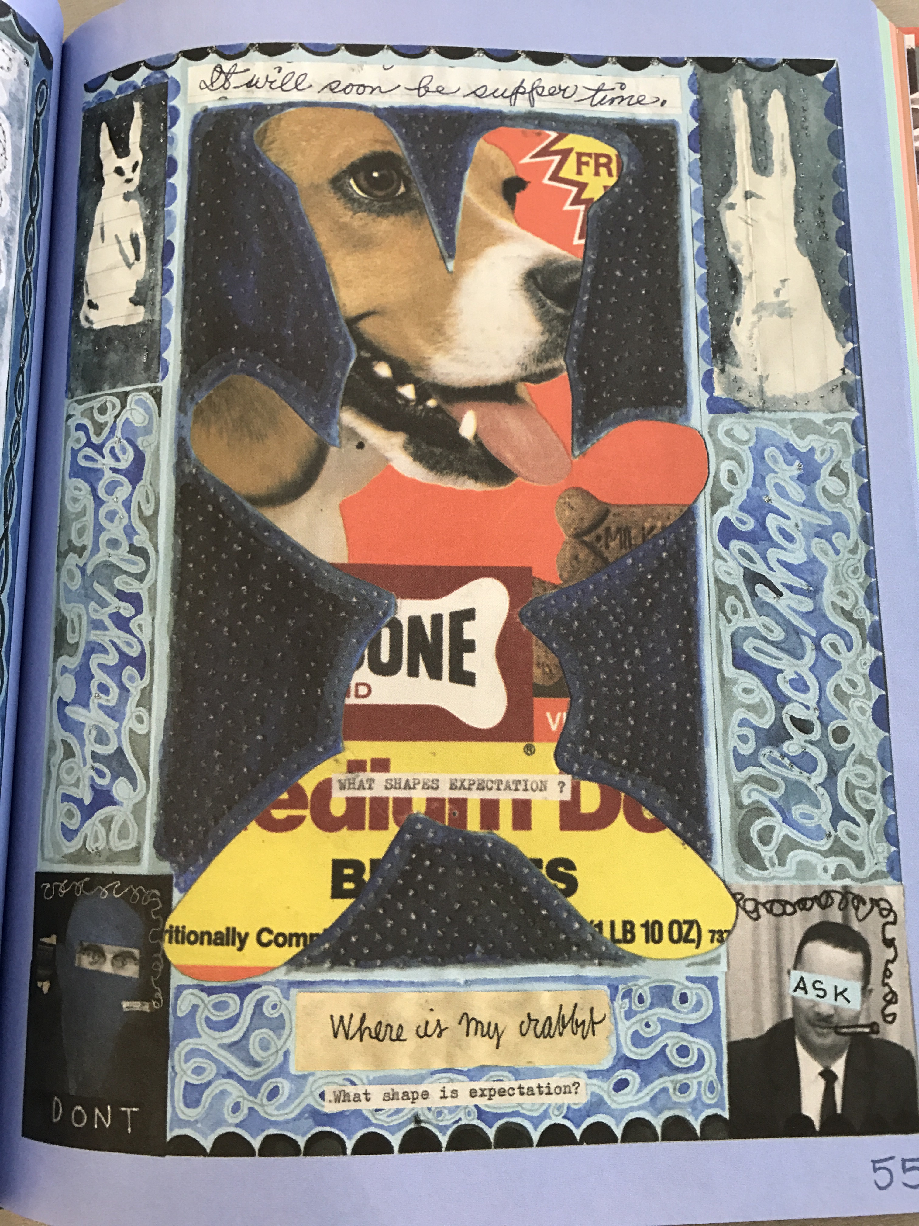
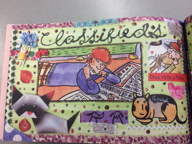
Lynda Barry provides a perfect example different types of framing within her graphic novel, One! Hundred! Demons! In the page I chose to focus on Barry has formed a camera frame around the picture centered on her page “classifieds”. By doing this she shows us a moment that is up for interpretation. The framing image and text is used to form questions within the reader’s mind. Is the character looking for a job in this or is she the classified? Through the use of from the image of the actual page in scrap book form with text, the reader is left to interpret what the author meant when she made this image seem like it was put together by itself. It makes the reader question what the headline means. Without caption, it is a full interpretation. By having another image with a caption next to the centered photograph, Barry continues to have us interpret her drawings.

This one is captioned “Once Upon a Time” with a cut image of a woman writing. The readers are still left to analyze if this image is more important than the other. This image has been cropped instead of bordered, working the framing differently than the center photo. I would think not, since it’s frame is not defined as the picture, or even the page, is. Instead it seems to be sloppily cut and posted, not bordered in the same way the other photo was. To border in the way that Barry did here is to make the picture stand out against the other images. The cats here seem to have implied frames, standing out in their own image rather than being squared off in a separate frame like the photos are.


img_0735

From Lynda Barry’s One! Hundred! Demons!


Posted in Spring 2017 Archive (336) | Leave a comment

Framing: Elise Detloff

Jimmy Corrigan: The Smartest Kid on Earth by Chris Ware is a graphic novel that makes use of framing incredibly often. This comic began as a serialized strip in newspapers which accounts for the many panels and subsequent frames around those panels.  According to Graphic Design: The New Basics, frames create the conditions for understanding an image or object. It essentially provides a visual cue to the reader that the image has stopped at a certain point. The frames in Jimmy Corrigan are all the same width, thin black borders that allow some of the negative space behind the panels to appear. This repetition is most likely due to the fact that this strip was serialized and releases week by week in newspapers. That requires a certain level of duplication because strips only have so much space to work with.

jimmy-corrigan-1

2-page spread from Chris Ware’s graphic novel Jimmy Corrigan: The Smartest Kid on Earth (pgs. n.a., New York: Pantheon Books, 2000)


But what really matters is the size of the frames, not the width, but the circumference. Chris Ware represents the importance of panels and images with scale. The larger frames represent moments of great importance to the main character, while the smaller ones are more frequent and are used to highlight every little movement Jimmy makes. This comic takes painstaking detail to just illustrate Jimmy blankly looking around a room. This can be seen in the example image. A man dressed as a superhero falls to his death, representing Jimmy losing his dreams and adoration of heroes he had as a child. It’s a large silent moment. The next page features several smaller framed panels of Jimmy at a complete loss as his mother continuously calls him.

            Another interesting detail is how the ringing of the phone and his mother’s text is outside of the frames. He isn’t thinking of them. He’s thinking about the hero that just plunged into death. Jimmy’s mother was shown to be uncaring and unobservant of Jimmy when he was a child and that lack of being invested and involved in what her son cared about has led to her still being outside of his world. And his world, in this case, is within the confines of the frames.

            The use of scale and negative space outside of the frames not only adds visual variation and interesting page layouts, but connect deeper into the themes and ideas the comic is trying to present to the reader.

Posted in Sample Posts by Students, Spring 2017 Archive (336) | Leave a comment

Framing: Emma Garcia

According to Graphic Design: The New Basics, a frame creates the conditions to allow the audience to understand the image. Framing changes a picture and focuses an audience’s attention to the work. When framing

pg-55-of-the-nearsighted-monkey-book-picture-this-by-lynda-barry

Pg. 55 The Near-Sighted Monkey Book Picture This By Lynda Barry

an image you can add so much to the image that enhances and builds more meaning.


In this example from Lynda Barry’s graphic novel, The Near-Sighted Monkey Book Picture This, she is using the outline of an animal which is upside down to frame the head of the dog and different types of bones for a dog. Her margins for the image is the outline of the animal and the images inside bleed out of the outline in order to change the way we see the images inside.

Also on page 55, the images surrounding the outline could be seen as an implied frames because they are separate thoughts and images that connect with the images meaning of learning how to draw and sketch which is what the overall graphic novel is trying to teach you.

Not only that but the whole page presents framing with the outside margins scaling the combined images to be one and using the purple background to focus your attention on the content of the page.  Lynda Barry uses framing in multiple ways throughout her novel, the scaling of her images are defined by the lines that encompass each of the different pieces on the page. The size and the shape of each of the frames are different but not drastically, only enough to keep the page pleasing to the reader.

Using all of the different aspects of framing, the page brings out more details that would not be seen or understood otherwise. The lines and the details that centralize your attention to a certain area enhance the overall layout.  

Posted in Spring 2017 Archive (336) | Leave a comment

Framing: Tia Caton

comic_moomin_post-3

Page 74 of Tove Jansson’s graphic novel Moomin

For this blog post I decided to use a page from the graphic novel, “Moomin” by Tove Jansson, in order to  analyse various uses of the framing technique. Although there are many types of framing techniques not used in this particular spread, what I liked and wanted to focus on was the idea of framing within a frame. Frames are described as having the ability to effect how we perceive information and creating the conditions for our understanding of a subject. If we take a look at this page you can see that each frame is side by side, creating a very clean, linear flow to the comic. Each frame has a thin black border, defining exactly where each set stops and ends. I think this really helps keep the reader’s eye focused on the comic itself and follow the path of the story. Along with this, there are slightly wider margins between each of the four strips. I think this not only helps with the clean look of the comic but also puts an emphasis on where the eye should be drawn. It makes each of the strips almost pop off the page and away from the white space. If you take a closer look at the images themselves within the main frame you can also seem to notice more framing within the comic itself. For example, in the second strip, the second and third frames seem to have inner framing as well. The arch of the building frames in the characters and allows the reader to understand that they are in a building of some sorts. The next frame over then includes a door, which frames the space as being a room of sorts within the building they entered. This idea of creating frames withing the frames is what allows the reader to understand the context of where the characters are in the story and what they are doing.The idea that framing greatly influences the readers perception of a story and how they might read it is very true, and can be seen here in this comic by Tove Jansson.

Posted in Spring 2017 Archive (336) | Leave a comment

Framing | Cristian Gutierrez

img-010

Artist | Chris Ware

While reading the new chapter Framing, I realized that a frame is both limiting and limitless. From the collection of graphic novels, I chose to write about Chris Ware’s work. In this particular layout he chose to work with implied frames for the images and for most of the typography he chose to create a border. The page where the content sits serves as the main frame that limits the space. Although the space is limited, by using the concept of frames within frames, we have an abundant amount of choices to create the most aesthetically pleasing and effective layout to display the content. If we were to get into more detail, we could also talk about the many other frames that are being created in the actual illustrations. For instance, the borders around the window create a frame for the glass and the list goes on. Something I noticed and found interesting in this particular image, was that the artist at times uses the alignment of the text to create an implied frame.­ Lastly, I also noticed that with the word “but” the scale changes which helps create the implied frame on that individual piece. Like I mentioned, frames can be limitless and playing around with the scale, position or type of frame can contribute to the overall effectives of the design.

Posted in Spring 2017 Archive (336) | Leave a comment

Framing: Tre Bobo

IMG_4662 (1).JPG

Page from 100 Demons by Lynda Barry

Framing is an important aspect of graphic novels and creative design as a whole. From reading Graphic Design: The New Basics I learned that a border is not the only way an object can be framed some, for example, can be implied from objects surrounding a man focal point that leads the viewers eyes instinctively towards it. With these tools of framing an artist can subconsciously lead a viewer through his art and make a person see an object in a new light.

In one of the graphic novel that I viewed in the CDSC called One Hundred Demons by Lynda Barry I was able to see the different things that can be done with framing that I previously never thought about. In the example given above I noticed how she decorated the border surrounding the frame with things like glitter to make the page more visually interesting. I also noticed that she didn’t use the whole page to cover the two images in the frame and made the two images different sizes from each other. This action made me focus more on the bigger image on the right and gave it more importance on the page.

In the spaces outside the frames Lynda Barry also decorated to make the book feel more like a scrapbook, which I thought was a good idea as most artist in graphic novels and comics that I saw had not done this. These somewhat unorthodox methods that Lynda Barry utilized in something as simple as framing left a big impression on me and made her book stand out more than the other ones I previously saw,

Posted in Spring 2017 Archive (336), Uncategorized | Leave a comment

Framing: Toree Boutz

tumblr_nd7w5cexkf1u0xvpvo3_1280

Page from 
Richard McGuire’s graphic novel, Here (Pantheon Books, 2014).

Ellen Lupton and Jennifer Cole Phillips explore the idea of framing in their book, Graphic Design: The New Basics. Generally, frames are often meant to bring special attention to a piece by lifting and separating it from its surroundings. Additionally, frames can also help us better understand an art piece or object.

Frames may fulfill their purpose in many different ways in many different contexts. For example, in comic books, often times frames are created using borders around each piece of the story. This can help readers understand the sequence of the events in the story being told, as well as what should be noticed in each frame.

Richard McGuire’s uses borders like this in his graphic novel, Here. Boxes of the same size are created using thin black borders, in which images that tell the story are drawn.

In addition to more obvious frames, like borders, frames may also be implied. These kinds of frames may be created through a camera lens, margins, or the page size of a book. In Here, McGuire uniquely places frames within frames and uses shifts in scale of the frames to tell multiple stories at once. He simultaneously tells of one story in 1922 using one frame, and tells a story in 1957 using a smaller frame within it, scaling it to look like the woman is sitting on a similar couch. This creates a more dynamic story for readers, and we are able to grasp it thanks to the framing McGuire uses.

Posted in Spring 2017 Archive (336) | Leave a comment

Point, Line, and Plane: Andrese Collins

The comic Butt To The Future by Taylor Dew is an unique and adventurous fats paced comic about a young women, Mary, who leaves to the bathroom to take a “poop” and ends up flushing into the toilet. She then flushes out into a new bathroom which leads to a new dimension known as the FUTURE!

In this scene, Mary is shown being spouted out by the toilet. There are various sized panels which helps state how significant each panel plays to the point of the scene. Mary is the focal point of the page which is why Mary is visible in every panel expect for the 1st one. Even when Taylor emphasizes Mary’s glasses, she draws out Mary’s hand but with rigged-edges to show the reader how hard it is for Mary to see without her glasses. Taylor Dew uses an assortment of lines and dots to control the space in and out of the planes within the panels. In the center panel, Taylor focuses on Mary’s recovery from the fall by shading in all of the background space that surrounds Mary. Taylor also used many small dots to help express the distraught that Mary was experiencing.

screen-shot-2017-01-19-at-9-51-57-pm

Page 3 of Taylor Dew’s Butt To the Future. Image from Taylor Dew. Tumblr. 2013

Last, Taylor uses a consistent amount of contrast between black and white to express specific details and addresses a sense of reality that may not be common in most comics. A good example of negative spaces relating is in the 5th panel where Mary’s glasses are by the puddle of toilet water drenching from her. The puddle of water and to the glasses look different whether its under the white or black tiles. When the water and glasses lens is on black tiles, the inside of the objects are shaded or drawn in. And when the water is on the white tiles it lacks inner details expect for the single water drops.

Posted in Spring 2017 Archive (336) | Leave a comment

Point, Line, and Plane: Angelica Tibule

image1

Flitty: Son Boy’s Fly Pal by Archer Preweitt

Flitty: Sof’ Boy’s Fly Pal by Archer Prewitt is a short comic about this character, Sof Boy, who finds a fly named Flitty, trapped inside the house and tries to help Flitty find it’s way to the hole on the window screen. Based on how Prewitt drew the character’s expression on the second and sixth panel, he wanted to help Flitty, but got frustrated and eventually gave up. In the last panel, Prewitt only focuses on Flitty to make it clear to his viewer’s that Sof Boy gave up and left.

Looking at the comic, there are a lot of line details in each panel. He used a lot of sharp, broken lines to provide more texture towards the walls, ground, and window. The line textures also created more depth in a two-dimensional plane. In addition, the window, wall, and trash can are examples of plane.

Lastly, according to Graphic Design: The New Basic, a point marks a position in space (p. 34). A simple point in a person’s design, can easily catch the viewer’s eye through its contrast or value. In the second panel, Prewitt uses balance between the two characters and creates an implied line of the Sof Boy’s eyes looking up at Flitty. Through the implied line, it is a way for Prewitt to lead his viewer’s eyes towards Flitty.

Overall, the choice Prewitt made for the cloud like speech bubble and typography creates a theme that goes along with how he designed Sof Boy.  I also like how simple it is to understand the story with such little dialog, based on how he made the character’s actions and expressions clear in each panel.

Posted in Spring 2017 Archive (336), Uncategorized | Leave a comment

Point, Line, and Plane: Aaron Uptagrafft

The section that I have chosen to write about was in a large newspaper sized comic strip about an ordinary woman’s life in a tourist heavy area. This was the very first thing I saw on the front cover of the book and I have to admit it caught my attention way quicker than any of the other things that I read. The image shown is made and placed where is has been to do two things, and that is grab your attention and to set a tone for the rest of the comic. While the artists intention isn’t immediately known to the reader, as I had to go back and look at the image to fully understand it after reading a little through the comic, it conveys a sincere and deep meaning with just one word, god. As you go on to read through the comic, the artist’s depiction of this seemingly normal person gradually slides into worse and worse situations that she has to be put through and when you flip back to this page the meaning becomes clear, this woman is worn out and has had just about enough of her daily life. The most intriguing thing to me about this image is that she clearly tries to throw off your understanding of what is going to happen in the comic because it is brightly colored and honestly looks like a beautiful summer day. Also, to emulate the monotony of the suburban life, the artist uses a scene focused around a central plane that follows symmetrical patterns that can be seen in the lights, sidewalks, grassy areas, and even in the trees.I think that this comic is demonstrative of a great artists work, regardless of whether I liked her overall style or not.img-026.jpg

Posted in Uncategorized | Leave a comment