Javin Nash: Point Line Plane

dtc336-blog-pic2

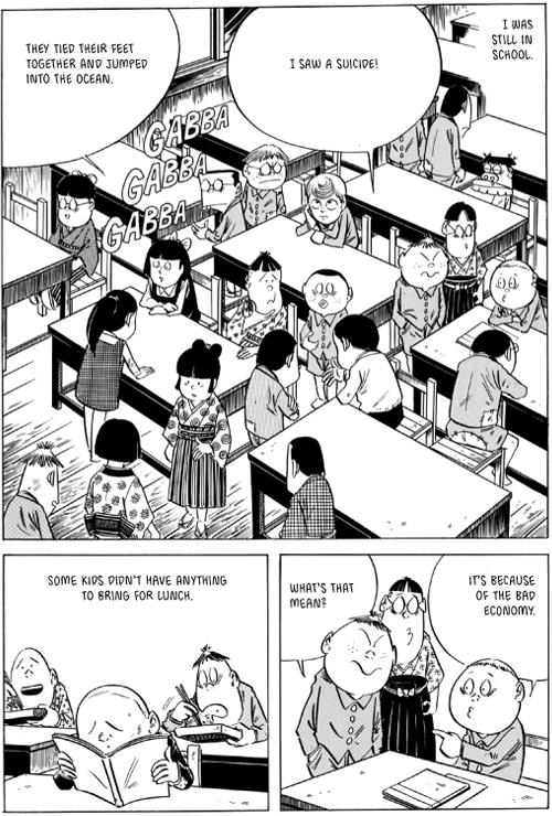
Perfect Example by John Porcellino Page 11

From these pages in the comic book “Perfect Example” my eyes move left to right starting at the top left hand corner to the bottom right hand corner. I feel as if this is the typical way Americans make comics easy to read. I liked this example because of its simplicity. There are eight squares on each page usually which make this comic an easy read. The background is brown so I can get a sense of what is and is not dark in the picture or what the illustrator is trying to make me focus on, which would be the words in brown and the people and images in white. This technique can function as a point because it draws the eye and is surrounded by so much white space (negative space).  A line is an infinite series of points, used in these pages to show emotion on characters from swirls and straight lines. The use of lines in this comic also is seen to outline focal points: cars, houses, speech, characters, city skylines etc. I think that this is a unique way to describe something with only two colors (white and brown). Here, a point is used to create space in the ground and facial expressions. One point is a persons pupil and multiple points represent grass on the sidewalk. A much larger example would be the tires on a car. A point marks a position in space and can express its own identity or melt into the crowd, thus creating texture (like the grass). I noticed planes twice on this example of the comic I read and that was when showing a bush, the gas from a car and the city skyline. A plane is a flat surface extending in height and width or a path of a moving line.


Posted in Spring 2017 Archive (336), Uncategorized | Leave a comment

Point Line and Plane: Noah Martin

I have chosen to analyze a section of a graphic novel that was available in the CDSC during Thursday’s class. This was one of four illustrations on a large fold able 4 panel board. Each image showed the same building but at different times, with different people and events. The building acts as a background with illustrations showing what is happening within the image. The artist uses lines and symbols to connect imagery with with the background. For example near the top left an arrow points to a window of the building, then connected to that arrow is an image of the same window from the perspective of inside the building. The image and arrow act as a point and line together. The comic is especially interesting to me because it can be seen as one image but can be read many different ways. The series of images on the top right is the largest group signaling to the reader that this is the most important part of the story, were as the scattered images on the left appear to give context to the story. The bottom section is the only sequence that follows a horizontal plane which makes it seem as if it is separate from the events pictured above but still relevant to the story because it is still on the page. Overall this comic is very unique in its layout and use of lines to connect important points of the images story and alignment of frames to give a sense of direction.

comic-image

Posted in Spring 2017 Archive (336), Uncategorized | Leave a comment

Points, Lines and Planes: Alexa Berg

I took a look at the graphic novel Smile by Raina Telgemeier in the WSU library during Tuesdays class. The novel tells the true story of the authors awkward early years from 6th grade up to high school. The novel did a good job, style wise, at creating a teen like comical feel by using large gutters on the surrounding edges and thin clean cut gutters separating the straight-edged planes that give it its position in space. The large space surrounding the planes is symmetrical and makes it feel balanced and equal.  I thought the design choices made were appropriate to the story, especially with the use of splash pages. Each new chapter contained a full page image that introduced the scene that followed. It usually was a location, like the city, or a characters house, but succeeded at creating that acknowledgement of environment and draws your eye to it because of its surprising detail. It felt almost as if you were watching it through a television, only you can take your time soaking in each scene, which is why design choice is so important.

An interesting style choice Telgemeier made was the ridged lines around the planes during the earthquake scene. Right away your eyes are drawn to the dissonance that is occurring within the scene and its black background is capable of making the viewer feel the transition to a tense environment, as we begin to see something other than strictly arranged lines and a shift in symmetry. Another use of color was during Raina’s dental surgery, where the pages background appeared a decaying yellowish color to illustrate the characters lack of reality while she is under the anesthesia.

When significant actions occur within each plane, the words, made up of points which mark a position in space and express their own identity, are worded in bold and typically take up an unusually large portion of the comic. This immediately draws your eyes to the big letters and elaborates the importance of the action. It also ties into the “teen comedy” kind of feel that I picture the author going for based on her design choices in this particular novel. Overall I felt it was a very smooth and goofy visual read.

Posted in Spring 2016 Archive (336), Uncategorized | Leave a comment

Point, Line, Plane: Aaron Scofield

graphic-novel

This is a page from a graphic novel I looked at in the library when Lorena O’English taught our class for the day. I saw several examples of points, lines, and planes in this image so that is why I decided to use it.

In their book, Graphic Design: The New Basics, Ellen Lupton and Jennifer Cole Phillips discuss what a point, line, and plane are and why they are important to world of designing. According to these authors, “Point, line, and plane are the building blocks of design” (33). I completely agree with this because points, lines, and planes are what make up shapes and those shapes can form pictures that are creative and imaginative which brings us back to how the author or illustrator is perceiving those images. I forgot the title of the graphic novel that this picture is from, however, you can see that the frames all use points, lines, and planes to show the environment in which the comic takes place as well as gestures and facial expressions by the characters in the novel. For example, there are lines on the floor in the first frame and that gives the reader an image of perhaps a wooden floor texture in the classroom. There are also lines on the clothing as well as points and planes to give the clothing more of a three-dimensional form. You can see that the lines and points make creases in the plane on almost every article of clothing in the frames. There are also lines around the pictures which gives us three separate frames to look at it. We naturally read left to right and move downward with our eyes as the story continues. It is amazing to me how these kinds of graphic novels can be solely black and white yet still have so much meaning and intention behind every texture and pattern in the design. The illustrator even makes it possible for the readers to see the animation of a student using chopsticks which is shown by two small lines in the second frame. Designers and graphic novelists use many elements such as points, lines, and planes in their work to create artwork that is capable of capturing gestures and textures, which makes the novels more relatable to the readers because we can see the actions happening in the picture frames.

Posted in Spring 2017 Archive (336) | Leave a comment

Point, Line, Plane: Cora Kline

The example I chose is from “A.D. After the Deluge” by Josh Neufeld,

ad-after-the-deluge

“After the Deluge” by Josh Neufeld

which was the graphic novel I received from O’English. This piece shows a points, lines, and planes in several different ways. One of the biggest is the implied line from each panel.  Ther
e is no physical line, but the way the characters’ eye’s gaze in the first and third panels guide the reader to a specific point in the second and fourth panel respectively. The point in the second panel is the man kicking down the door, which is almost perfectly in line with his eyes in the previous panel.  The point in the fourth panel is the very top of all the destroyed possessions, which again is almost perfectly in line with the man’s gaze.  There are major white lines dividing the page into the four panels, which help guide which way the reader should looks. Planes are shown through the angle of the “camera”.  The lines of the windows and the sidings show which way the “plane” of the house goes relative to our point of view, giving depth to the pictures. The lines create very little texture to the images. Combine that with single color images, there is a great deal of negative space.

Posted in Spring 2017 Archive (336), Uncategorized | Leave a comment

Point, Line and Plane: Cassidy Krahn

bowling-ball-commic

In the Bleachers by Steve Moore

I love this comic! It tells a whole story without any words. This bowling ball is walking into a bar full of pins, about to roll out on these guys (poor pun intended). The artist use three points to let us know the grape looking circle in the center of the comic was a bowling ball. What is even more impressive is the use of lines to create depth. The line create volume or a plane in the photo. This 2 dimensional photo turned into 3 dimensional photo by the use of lines to create planes. The bowling ball looks big because the shadow of lines behind it, compared to the pin shadows. Also the little detail lines of the hat make them look more 3 dimensional, rather than flat. Using the lines created a plane in this comic.

I think if the author of this comic used spatial translation wonderful. He used the space of an old western scene to create a tension between the bowling ball and the pins. This has been done in photo graphics, movies, and books but because of those occurrences we understand this translation. We understand this ironic comic and get a different, funny, view point of pins and bowling balls.


Posted in Spring 2017 Archive (336), Uncategorized | Leave a comment

Point, Line, Plane: Cesar Rubio

I was unable to attend class on 1/17/17. I used examples from What It Is for this post.

EPSON MFP image

Page 125 of What It Is by Lynda Barry.

I tried to find the page I thought would best demonstrate all three elements working together. I found that after page 122 of What It Is the style of the work changed a bit, the elements were easier to spot.

The use of points to create depth and border to the drawings, particularly the words written out in points on the rug, emphasizes the idea that lines are an infinite series of points. By not connecting the points this is made for evident, legibility is not sacrificed.

The things that popped out to me the most was the use of the cross hatch patterns that created negative space on the page. This is due to the fact that the lines Lynda creates are made as negative gaps instead of positive marks.

Upon scanning the page, I realized that the right side of the page was out of focus. I tried rescanning the page several times to provide the best scan possible, that was until I realized that this was a good demonstration of the third concept of planes. The blurring on the right side of the page is due to the fact that the perfect plane that is the scanner bed did not make full contact with the imperfect curved plane that is the page. All the elements on the page have many characteristics, but one thing they lack is breadth. The page has the breadth that allows this to occupy space in the physical world.

Posted in Spring 2017 Archive (336) | Leave a comment

Point, Line, Plane: Alex Gutzwiller

From the book, Graphic Design: The New Basics, Jennifer Cole and Ellen Lupton explain the basis for design comes from the use of point, line and plane elements. These elements combine to form textures, patterns as well as relationships within the image to create a design that promotes the movement of the viewers’ eye across the piece.  I chose a non-scripted image from the graphic novel; fax from Sarajevo, by Joe Kubert because I feel it illustrates this concept of eye movement across a design. This image uses lines that move horizontally and vertically throughout the image, which immediately caused my eye to move across the entire image by looking right to left as well as up and down. The horizontal lines form a plane because it is filled with a relatively wide field of white. As described in Graphic Design: The New Basics, a plane is trail of a line that moves. The white planes within this image I feel caused my eye to move from right to left because the thickness of the plane is greatest on the right edge, initially drawing the eye to this location. Becoming smaller as the plane moves to the left, my eye moved to the left. Additionally, because these planes contain only the color white, they seem to become a focal point within the image that is filled with color. My eyes initially looked at the white plane on the right first.  Also because this novel concerns the Serbian siege of Sarajevo during the Bosnian War, the use of the color white also becomes a focal point that is positive space because I feel it illustrates the absence of war and fighting.  Lines that create the war-torn tree trunks seem to be behind these planes of white and draw the viewers to look at

1296596385_sgtrockhellhardplacehc

This image represents characters from the graphic novel fax from Sarajevo, by Joe Kubert

the image vertically as a tree would grow. Furthermore, the white planes could be interpreted as a fence that is keeping the war zone filled with the dead trees away from the soldiers, further adding to this positive space. Lastly, as discussed within Graphic Design: The New Basics planes can be parallel to a picture surface. Within this image the white planes are parallel to the soldiers in the foxhole that seems to further emphasize the positive space that is creating protection for the soldiers. Looking closely at the soldiers, several points are visible. As explained by Cole and Lupton a point marks a position within the space of the image.  The standing soldier has two points upon his right sleeve shoulder.  I feel these points high on the soldier mark the position that the soldier is standing up as opposed to those in ground within the foxhole.  Likewise, there are small points on the soldier’s hand that is in the foxhole that adds to the placement of the soldier within the ground contrasted against the standing soldier. Since there are few points used within this image their use is powerful because their placement is illustrating the location of the soldiers within this image and pushing my eye to these positions. As a result because of the use of points, lines and planes this design is active because it draws my eye to move across the entire image. The design also seems to contain depth as the white planes create a fence-type image, which illustrates a background and foreground. Depth is also created with the foreground of men in the foxhole, a standing soldier in the middle, which is followed by the white planes and trees that further caused my eye to move vertically up the image.


Posted in Spring 2017 Archive (336) | Leave a comment

Point, Line, Plane: Mikah Chan

In this image you can see point, line, and plane work together to create a dramatic, memorable illustration in John Lewis’ March. For the basic design of the page, point and line is used together to create the shape of the image, whereas the beams of the church, along with the lines of the walls and doors of the building give foundational structure to the image (a background to give the viewer context). With these points and lines that give shape to the background of the image, plane is also used to give more detail to the page. The shading of the church pews and people, create darker contrast and distinguish depth between different characters sitting down. This is an example of plane, using the color of shapes and the interaction of lines (lines outlining the shape of the pews differing from the lines that outline people), to create depth within the illustration as well as give a sense of space and proximity to the objects within the drawing. The balance of the image is for the most part symmetrical, the weight of the page being distributed equally. The background structure of the church is placed centrally in the image, while the  placement of characters sitting down are placed evenly on either side of the page, providing balance of color and objects  in this drawing. Though asymmetrical qualities do appear as well, as the “closest” character on the left, is the darkest colored image in the drawing. The color of his skin and suit, along with the shadows that cast over his body and partially his face give an asymmetrical balance to the image.


This particular character and

march

Image from John Lewis’ graphic novel “March”.

the darker tones that surround him, separates him from the rest of the image. He stands out from others sitting down and the lighter background of the church, emphasizing this particular darker character, and giving and unequal balance to the page’s symmetry. Though this done to direct the eye towards this character, making him the largest in scale to the objects and people around him, as well as drawing him with darker colors to differentiate the character and attract the viewer even further through such contrast.

Posted in Spring 2017 Archive (336) | Leave a comment

Point, Line, Plane: Jasmin Negrete

barefoot-gen

Page 9 of Keiji Nakazawa graphic novel “Barefoot Gen” 


One of the graphic novel that I was able to look through and that really caught my attention on Tuesday’s class was Barefoot Gen vol 1, by Keiji Nakazawa. While glancing through this graphic novel one can see that there are many different forms of Point, Lines, and Planes being used throughout the novel. In Ellen Lupton and Jennifer C. Phillips book Graphic Design: The New Basics the authors describe  each of these terms as”building blocks of design”. Lupton and Phillips see a point as being the main focus in a design. One can see this on page 9 of Barefoot Gen, in which the artist creates a point or a focus point on some of  the panel (square). Specifically the one with the building and the one with the soldiers feet.  Out of all the panels in this page these two stands out that most  and draw the reader’s attention, due to them  being the only panel that are filled in with black in certain areas, to emphasis a feature .Throughout this page  there are also many forms of lines that add to the design of this novel. On page  9, one can see the use of lines to separate the squares that contain the different information that is going on throughout the story. One can also  notice the lines that help create the bridge and the path way on the top panel. The lines in this panel all start at one point ans lead the readers eyes to an end point. Throughout this page one can see that some lines are longer than other, as well as some being thicker than others. However, when a line excised as certain thickness it becomes a plane. According to Lupton and Phillips a point is a “flat surface extending in height and width”. So in between each comic strip there is a plane that helps divide each idea( or each panel) into its owns panel. These three design terms can be seen in many different graphic novels and in many different forms.


Posted in Spring 2017 Archive (336) | Leave a comment