Scale: Elise Detloff

This two-page spread from Maira Kalman’s The Principles of Uncertainty is an excellent example of how scale can be interpreted objectively and subjectively. Scale isn’t just size, but the interpretation of that size literally or based off of experiences or impressions of the size an object should be.

When an individual considers scale in terms of literal dimensions, then scale is being considered objectively. When the individual uses first impressions or relates to our past experiences, then scale is being considered subjectively.

                The example from The Principles of Uncertainty exemplifies both of these interpretations through its subject matter. In this spread, Kalman draws a scene from a sidewalk store. The image bleeds off of the page, continuing off the page due to a lack of a border. This cropping alone indicates a larger scale, we know the scene continues on past where we can see.

the-principles-of-uncertainty-pages-32-33

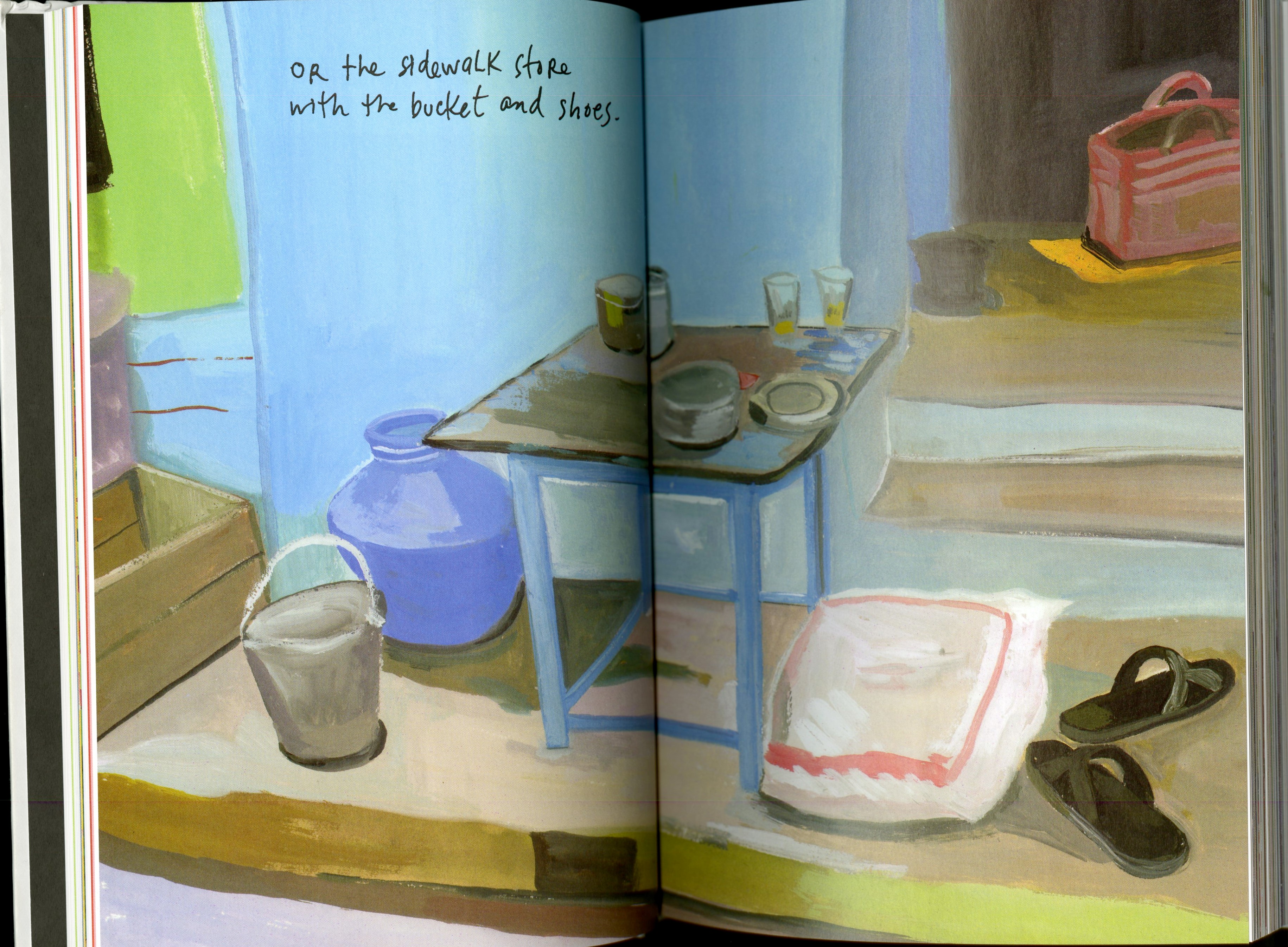
A drawing of a sidewalk store from the author’s past. (Maira Kalman, Principles of Uncertainty, Penguin Press, 2007, pgs 32-33)


The sidewalk store features a table with drinking glasses on its surface. There is a bag of flour and sandals while steps lead up into a doorway and a bucket is on the left. This could be viewed objectively, a reader could make a literal correlation between the represented objects and the real items it depicts.

But the objects drawn are not exact renditions of real world items. The bucket is a bit misshapen on one side for example and these drawings are definitely not re-creations with exact measurements re-scaled for the pages.

These pages will probably be interpreted subjectively. This page plays off of the idea that we, the audience, as seen a pair of sandals before, or staircases, or buckets, etc. If the sandals were larger than the table top while everything else remained the same, we’d think, “Those are big sandals” or “Everything is small compared to those normal sized sandals.”

The scale also provides depth though there isn’t really movement. For example, the front legs of the table are larger than the back legs, giving the table a 3D element. We know the back legs are further away.

Scale is relative and often times depends size, placement, and color of the elements around it. If all of these objects drawn were the same size we’d have an unrealistic depiction of the store. The table in relation to the flour bag in relation to the sandals gives us an idea of what the real world version would look like.

Posted in Spring 2017 Archive (336) | Leave a comment

Scale: Mikah Chan

ware2

Use of scale taken from a page of Chris Ware’s graphic novel titled “Building Stories” (2012)

In examining the use of scale in design, this page taken from Chris Ware’s graphic novel Building Stories provides many elements of scale. Objective scale is referred to as a literal representation of something. In this example the correlation of the sizes of the buildings to each other are relative, as one can interpret the buildings all being of a large size in comparison to other objects that surround them (i.e people, houses). The artist creates a static image in which the scale of objects compared to others, whether larger or smaller, are identifiable to us and are not extreme or imaginative. Subjectively, the artist explores scale through the tracks to the right and the human hand using some kind of technology interface. By creating a track that seems to extend for a farther distance and large hand that seems closer to the viewer than the other characters in the image, the artist plays heavily with depth. With this created depth, a scene is set and and emphasis is made through the scale of the objects the artist allows us to see. We see this hologram-like screen which is meant to grab our attention through its larger scale in relation to the rest of the image and through human interest (it makes us wonder what kind of technology it is, and what it’s used for). Beyond using scale to make the image seem realistic in terms of size, this emphasis on certain elements gives more scale to the importance of the image, and the message the artist attempts to convey. The smaller images in the bottom third of of the page give us examples of contrast of scale. With the size of the images and implied depths differing, these changes in scale helps mix the rhythm of the page, keeping the viewer’s focus at high alert and giving emphasis to each smaller image by making them different from one another.

Posted in Sample Posts by Students, Spring 2017 Archive (336) | Leave a comment

Scale: Nikki Aviles

This page is from the graphic novel The Architect by Mike Baron demonstrates scale with its  depth and  movement through frames. When you first look at the page it looks like a bunch of small individual frames, placed on one big frame as the background providing  some depth in the page. The individual frames at the top of the page are nicely arranged and are around the same size, towards the bottom of the page the frames are more zoomed in and cropped to show facial expressions or a certain object. Then the last frame isn’t really even a frame but the woman standing by herself with no boarders around her or anything. She is scaled so big that she takes up most of the bottom half of the page. disppage-1

Posted in Spring 2017 Archive (336), Uncategorized | Leave a comment

Scale: Alexa Berg

In design, scales can range from a printed piece as small as a postage stamp to as big as a billboard. No matter the size, your work must have its own sense of scale.  When we think about the meaning behind this, we consider both objective and subjective points of view. Objectively, scales are literal dimensions of a physical object, while subjectively they refer to the impression of the objects size

17-1

Page 17, issue #9 of Daytripper by Fabio Moon and Gabriel Ba

On page 17 of Daytripper , Fabio Moon and Gabriel Ba illustrate depth and movement by the size placement of their graphics and the color of elements surrounding them. In the first image, we see a tree with Bras’ father standing beneath it. The tree and everything around it is shaded to demonstrate that he is far away, and that their is a different emotion to that particular part of space he occupies within the scene. Surrounding him are warm colors that help to highlight and draw your eye to that section of the frame. Since we expect some objects to be particular in scale (familiar objects, familiar scale), it would appear odd that Bras father is much smaller than him if we didnt get that sense of depth that it is trying to provide, but it also gives us a sense of tension. Just by the difference in size, It appears he is observing this relationship from a far, and that his son, in a way, is reliving himself to be a bigger and better man than his father ever was to him. .

In relation to his grandson, Bras is much bigger which is a good example of relative scale because in this case we can observe bigger as older. This is also an example of a subjective point of view. Scale can also depend on context. In the last box, we see Bras hand his grandson the string and hold the kite all on his own. The dialogue on this page reads that life is a beautiful book that you wont know the ending of until you read the last page, and when you do, it feels all too real, so the empty space we see in that last scene punctuates the two boys and draws in its importance. The image itself is the metaphor.


Posted in Spring 2016 Archive (336), Uncategorized | Leave a comment

Scale: Alexandra Borders

comic

Page 52 from “David Boring” by Daniel Clowes, portraying a man dumping a woman’s body in presumably the ocean. Clowes, Daniel. David Boring. New York: Pantheon Books, 2000. Print.

I found this in David Boring by Daniel Clowes. I did not spend a lot of time looking through this one, but I thought this page was interesting. After reading about scale, I decided this page would work well while writing about this topic.

When concerning scale, it can be an objective scale or a subjective scale. Objectively, the scale will stand as a specific and literal translation (or representation) of a subject/object. For example, the dimensions of the human body to convey correct proportions. Subjective scale, on the other hand, relies more upon the interpretation of the viewer, as their experience and perspective can alter the scale of an object/subject, thus altering its meaning as well. Such as, the waves drawn in any panel might seem small, but with knowledge of an ocean, our perception of how big the waves could actually be (and the ocean itself) changes.

On this page, scale is used greatly, especially to represent distance and movement. For example, the stars in the sky are much smaller than the people and objects, showing that they are far from whatever the main focus is (in this case, the man on the boat). In addition, one panel has the man rowing away from the woman he abandoned in the water, but he and the boat are smaller than the face of the woman, showing that there is a larger distance between them. This also helps create more complexity and depth to the panels, so that each one looks flat, especially when the man is swimming away from the woman and boat, toward shore.

The waves drawn in work to help show movement within the water, considering the waves drawn up front are larger and continuously get smaller. Also, when the man is throwing his oar, the oar is drawn a little smaller than it would have been if the character was still holding it. This shows the oar is moving away from the man. The artist did well conveying the movement happening, specifically with the water.

Posted in Spring 2017 Archive (336) | Leave a comment

Scale | Cristian Gutierrez

Artist Chris Ware, no page number.

Artist Chris Ware, no page number.

Scale is both objective & subjective. In the design world, scale is used to create depth, movement, importance and many other effects. In the visual I chose to present, your eyes immediately go to the face right in the middle. If the face is that big, one would assume there is some significant value placed on the face. In this case the face is a representation of self-image, which is what the story is about. As for the frames, its obvious they are not all the same size, but the illustrations are scaled proportionally to prevent any distortion. In addition, the scale of every individual drawing follows the concept of familiar objects, familiar scale to create conceptual relationships.

Posted in Spring 2017 Archive (336), Uncategorized | Leave a comment

Scale: Noah Martin

Scale is always important in design it determines the size of the work itself and gives
context to the content. According to “graphic design: the new basics” there are 2 ways of referring to scale, objective and subjective. Objective scale is the literal physical scale of an object, for example a ¼ scale model of a car is exactly ¼ of the size of the actual car. Subjective scale refers to your perception of the scale, for example if I shcomic-image-3owed you an image of a rock with no background it would be difficult to tell the size of the object because you have nothing to relate its scale to. Objective scale is important when considering medium and print, and subjective scale is important in the illustrations to make them seem realistic. The illustration I have chosen is by Paul Chadwick from his “concrete sketches” series of illustrations which can be found here. I chose this comic because it is a good example of how scale can be used effectively. The objective scale of this image is unclear since it was originally created as a drawing but was viewed digitally. Placing the concrete man next to a tree is an example of subjective scale because it shows how large he is since almost everyone has seen a tree and can relate this image to a physical experience. He also appears to be on the peak of a mountain, this is an example of cropping to imply scale because we only see a small portion of rocks but the shape and context make the reader think he is on top of a giant mountain. Overall this image effectively uses scale to create a visually dynamic piece.

Posted in Spring 2017 Archive (336) | Leave a comment

Javin Nash – Scale


dsc_00271

What It Is page 44 by Lynda Barry

From my understanding scale can be subjective and objective. Subjectively scales reflects one person’s impression of an object’s true size. For an example on page 44 in What It Is there is a black crow that almost fills the page to stress the importance and true size of a crow. This imagery is the crow’s profile view and is close enough to the crow and it’s nut that you feel as if the actual crow is right in front of you (perspective of my own body). Also the crows placement is important for this particular page because had this same image of the crow been further back in the distance the intended audience might feel differently about the actual size of a crow and predicted that crows are smaller in person. Objectively scales are related to a representation and the real thing it depicts. For an example the nut that is in front of the crow is scaled objectively because that is about the actual size of that kind of nut and it is not just my perspective of what a nut might look like

The crows size is a contrast of scale because it seems big because it forms beyond the frame of the initial picture but also gives us a sense of depth. It does not look as if the crow is moving and is sitting still which expresses a sense of importance because most birds fly away when you get too close to them. So I wonder why the Illustrator made the crow seem close and still/brave.

Posted in Spring 2017 Archive (336), Uncategorized | Leave a comment

Scale: Sophia Price

When looking at an image, the scale of the picture gives away many implications that the reader should have about the photo. How large the images are, how far away they are supposed to be perceived, and the reality of the image are a few of the things scale tells you. For example, when looking at Daniel Clowes’ novel David Boring, the scale tells in an objective way that the two women are different sizes. The relativeness of one girl to the other makes their dimensions  clear to the reader. One is larger, with more body mass. They other is smaller, more thinly perceived.

img_0739

David Boring by Daniel Clowes, page 43.

In the second frame, this is more obvious because they are standing next to each other. In the frame below this one, it is subjectively implied that the two women on the other side of the table are further away than the two “closer” to the other side. The subjective gives the 2-demensial image a depth that it does not actually have. The subjective depth makes the objection clear that they are all supposed to be sitting around the table together in the same room. The relativeness that the family is having a conversations added to it because of the way the bubble around the room work. It adds a familiarity, something the readers already know about, to the framing. Then by changing the scale of framing, the reader can see the movement between the bodies as the scene continues frame by frame.

Posted in Spring 2017 Archive (336) | Leave a comment

Framing: Dave Herman

The image that I have chosen to represent a good example of framing is from Frank Miller’s Vol. 4 of his classic graphic novel Sin City. This page does an excellent job of framing by using Sin City‘s trademark solid black and white coloring. It appears that the illustrator took a solid black page and created images and text boxes using white, introducing the idea of negative space. The image that first caught my eye and probably the image with the most weight and significance is the man in the cage. Since the cage is quite literally a frame for the man and due to the size of the image, I can assume that this is the center of the image and most likely the setting as well. While the setting exists depicted on the right, the action happens on the left. On the left, the audience’s eye can follow a clear downward path moving through text boxes and images of the prisoner’s face each contained in strict rectangular frame and slanted. In fact, all of the images on the page except for one appear slanted and tipped of their supposed bases. The one frame on axis is an unusually small text box, separated from the other images in the bottom right corner. These inconsistencies lead me to believe that the content of the text in this frame holds importance or at least provides a resolution to the page, being the last frame that is to be read on the page and bringing the frames back to axis.


lkj

Figure 6 from Frank Miller’s Sin City Vol. 4: That Yellow Bastard, 1996.

Posted in Spring 2017 Archive (336), Uncategorized | Leave a comment