Comics: Kaleb Parrish

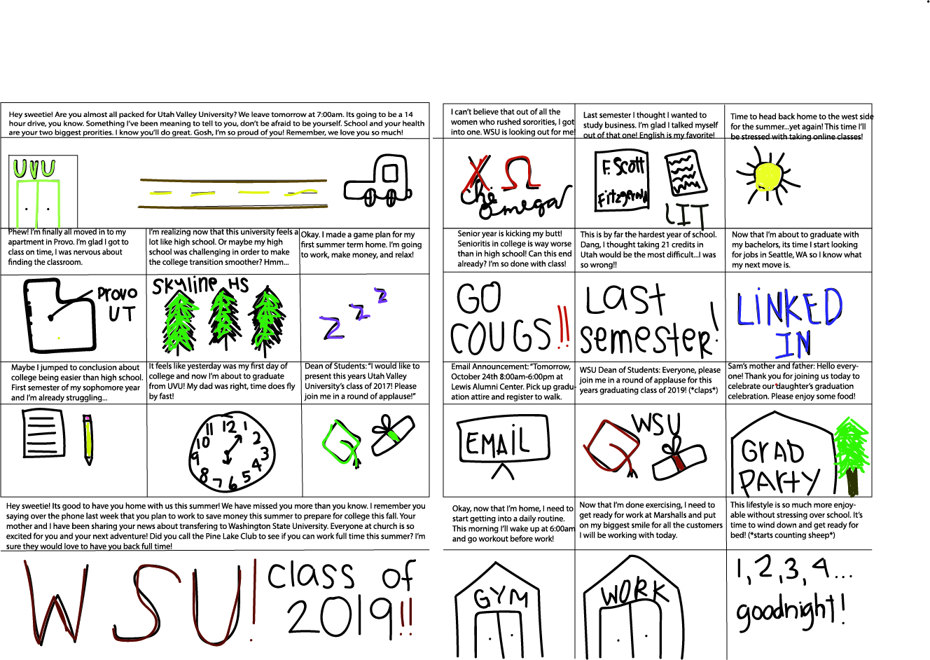
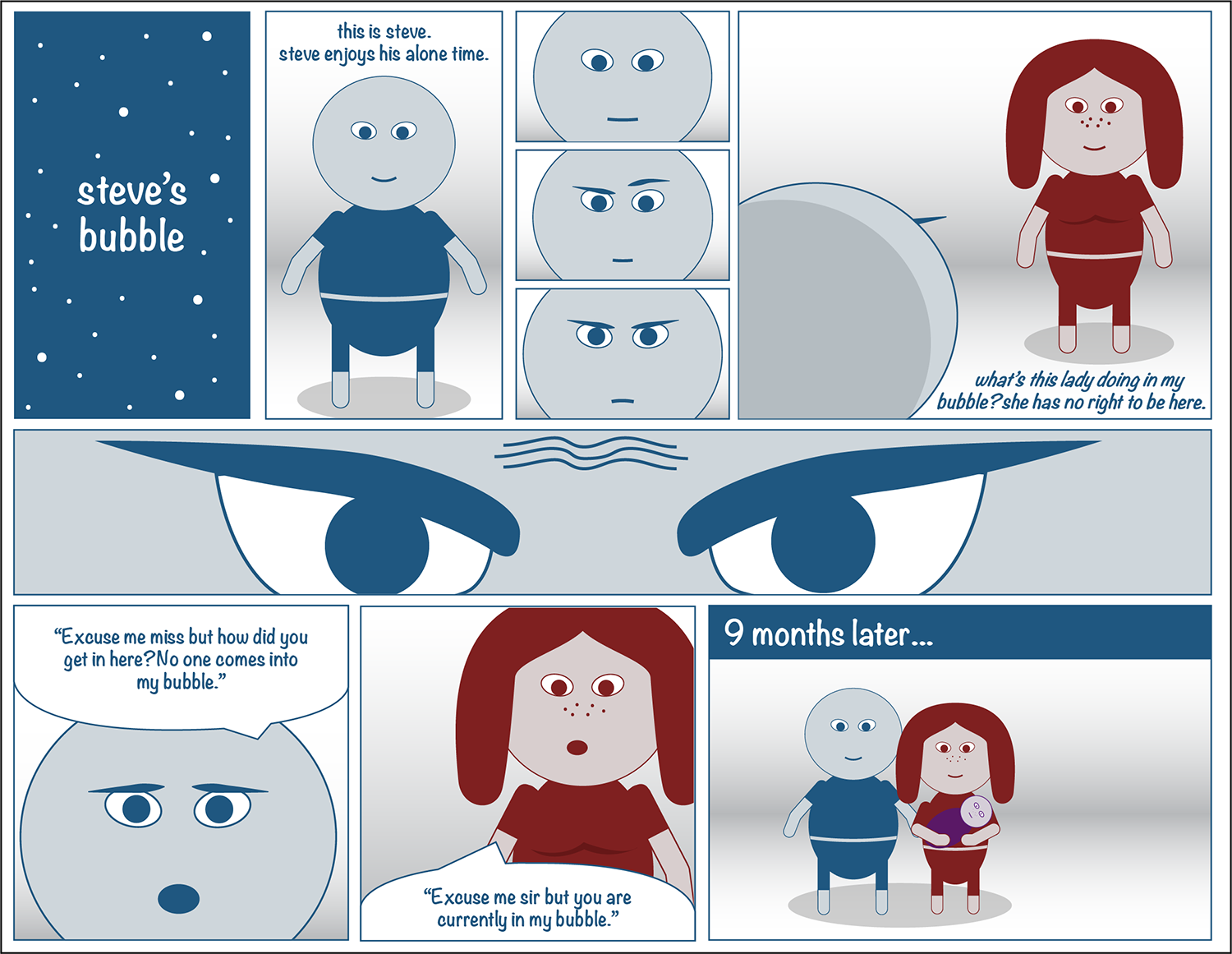
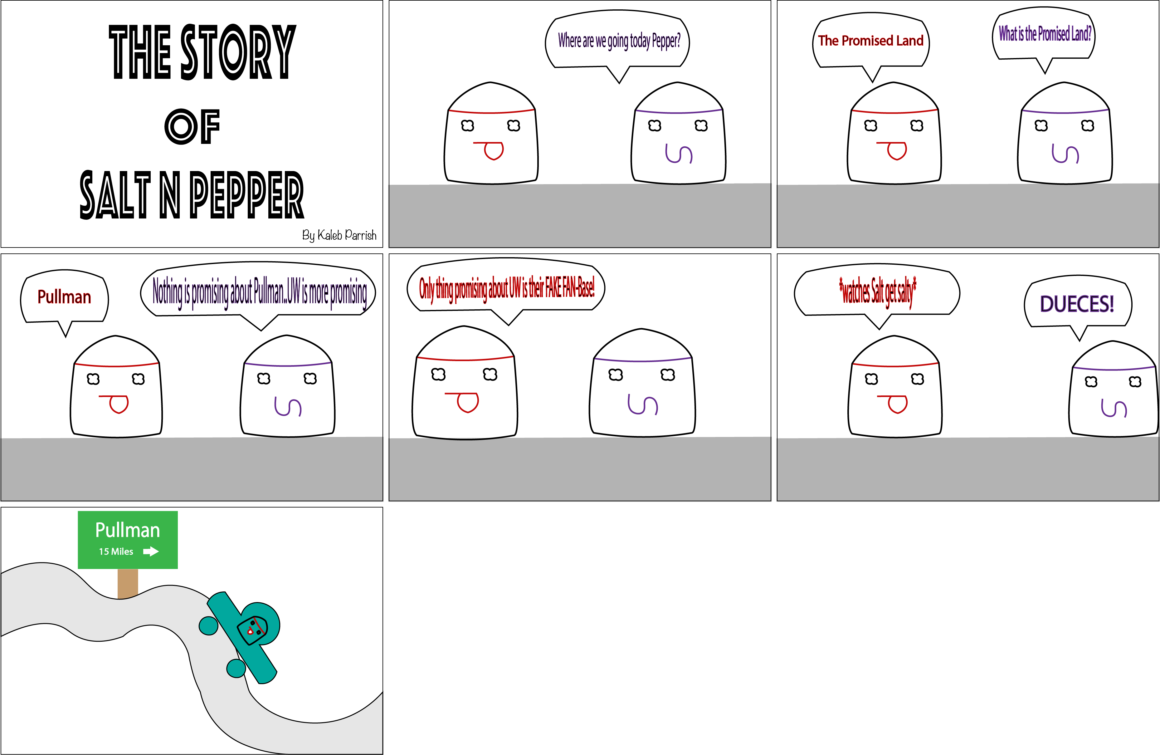
Adobe Illustrator, what an adventure to say the least! At first trying to get used to the tools was a challenge because this was my first-time using Illustrator. A lot of my time early-on during Project 2 was spent doing the required tutorials just so I could get the basics down which helped me create what I wanted with my comic strip. For my comic strip I wanted to make a funny yet simple comic bashing UW fans so I created the characters Salt and Pepper, in which Salt is salty (UW fans) and Pepper is your fun and jokingly-typical Coug fan.

Designed by Kaleb Parrish, October 2018.

When I see my comic strip that I created, I would say that it fits Scott McCloud’s definition of comics being “juxtaposed pictorial and other images in deliberate sequence”. Not only does it follow juxtaposed pictures because my pictures are placed side to side, they are also incorporating pictorial images. They are pictorial because I created them from scratch on my storyboard, but I also wanted to incorporate the deliberated sequence so when one would read it left to right, the story would flow like reading a book. My comic seems to rely on a good balance between graphics and images that are both written and illustrated communications to help the overall idea of the comic to be a sequential story.

As for print versus digital, I think my comic would be better presented on a landscape print page so that all of the frames could be visible at one time. The ideal environment for readers to view my comic would be whenever fellow Washington State fans want a quick laugh, they could get one since it is making fun of University of Washington (UW). The rivalry between the two Universities has always been fun and games so by making a short, funny comic about that, seemed to really catch my interest and hopefully yours as well.

Posted in Fall 2018 Archive (201) | Leave a comment

Comics: Andy Snow

McCloud’s definition of comics is “juxtaposed pictorial and other images in deliberate sequence” (9). In my comic, “The Ride to Success,” I chose to use words as the structure in order to tell the story in a chronological order. The intended humor in this comic is the fact that although “The Ride to Success” is about a girl who is a spitting image of the author and shares her story of attending college, the author has no idea how to draw. The decision to find strength in words rather than pictures came from chapter six in Understanding Comics by Scott McCloud. McCloud discusses how changing the balance of words and pictures can allow readers to interpret an author’s comic differently. McCloud wrote, “on the other hand, if words lock in the ‘meaning’ of a sequence, then the pictures can really take it off” (159). To ensure reader comprehension of my comic, I focused on the

Photo by Andy Snow, “The Ride to Success” October 2018. A comic about a girl going through her college experience who transfers from one university to another.

words in my comic and wanted the drawings to be simple, more iconic and symbolic. My idea to use icons to help represent the story frames came from chapter two of Understanding Comics, “I’m using the word ‘icon’ to mean any image used to represent a person, place, thing, or idea…and finally, the icons we call pictures: images designed to actually resemble their subjects” (McCloud, 27). In my pictures, I used some color and in others I did not. I chose to do this because originally, I wanted it to be just black and white but then I realized that color is more aesthetically pleasing and I wanted to add aesthetic to my comic. The ideal reading environment for my comic is print because I am old school when it comes to comics, I like to turn the pages and read it like a book. I enjoy print and feel that print is the easiest to read, therefore I chose print for my comic. I hope that my viewers will look at my comic in book form, from left to right, instead to constantly moving down the page like a newspaper. I believe this comic would look best in a larger text because there are more words than pictures. I also hope that they can see the humor behind the drawings. While creating this comic, I had a difficult time with the tools because I would forget to change to the select tool before trying to move pieces and lines. This was my first time working with Adobe Illustrator along with my first time creating a comic. I don’t find myself to be the most creative person, so I turned to irony to help grab the attention of my audience. I really enjoyed learning more about Adobe Illustrator because I had the opportunity to learn about creating comics and the background behind comics. I used to think that comics were mainly created for the look, not just the context but after this project, I learned more about what comics are and the importance of them. After reading through my peer critiques, I was pleased to see that those who peer critiqued my comic noticed the icon use and story telling the way I had hoped, understanding my comic in its entirety.

Posted in Fall 2018 Archive (201) | Leave a comment

Comics: Zachary Larson

The short story I came up with for this project fits into McCloud’s definition of what makes up a comic. At the most basic level, my story follows a character through a sequence of frames to illustrate a timeline of events that occur. The main protagonist Steve is content living in a space that he’s knows and claims as his own. He spots another person entering his bubble of space and becomes irritated at the fact that they would wander into his area so aimlessly. After confronting his intruder, she rebuttals to Steve in a mirrored reaction. Steve realizes he is not entitled to that specific space at all. In fact, he realizes she must feel the same way he does and the two bond over their shared ideals. I utilized the concept of expressing emotion through the use of facial expressions in my comic. I want the reader to understand the frustration Steve was experiencing and how his thoughts changed through the sequence of frames.

Designed by Zachary Larson, October 2018

I believe my comic would be enjoyed on both mediums of print and digital. However, the way my story is designed and the style I used would be most effective on a digital platform. The pictures would come out crisp and the colors would appear more vibrant. I hope the reader will look through my comic and understand the process of emotion throughout. I am trying to portray the message that even if you might be feeling alone or moreover prefer to be alone, there are others out there feeling the same way. Everyone enjoys their own space and time to themselves but that is no way to spend the duration of your life. In my story, Steve had to get over himself and realize his new colleague shared a similar thought process to himself and that is what brought them together.

Posted in Fall 2018 Archive (201) | Leave a comment

Comics: Emmalina Krist

Comic made with Adobe Illustrator.

This project was intended to fit Scott McCloud’s definition of comics as “juxtaposed pictorial and other images in deliberate sequence.” I feel that it accomplishes this goal because the panels and images within are juxtaposed, or placed beside one another in deliberate sequence; in this case, the sequence is made up of events that follow each other through time. One thing that I identified with while studying Scott McCloud’s exploration of comics was his suggestion that while many comics contain text and dialogue, comics as a medium are not required to contain these things, especially if images convey the meaning behind the piece. As such, the comic that I created for this project contains no text or dialogue, but still attempts to tell a story through images, with emphasis on contrast between grayscale and color.

Ideally, the comic is read on paper, because I feel that the only sources of color, being the butterfly and, eventually, the lily, create a type of implied line that guides the eye through certain important panels of the comic, and this is only possible when the entire comic is visible on one page, and doesn’t need to be scrolled on a computer or phone. The panels should also be set up in the specific order and format shown, which are designed to fit a portrait-oriented sheet of printer paper. I also found print to be more enjoyable to read than digital, due in part to the fact that reading print comics held my attention for longer periods of time than reading the digital comics.

Posted in Fall 2018 Archive (201) | Leave a comment

Comics: Leah Henry

“The Longest Waiting Game” by Leah Henry, October 2018

For my comic I developed a simple story about a character, that represents me, getting into college at WSU. My project fits McCloud’s definition of comics in the sense that I have created a storyline made up of different visuals that are placed in a specific order. The illustrations that I produced were intentionally arranged in a sequence that could be easily understood by my viewers. One element from Understanding Comics that influenced my choices while working on this project was the concept of closure. I like the idea that readers can interpret messages in comics that aren’t necessarily included through an artist’s style. For example, I wanted to use some sort of transition between panels, so I decided to have a thought bubble connect two of the frames. In addition, the last panel of my comic portrays a message without any words, and instead uses illustrations and size of the panel to convey my idea.

At first, I decided that I wanted to have my comic printed because I know how the viewers experience differs from digital comics. Then, once I began working on my project, I found that the format of my comic seemed like it would work better digitally. With printed comics an artist is able to use each page in a way that a digital version cannot. On the other hand, digital comics can potentially be more interactive for its audience. My hope is that viewers will be able to easily follow the storyline and realize that I am referring to my own experience. Also, I hope that my audience is able to relate to my story and the message behind it in one way or another. The significance of my comic was to present the idea that good things come to those who wait. Overall, I struggled a bit when learning how to use Illustrator, but I am now eager to improve my skills and understand everything this software has to offer.

Posted in Fall 2018 Archive (201) | Leave a comment

Comics: Juan Guzman

In Scott McCloud’s definition of comics, he explain comics as being juxtaposed pictorial and other images in deliberate sequence. Since my comic is called ‘Stranger Danger’ and basically a horror type, I used a lot of jagged and hard lines in the panels. I left a few images without a set panel to create a variation and keep the storyline interesting and suspenseful. These vary in size and shape but like addressed in Chapter 5 of McCloud’s “Understanding Comics” lines can convey emotion. The amount of detail that I added on the stranger in my comic is considerably less than the driver to signify a mysterious mood. I designed this character with emotionless facial features and dark silhouettes. Turning to the objects displayed in the comic, I would say that a lot that influenced that are those known as “Subjective Motion”. In few instances in my comic, it shows the car moving and taking off, with repetitive lines either behind of front of it to impose it driving off. I tried to portray a reading of the panels from left to right and is best used in print. This is the ideal reading environment that hopefully my viewers will look at it as a more “spooky” and kind of suspenseful comic. The experience of reading it digitally is different because of the scrolling and zooming in. The reader would focus more on trying to see the words rather than reading it, and that is why it is best in print format. and The comic is short and since it is in black and white, it seems more old-fashioned, almost expected it to be in print to get that full, eerie emotion. This is helped by the comics sequence used from the idea of subject to subject. The exchange between words from both subjects helps guide the reader to feel the awkwardness that is shown throughout the storyline. Comic Project-04.jpg

Posted in Fall 2018 Archive (201), Uncategorized | Leave a comment

Comics: Jessica Harja

For my project, I wanted to focus on a common project I’ve been working with for a while in my art degree. This project basically has to deal with the meanings of trees in a basic sense of what I’m working with. From right to left, top to bottom; my project features panels of Aspen trees. It starts from one small tree, a group of three, and more join in with them until just three are left and zoomed in. These trees I created with the help of a reference in Adobe Illustrator. From there I used various sizes of them to create more of the trees. Once I printed it out, I went back in with a couple of pens. Yellow to add the characteristic yellow to the canopies and black to signify the interconnected root systems.

harja-jessica-project-02

A comic about Aspens and creating unity in communities made by using a reference for outlines, creating the layout in Adobe Illustrator, and hand coloring and lining in the final print version. Designed by: Jessica Harja, October 2018.

In doing my research of Aspen trees I found something interesting from this info graphic written by the Denver Post. Aspen trees are really just one tree depending on the grove. Their systems start with just one tree and slowly over the years, more can grow from the original’s outstretched roots. Some of the oldest organisms on Earth are these trees that can cover hundreds of acres!

The second part to my project is that I wanted to focus on this aspect. Something (like an idea or a person) brings attention to an event or moment that’s important. If this idea grows enough, it spreads. As this idea spreads, the roots of the cause become stronger. In response to various social events, there is a common occurrence that happens, and that is people banding together.

Does my project fit McCloud’s definition of comics? I’d like to think so. These panels are deliberately placed in the sequence that they are in to signal the reader that they need to focus on the one tree and then the group of trees. Just like they need to focus on an individual to focus on the group of people.  Ideally, my project is meant to be in print. Numerous people nowadays are accustomed to everything being online that print is kind of ignored. I wanted to use the paper to bring attention back to the subject at hand. For people to take time with it instead of flipping through. Ideally, I’d like my comic to be viewed with other Aspens or potentially areas of people trying to bring about social change. By using very little words, I want readers to try and put together what I’m trying to tell them. Even with words, meanings can be lost and misinterpreted.

Posted in Fall 2018 Archive (201) | Leave a comment

Comics: Bethany Smyth

This was my first time using Adobe Illustrator and was very relieved the tools were similar or the same to the tools in the Adobe Photoshop program. As I started my project, I was very overwhelmed with where to start and how to execute my project. Although the program’s tools are similar to photoshop, there are many tools that are different. With experimentation and time, I got more confident and found which tools I enjoyed using most. I told myself not to get overwhelmed with the amount of tools so I educated myself in a few, more simpler tools such as the calligraphy pen and the curvature tool, and changing colors and point sizes.

smyth-bethany-project-02

This is my Comic. It is a how- to guide directed at people who stand in disbelief at how simple elevating such a simple instant- meal can be.

My comic is a strip that shows how to elevate ramen, a typical source off nourishment found in every college student’s pantry. Being Asian, my roommates, friends, and I like making Asian cuisine because it has intense fresh aromas and intricate flavor. One particular item we eat is ramen. We know how to make the simplest of foods into something much more appreciative to the palette. Whenever we make ramen our non asian friends are always surprised we serve them ramen, since their versions don’t have pork, chicken, beef, or duck and fresh ingredients like lemongrass, cilantro, basil, and peppers. This specific way of “dressing up” ramen was made popular in Japan, and it has now spread throughout Asia. There are restaurants that are dedicated to only serving ramen! For my comic, I wanted to make a joke of how some people react to dressed up ramen. They always ask how we make it, as if it takes intense concentration to make like many other Asian recipes. Rather, it is very simple.

I think my project fits McCloud’s definition of a comic. He states that a comic is a “juxtaposed pictorial and other images in deliberate sequence.” My project contains multiple images lined in a sequence from left to right. The images show the process of elevating mainstream ramen to a more elevated meal. My comic shows action and tells a story. They are placed in this sequence for a specific reason. I wanted to make a print comic because I personally don’t like reading comics or illustrations on a screen. I look at a screen almost 40% of my day and when I read literature or look at drawings and paintings, I enjoy it better off screen. Perhaps its more refreshing and satisfying to see artwork in person. I made my images to be hand drawn so I used the calligraphy tool and drew most of the images. I thought if it were in print, the artwork would be appreciated more but looking at on screen, it looks good on screen as well. In fact, I think I can see the detail a lot better on the screen.

I wanted my comic to be more animated than realistic. I think it is more fun to read comics and see pictures that are more abstract and not as realistic.

Posted in Fall 2018 Archive (201), Uncategorized | Leave a comment

Comics: Tori Bredy

My comic, “What Goes Around Comes Around”

My comic project fits Scott McCloud’s definition as I have used a mixture of frames with pictures, frames with pictures and text, and a frame with only text. All of my frames are put in a sequence where the reader’s eyes flow from the first frame all the way down to the final frame. The specific concepts from McCloud’s book that influenced my decisions when designing my comic were making frames, no matter what size, that would tell my story smoothly. Sometimes comics can be tough to follow if there are frames that seem to ‘jump’ from one section to the other, so I wanted to create little frames that would pull my story together and make it flow. Another concept I tried to incorporate is McCloud’s description on the importance of sequence. I decided to move around some frames to make the story flow better because if there are frames that do not fit well together then it also makes it difficult to read. Thirdly, I wanted to incorporate including detail when necessary and keeping designs simple. I added details on the outfits to make it more realistic and Christmas decorations to bring in holiday, cheerful spirit, but kept the supermarket and alarm clock, for example, as more simple designs.

The ideal reading environment I wanted for my comic was to have it in print so the reader would be able to physically hold my comic and read it versus putting it on the screen. It seems as if everything is digitalized now, not all bad reasons, and I really wanted to create work that would bring the reader back to a nostalgic period of their life when they would physically read comics in print such as comic books and newspapers.

A snippet of two frames from, “What Goes Around Comes Around”

I hope my readers will read my comic and have a warm, fuzzy feeling people get when they do the right thing and are rewarded for it. The title, “What Goes Around Comes Around,” is a saying I try to live by every day and wanted to demonstrate this saying in an artistic form.

This was pretty much my first official time working with Illustrator and watching tutorials on how to utilize the tools so it was a very fun and rewarding experience!

Posted in Fall 2018 Archive (201) | Leave a comment

Comics: Josue Cuevas

What I like about Scott McCloud’s definition of a comic is that it’s very broad now. So I do think that my comic indeed fits the definition of comics by Scott McCloud because my comic is a set of juxtaposed images in a deliberate sequence. It goes from panel to panel flowing nicely through with the images telling somewhat of a small story. One of the concepts discussed in Scott McCloud’s book which influenced my comic was the one about time frames. He talks about how in a comic each frame can be told from a different time in the story even though on the page they are next to each other. I used this concept because in my comic it shows that time is moving quickly with driving the truck on a road trip in the beginning of the comic to then finally getting home in the span of those panels. In my opinion my comic is better if it’s in digital form just because it looks much more crispy than if it were to be printed. As for the ideal environment to read my comic it would honestly be anywhere, any time it doesn’t matter it’s up to the readers choice. I hope the readers just don’t judge it that hard and look at it as attempt to do a comic for a first time Adobe Illustrator user. Much like Photoshop I am not proficient in Illustrator or any of the Adobe applications in fact. I’ve just been trying my best to create a nice, simple comic, for art isn’t really my thing it never has been all of my life but regardless I’ve tried my best. That’s why I hope my project won’t get judged too hard and instead it’s critiqued fairly knowing now that I am not very good with Illustrator.


Posted in Fall 2018 Archive (201) | Leave a comment