
McCloud’s definition of comics is “juxtaposed pictorial and other images in deliberate sequence” (9). In my comic, “The Ride to Success,” I chose to use words as the structure in order to tell the story in a chronological order. The intended humor in this comic is the fact that although “The Ride to Success” is about a girl who is a spitting image of the author and shares her story of attending college, the author has no idea how to draw. The decision to find strength in words rather than pictures came from chapter six in Understanding Comics by Scott McCloud. McCloud discusses how changing the balance of words and pictures can allow readers to interpret an author’s comic differently. McCloud wrote, “on the other hand, if words lock in the ‘meaning’ of a sequence, then the pictures can really take it off” (159). To ensure reader comprehension of my comic, I focused on the
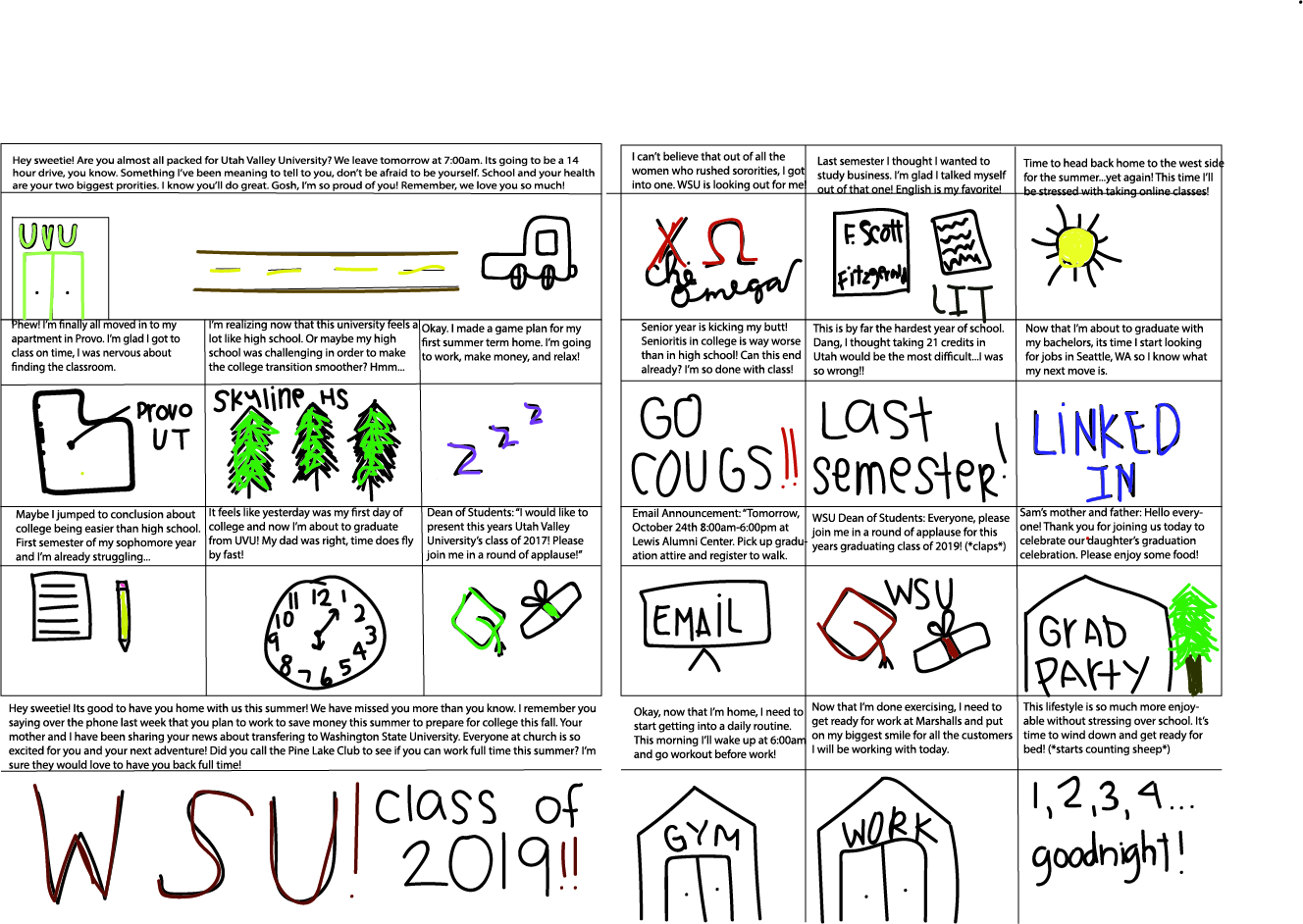
Photo by Andy Snow, “The Ride to Success” October 2018. A comic about a girl going through her college experience who transfers from one university to another.
words in my comic and wanted the drawings to be simple, more iconic and symbolic. My idea to use icons to help represent the story frames came from chapter two of Understanding Comics, “I’m using the word ‘icon’ to mean any image used to represent a person, place, thing, or idea…and finally, the icons we call pictures: images designed to actually resemble their subjects” (McCloud, 27). In my pictures, I used some color and in others I did not. I chose to do this because originally, I wanted it to be just black and white but then I realized that color is more aesthetically pleasing and I wanted to add aesthetic to my comic. The ideal reading environment for my comic is print because I am old school when it comes to comics, I like to turn the pages and read it like a book. I enjoy print and feel that print is the easiest to read, therefore I chose print for my comic. I hope that my viewers will look at my comic in book form, from left to right, instead to constantly moving down the page like a newspaper. I believe this comic would look best in a larger text because there are more words than pictures. I also hope that they can see the humor behind the drawings. While creating this comic, I had a difficult time with the tools because I would forget to change to the select tool before trying to move pieces and lines. This was my first time working with Adobe Illustrator along with my first time creating a comic. I don’t find myself to be the most creative person, so I turned to irony to help grab the attention of my audience. I really enjoyed learning more about Adobe Illustrator because I had the opportunity to learn about creating comics and the background behind comics. I used to think that comics were mainly created for the look, not just the context but after this project, I learned more about what comics are and the importance of them. After reading through my peer critiques, I was pleased to see that those who peer critiqued my comic noticed the icon use and story telling the way I had hoped, understanding my comic in its entirety.
