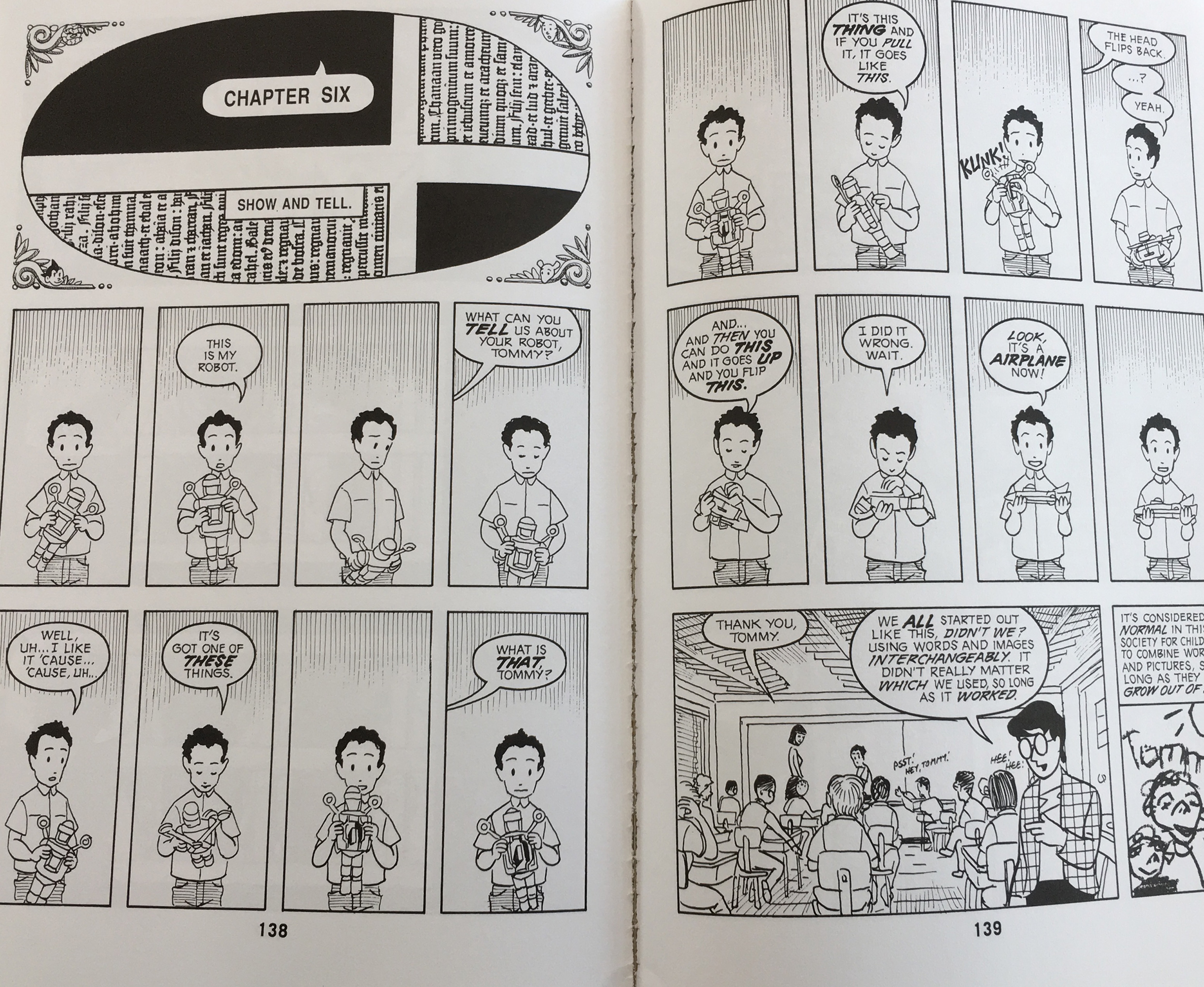
Page 31 “Understanding Comics” by Scott McCloud.
The page that I am going to review is page 31 of Scott McCloud’s book Understanding Comics. The first principle that stood out to me when I was reviewing the page was the repetition that Scott McCloud uses to reference the heads to compare the different styles. When viewing the faces they are all lined up in an order that goes one after the other and they are all similar enough to repeat, but still have enough differences to look at each one individually. The faces all have to be looked at individually and can not be taken in all in one glance, which creates interest.
The next principle that I want to look at is dominance. We can see dominance in the panel where Scott McCloud’s character is wearing the large simplistic head. This large head draws the eyes towards the simplistic head and this further empathizes Scott McCloud’s main idea in the section is that humans can create faces out of objects. This large head dominated the small cartoon body enhances the image by giving an example of the idea that humans can see a face out of just two dots and a line.
The last principle that I want to talk about on the page is size. Scott McCloud creates a very large face in comparison to the size of the panel. There are words in separate places around the shape and they are very small in comparison. Scott McCloud wants you to focus on the face at first and then read the text. The focus of the reader will shift to the large face and then shifts to the text reading “what are you really seeing” because it is smaller in comparison and shifts back to the large circle with two dots and a line.
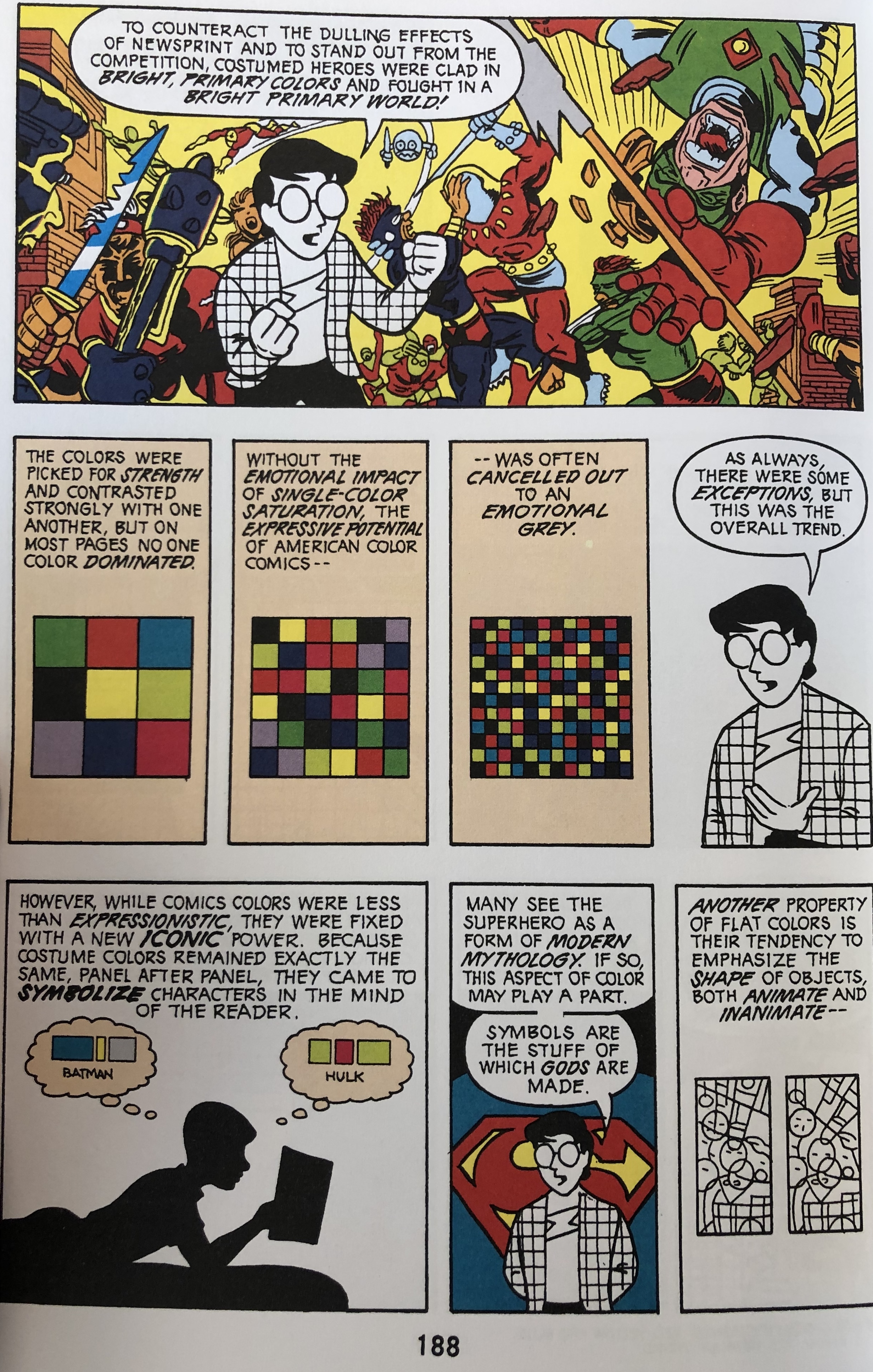 I chose the 188th page in Scott McCloud’s “Understanding Comics” because of the intense use of color in the “window” on the very top of the page. I believe that McCloud’s layout is effective in using shape, direction, and texture. Regarding shape, Lovett stated that a shape is “a self contained defined area of geometric or organic form.” In the middle parts of this page, there are three cubes, each with a different amount of squares in them. Taking that Lovett stated that a shape is an area of geometric form, the example in McCloud’s layout takes this literally in making actual geometric shapes (squares). The upper “window” shows great movement. Lovett stated that vertical movement suggests balance, horizontal movement suggests calmness, and oblique movement suggests movement and action. McCloud’s layout is a great example of oblique movement, seeing that it’s not exactly horizontal nor vertical movement, but a little all over the place/diagonal (oblique). Texture also plays role into this because there is surface quality on the red glove of the figure to the right in the “window” on the top. The lines on the glove suggest that the glove is smooth, but in movement because there’s a sense of retracting or bending on the glove.