
Pages 118-119 of “Understanding Comics” by Scott McCloud
In “Understanding Comics”, Scott McCloud does an excellent job of incorporating the different elements and principles of design seen in John Lovett’s Design Overview. There are so many pages where several of these principles are being used. On pages 118 and 119 in particular, one has clear examples of these elements being used to tell a story and to give off meaning.
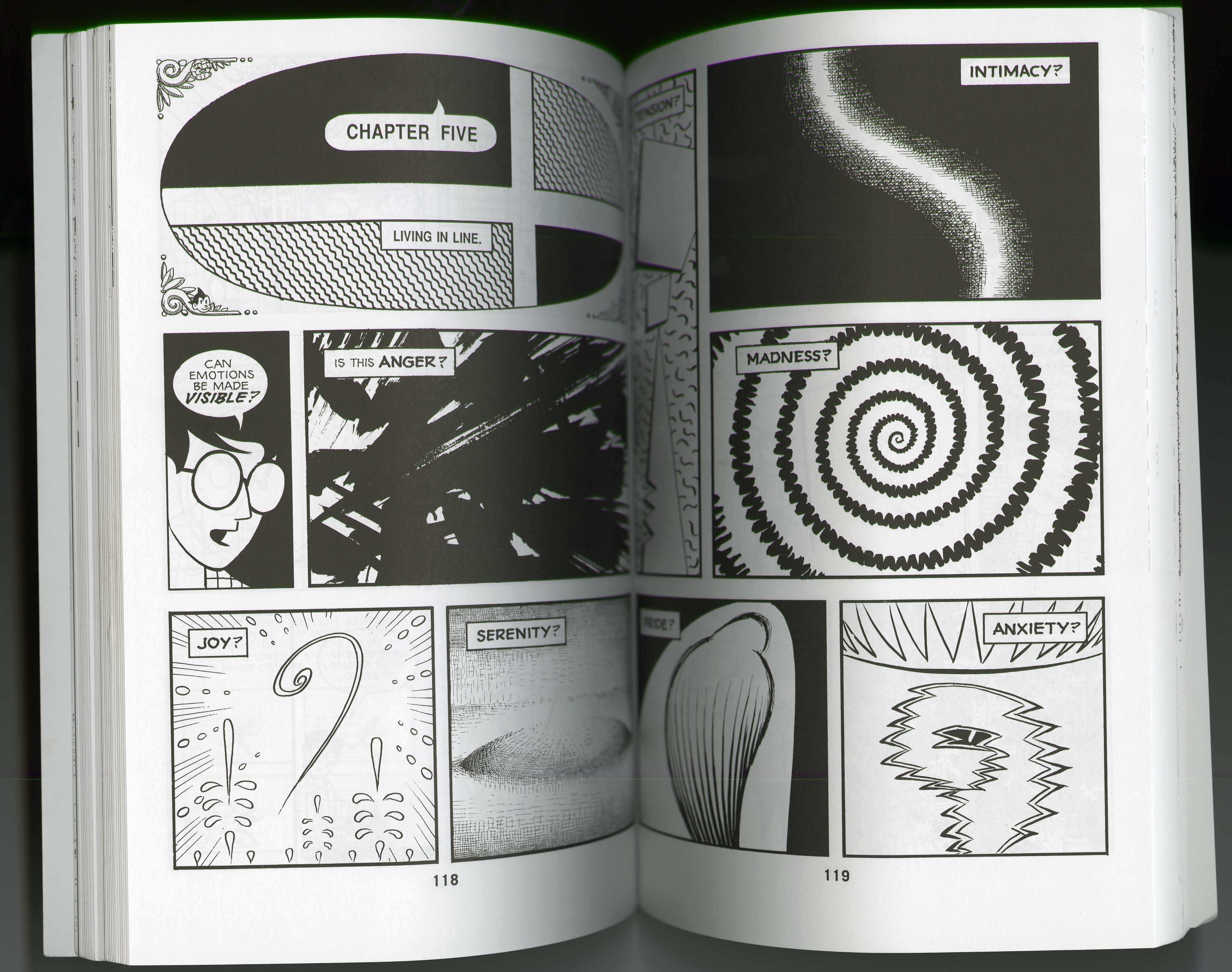
I find this spread very interesting because each grid contains a different feeling, as well as an image that sort of depicts that emotion. For example, the image of madness is a one continuous jagged line that spirals. To me, this accurately portrays the feeling of madness through a drawing.
It is also interesting to note McCloud’s other use of shapes. In the panels with the labels “Anger”, “Tension”, and “Anxiety” McCloud uses many jagged abstract shapes to depict that particular emotion. John Lovett’s Design Overview says that “Abstract shapes can trigger predictable responses…Our hard wired response to snarling teeth, sharp horns, barbs and thorns is to take notice, observe and react.” Those three emotions all involve “sharp” powerful reactions and stress, so it makes sense that abstract shapes would be used to portray them.
On the other hand, the more calm feelings have less jagged edges and shapes, and instead has more curves and soft edges. For example, “Intimacy” and “Joy” are much more relaxing to look at due to the curves of the lines drawn.
In addition, in Lovett’s Design Overview it states lines can exist as other elements, such as texture or tone. The viewer can see that the “Serenity” panel is made up of multiple tiny hatch marks, creating a visible texture in the image. In the “Intimacy” panel, Scott McCloud uses lines to create these hatch marks as well. This also causes sort of a gradient effect in the image.
