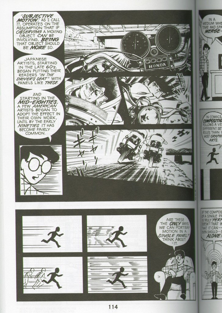
After reading John Lovett’s “Design Overview”, one of the pages that caught my attention was this page (pg. 114) The first thing I thought was unity. On this page on Scott McClouds book there’s since of rough textures and angular lines. That indicates the intensity of the comic scene. You can tell that it’s an action scene and not a scene that is calm or relaxing. Another thing that I noticed is the direction. I recognize that there are oblique lines indicting that these motorcycles are moving very fast. You can easily acknowledge that these two people in motorcycles are racing each other. They have another good example of that on the bottom as well where there are horizontal lines that represent the man very running fast. Having shown speed through imagery that includes direction, again shows the intensity of this action scene. Another way McCloud showcases intensity is the darker values that is drawn. It has more of a contrast on this page compared to the other pages. I feel like this is a great example of what the element and principle of design can do and how it can change the way you comprehend and see comics.
