Final Digital Comic Collage: Libby Fletcher

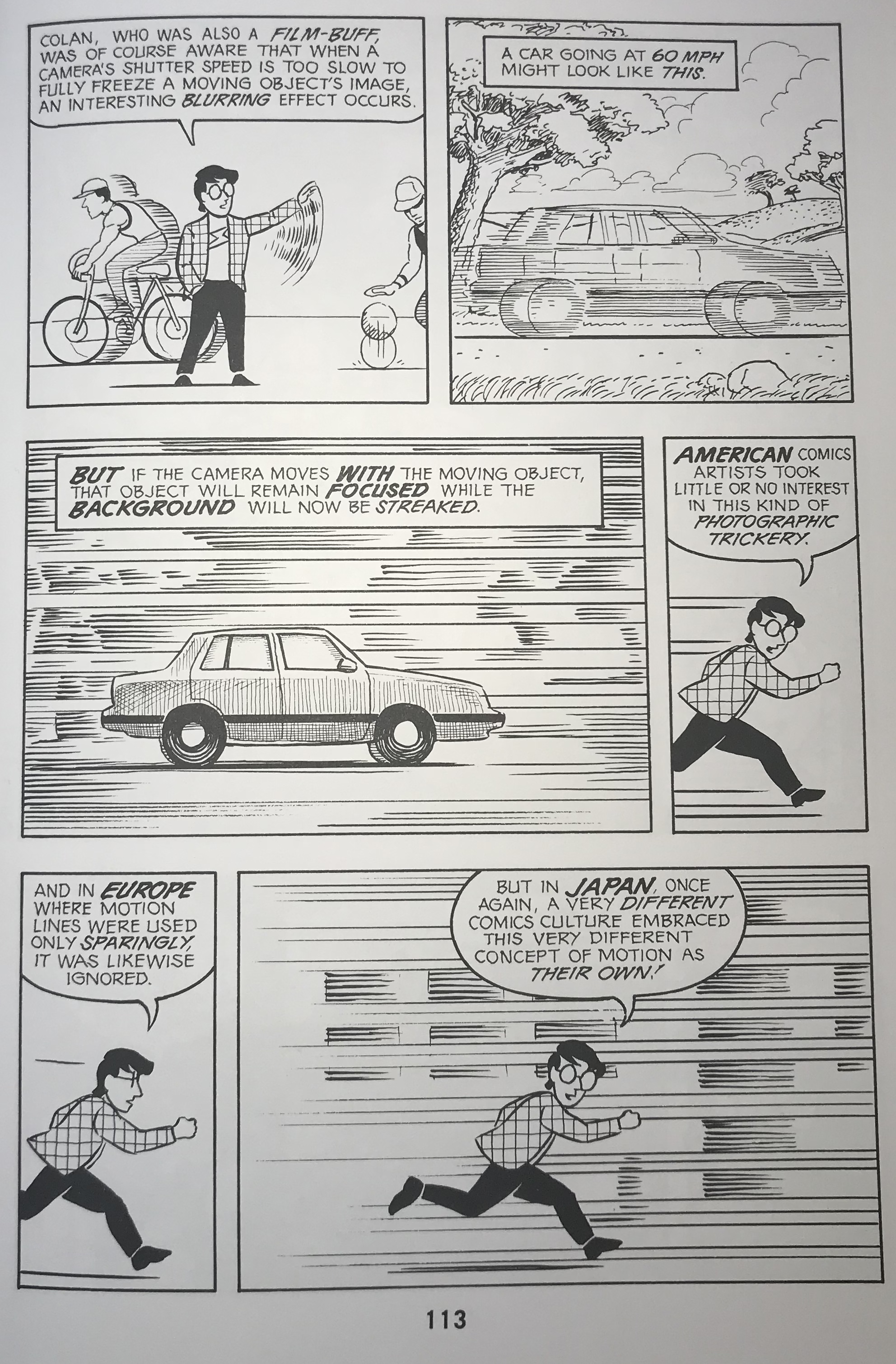
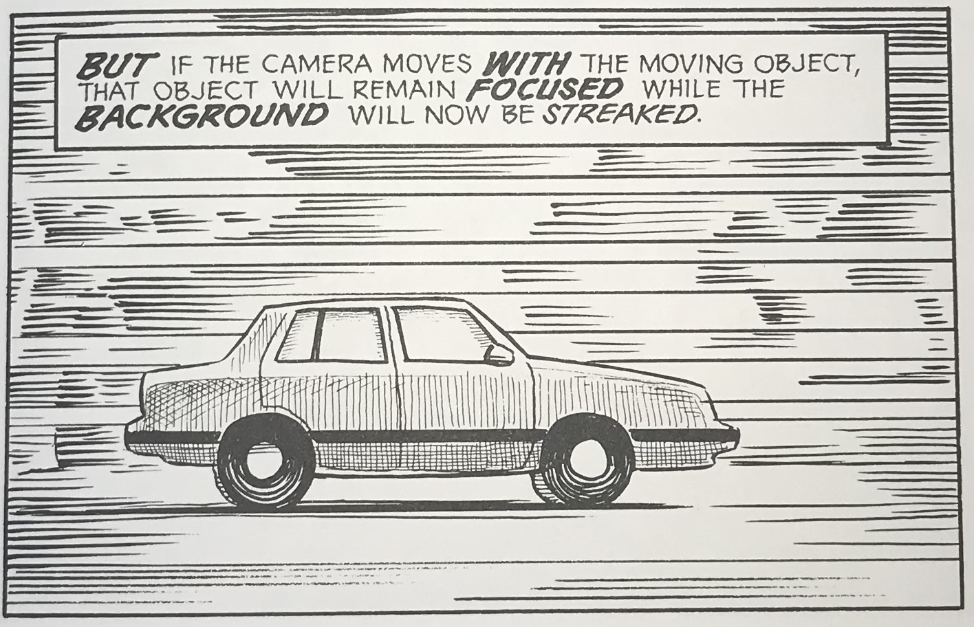
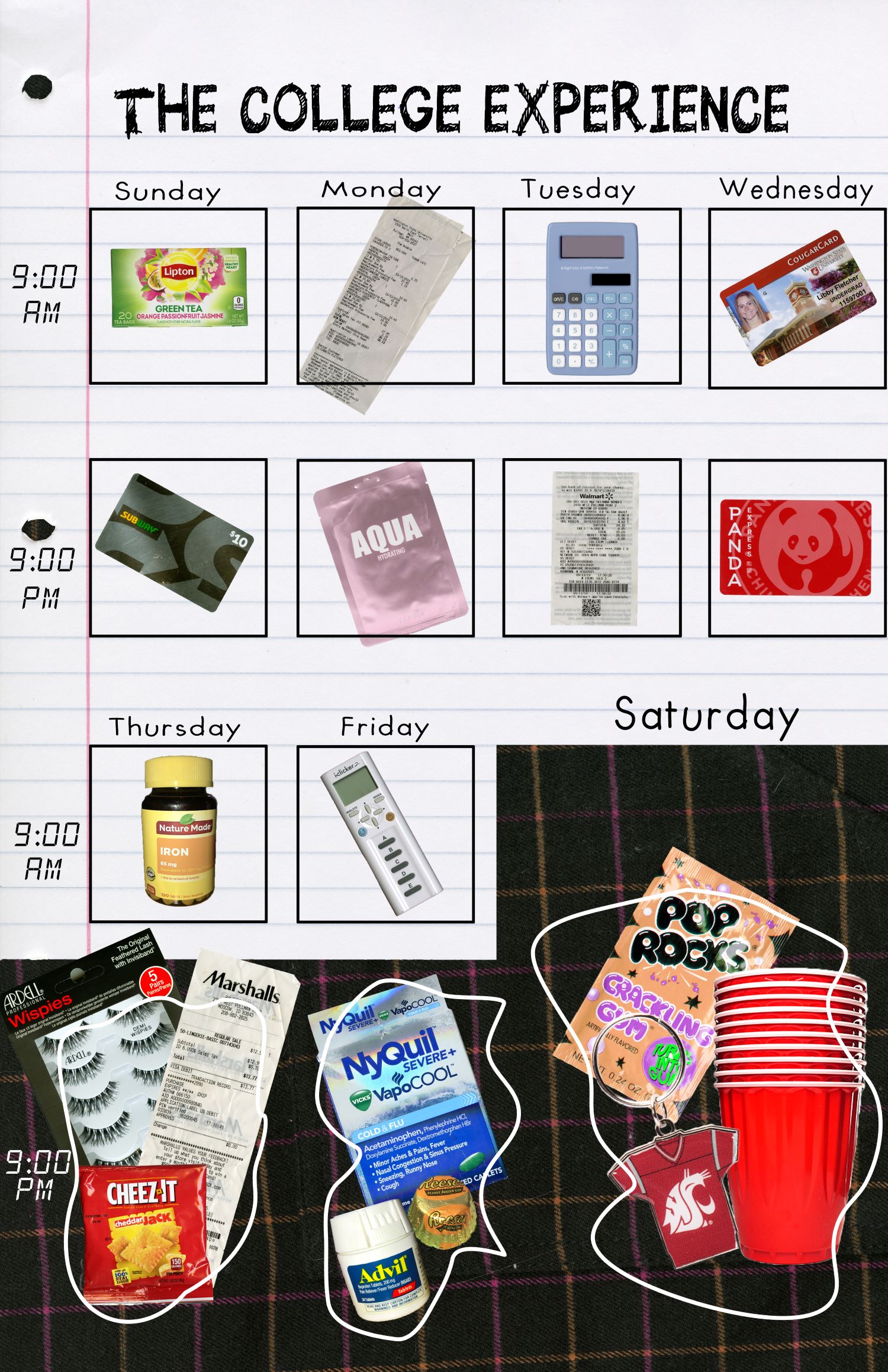
My final digital comic collage.

Creatively, I was motivated to create an accurate representation of the stereotypical college student in today’s society.  I hope that viewers will find my work as accurate as well as aesthetically pleasing to look at.   As McCloud’s definition outlines, my comic is “juxtaposed pictorials and other images in a deliberate sequence, intended to convey information and/or produce an aesthetic response in the viewer” (McCloud, 9).

When I began this class I was only familiar with the most common form of comics like those in the Sunday paper or Marvel comics.  However, after learning about Lynda Barry’s career, my thought process relating to comics changed drastically.  I’ve taken a previous DTC class and art composition/history classes in the past so I was pretty knowledgeable in regards to the elements and principles of design.  That being said, Lovett’s Design Overview was a really nice refresher.  His overview mostly impacted my work via size and emphasis.

The materials that I scanned and photographed were all very deliberate for one reason or another.  I used the notebook paper background to display two things: light/day and school.  I wanted to keep the school week clean and tidy to acknowledge the tedious upkeep that college students need to maintain in order to receive sufficient grades.  I created the black boxes in the collage digitally, but I wanted them to be uniform to further reinforce the repetitive schedule of the school week.  The materials I scanned and placed within said black boxes were also chosen in order to display the orderliness of the week as a whole.  I purposefully placed only one item in each box because I believe that in order to be a successful student, one must have strong prioritization skills.  I decided to include Sunday in the school week because I think that most students use Sunday to recuperate and get homework done.  I used the fabric from one of my skirts as a background for Thursday night, Friday night, and Saturday.  I wanted it to represent the night and the mysterious nature of the dark.  I decided to create the white frames digitally as well, however, I took a messier approach in order to convey chaos.  To preserve that aesthetic, I decided to place multiple items in each box and have them fall outside of the lines that enclose the school week materials.  The materials I scanned from the weekend are supposed to represent events like parties, football games, and going out/getting ready.

I tried to use as few physical words as possible in my comic.  However, the words I did include were supposed to come off as handwritten.  I decided to use size again to create emphasis on some text rather than others.

This was not my first time using Photoshop because I’ve taken a previous DTC class, but I did learn some useful information from the tutorials.  The most helpful tools I gained were definitely in regards to the selection-making process.  In this comic collage, I used the quick selection on my original scans.  I also used brightness/contrast and hue/saturation pretty extensively in order to get the aesthetic I wanted.  Personally, I enjoy composing in a digital environment much more than in a physical environment.  I like that you always have the ability to redo steps which you can’t do in fine arts such as painting.

Posted in Fall 2019 Archive (201 Blog) | Leave a comment

Final Digital Comic Collage: Isaiah Wilkerson

For my Final Digital Comic Collage, I wanted to show my audience a little taste of who I am based on the things I like and the thing I love to do the most: draw. I decided to use some of my drawing/art I’ve done recently is to show my audience what I can do and what my interests are. My comic fits into McCloud’s definition because I made a structured collage to give my audience an inside scoop of who I am without using any words. I wanted to make more of a image rather than an original comic because I feel like my art and how they are placed can give my audience the freedom to figure out why certain images are placed in certain parts of my comic.

Wilkerson-Isaiah-Project-01

Final Digital Comic Collage – Completed on 10/2/19

The other reading, John Lovett’s Design Overview, helped me think about my composition on my collage by using texture, colour, and contrast. I used texture in my layering process with my art. I used consistent colour throughout my collage, using black, white, gray (drawings), purple and yellow. Finally, I used contrast in my background to indicate a sunset behind my city art.

I have used Photoshop before last semester but it was a good review for me with our first project. I honestly feel like I improved on photoshop, however, I do feel like I could’ve really explored this site more had I owned this site on my personal computer. Because of this, trying to regain my knowledge on Photoshop and learn new techniques were a struggle for me. The tool I used the most was the Quick Selection Tool to crop all of my art and make it organized. I did have trouble adding my fabric within a specific shape but I went back to the tutorials and was able to figure it out. I enjoyed using Photoshop because I was able to improve my knowledge on how to operate this site. I hope to improve more on this site and Illustrator as well in the future.

Posted in Fall 2019 Archive (201 Blog), Uncategorized | Leave a comment

Design Elements and Principles: Madison Roby

Choose a single page or 2-spread from Scott McCloud’s “Understanding Comics” that you’d like to discuss in terms of your new design vocabulary. Explain why you think McCloud’s layout is effective in terms of at least three of the elements and/or principles described by John Lovett. Make sure you demonstrate an understanding of both Lovett and McCloud.

Scott McCloud, HarperCollins Publishers, 1993, pg 113

Line, arguably one of the more important elements of design, is defined by John Lovett as, “the linear marks made with a pen or brush or the edge created when two shapes meet.” While this definition covers the general idea of what a line is, in art and design line is so much more. Line is the staple, the backbone, of design, as everything could be considered line, whether or not it is intended. The separation between two things is a line, the direction our eyes take when reading through a comic is a line, the perspective of a drawing is covered in invisible lines. These lines can be used to denote a number of

Scott McCloud, HarperCollins Publishers, 1993, pg 113

things in comics, for instance, page 113 of Scott McCloud’s “Understanding Comics.” In this particular section, McCloud is describing the ways in which other artists use lines to represent action, for instance, the act of a car driving quickly past the reader/camera (see close up). The way McCloud uses line in this particular page is useful in that he is discussing how important they are, demonstrating their ability to show us, the reader, action.

Another present element within this particular page is direction. Lovett describes direction as having, “a powerful influence over the atmosphere generated by the work.” In this particular page, McCloud takes the horizontal direction and uses it (coupled with line) to show us where both the car is driving and where he is running. The way McCloud drew the action lines on the horizontal plane suggests that the action is taking place in the horizontal, moving rightward. The idea that the action is moving rightward is also interesting given we generally read from left to right, making movement in the right direction a natural flow from one thing to another. In the last two panels of page 113, McCloud starts of running to the right; the text bubble above (read left to right) is then easily transitioned to the next panel, as it is also going rightward.

Finally, alongside line and direction, McCloud has a good use of gradation throughout this page. Gradation, “size and direction produce linear perspective,” is seen in the way McCloud draws his lines in the last panel. He has drawn himself running rightward, and the action lines he’s drawn go from darker and more packed together on the right to completely gone on the left. This is effective in creating the idea of motion, as the things McCloud is passing by will fade away, given his speed, while the things to the right will be coming toward him into view.

Posted in Fall 2019 Archive (201 Blog) | Leave a comment

Design Elements and Principles: Dawson Bolen

This is page 40 from Scott McCloud’s Understanding Comics.

I found page 40 of Scott McCloud’s Understanding Comics very interesting and effective in terms of John Lovett’s design principles. John Lovett describes Value as the lightness or darkness of a caller. Value can also be described as tone. Page 40 of Understanding comics is all black and white; however, McCloud uses many different tones ranging from white to pitch black to effectively give his artwork a sense of contrast. On the bottom of the page, there is a boy wearing a hat across 4 different panels. In each panel the top hat the boy is wearing is shaded in with a different tone each time giving the hat a new look and texture as the value changes from darker to lighter. McCloud effectively uses value and colour to create contrast on this page as well. John Lovett describes contrast as the juxtaposition of opposing elements. Contrast can be used in many different ways but on page 40 the contrast is utilized in the tone of the colours. When a color is surrounded by it’s contrasting colors on the color wheel, the color appears brighter and more intense because the contrast is more intense. The boy is surrounded by a pitch black background which is why Scott McCloud chose to color in the boy as white. This makes the boy pop out because white is so contrasting from black. The top middle panel has a background of white with black lines streaking across. Every object in this panel is Black for the same reason the boy was white. He needs the main subjects of his artwork to contrast with the background. Another Design principle Implemented into McCloud’s artwork on page 40 is repetition. John Lovett explains that repetition without variation is very boring. On the contrary, repetition with variation can be very interesting. The bottom four panels have the same boy and same hat which is a perfect example of variation. However, it is interesting because the position and shading of the hat changes along with the movement of the boy. This makes the sequence interesting and not boring. 

Posted in Uncategorized | Leave a comment

Design Elements and Principles: Joseph Gardner

Page 114 cropped

Scott McClouds “Understanding Comics” Uses comic strips to teach readers about how to create them themselves. (Scott McCloud, HarperCollins Publishers, 1993, pg 114)

This is a page taken from Scott McCloud’s Understanding Comics. It is on page 114. This page talks about Subjective Motion, the idea that observing a moving object can be more immersive for the reader. 

I believe that this particular page is effective because it utilizes direction as a design element. John Loveitt says that in every image, there are one of three types of direction. It’s either horizontal, vertical, or diagonal. Each direction means something different.

In the frames that McCloud uses to emulate Japanese art, he uses action lines and direction to signify motion. In all of the frames with the motorcycle, it has dominant diagonal motion. The dominant diagonal motion shows that the subject is moving somewhere, and the scene is animated.

McCloud does this to show that Japanese artists put the readers in the action of the comics through movement. It also shows horizontal motion lines. 

McCloud also used repetition in the comic in the bottom left corner of the page. John Lovett says that repetition is only effective if used with variation. The person in the image is stationary, but the lines around him change, to show different ways that the artist can convey motion.

He purposefully breaks the rhythm to draw attention away from the actual subject of the image, and to emphasize how the subject is moving. If each person running was different, then the eye would be drawn to the person instead of the act of movement.

He also changes each repetition slightly to make it so the image still has its interest to it. 

Mccloud also uses difference in value in this comic. John Loveitt describes value as the lightness and darkness in an image.

Where there is more contrast in tone, there is more visual interest.  In the more detailed Japanese section, he shaded the persons face heavily, and added shadows to the motorcycles and ground. This is to signify change from his own style to that of a different time frame and culture.

There is also higher contrast in this section than in the images of himself. It serves to bring the readers eye to the examples rather than the text. This way, there is more emphasis on the way that depth works through visual examples.

Posted in Fall 2019 Archive (201 Blog) | Leave a comment

Design Elements and Principles : Jon Klaveano

Pages 32-33 Scott McCloud

I choose this photo because I thought it really highlighted the Design Overview I went over and read before choosing this photo. I noticed all of the elements that John levett went over his his Design Overview. All things considered these were the most appealing pages I could find. More specifically though I noticed the use shapes, size, balance, and repetition. I think that page 32 demonstrates shapes the best because the random shapes with eyes create a lot of negative space which Levett describes in his overview. The three frames on page 33 also demonstrate shapes as well with the frames of the screen not changing. I also believe that McCloud does a tremendous job of utilising sizes of things such as individual photos and pieces of art he has drawn. That being said I think the relationship between items in his book are perfectly executed. The balance between page 32 and 33 is really well done. The almost all black page of 33 is balanced by the dominitley white  page 32. I also think there is balance in the fact that page 32 has a greater amount of comic strips whereas page 33 has only a few comic strips. The repetition presented in these pages also fits Levetts definition of repetition. There are similar images but they are slightly different you can really see this on page 33. I think overall page 33 is very appealing visually the mixture of balance, repetition, and use of space just sets it apart. It reminds me of a movie screen in the sense that each frame shows a different part of the story. I also really like how the black frame does not change throughout the three frames. Which makes its seem like you watching a movie as I stated before. The placement of McCloud himself is also appealing because it doesn’t change throughout the three frames.

Posted in Fall 2019 Archive (201 Blog), Uncategorized | Leave a comment

Scan of pages 118 and 119 of Scott McClouds Understanding Comics

I chose pages 118 and 119 of Scott McClouds Understanding Comics. These pages show line, shape, and contrast, three of the elements discussed by John Lovett in Design Overview. The entire spread is actually discussing how different types of line can convey different emotions, but it still has good examples of shape and contrast as well. The middle left panel on page 118 is a good example of contrast, as it is extremely dark but still has areas of white juxtaposed against the dark background. This specific panel is meant to represent anger, and visually this emotion is shown by the jaggedness of the white. It creates a fairly harsh feeling, and contrast is used very well to convey it. In Design Overview, Lovett discusses how our eyes are drawn to the areas with the highest contrast, however in an image like this, there is high contrast across the whole image, making it difficult and perhaps confusing for the viewer to focus on just one area. The bottom right panel on page 118 is a good example of an implied shape, caused by different values of shading to create what appears to be a dome. This panel is titled serenity, and this is represented by the faint and soft lines, there are no harsh outlines to the implied shape, giving the viewer a sense of peace when looking at the image. This shape is also fairly organic, giving a sense of something natural and not man made. The spread as a whole is discussing emotion and how different shapes and values can convey those emotions. This to me is very relevant to Design Overview, since the main purpose of both is to show how various design elements can cause different emotional responses in the viewer.

Posted on by rubypc | Leave a comment

Design Elements and Principles: Justin Pardini

Page 106

Pages 106-107

I chose to analyze these pages because I liked the way the layout and different types of drawings were included within it. In order to truly analyze it in terms of design elements, I chose 3 main design tactics that are included in these pages.

The first concept I chose to discuss is lines, specifically boundary lines. Because this book is in black and white, the boundary lines are an important value to have in these comics. Not only does each box and speech bubble have lines, but the drawings themselves contain boundary lines that allow an image to stand out. Not all lines are straight which makes the boundaries more eccentric.

Another element I saw in these pages was size. The size of each picture and background is proportionate and follows the trend of the comic. It’s important to maintain the size of each idea throughout the comic to keep it thorough and steady.

Page 107

Lastly, another cool aspect I saw in these pages was visual balance. The wheel in particular displayed visual balance that caught my eye. It allowed me, as the reader, the see everything in the same importance and relevance, which is important for me.

Ultimately, these, and many other elements of design, are important to include in comics or graphic novels. I will strive to implement these ideas into my own creations moving forward.

Posted in Fall 2019 Archive (201 Blog), Uncategorized | Leave a comment

Design Elements and Principles: Dane Graves

Scott McCloud uses multiple Elements and Principles of design, as described by John Lovett, to make his work stand out on the page. One Element he uses to make his work effective are Lines and Directions. Specifically looking at page 36, the center right larger panel uses horizontal lines coming from around the boy to give the impression of a strong light coming from off the television. Horizontal lines suggest stability and tranquility. The strong light coming off a CRT screen is perfectly depicted in this panel by these horizontal lines, and the tranquil almost blank look on the boys face supports this.

understanding comics page

Page 36-37 From Understanding Comics by Scott McCloud

Repetition is a principle of design that also stands out in McCloud’s layout on these pages. Particularly on page 37 there are 8 panels that all are exactly the same size in a row where the character and text are the differences in variation between every panel. When repetition has small variation in the work, in this case the differences in stance of McCloud’s character in the center, it draws the user in subconsciously to focus on the panels helping deliver meaning and the reader to remember the text. Another principle used correctly by McCloud is Balance. Both of these pages use many panels of the same size with an image directly in the center to help the reader focus on exactly what McCloud wants the reader to focus on in each panel. Even the larger panels keep attention drawn to the center of the panels by keeping characters the same size divided equally in the panels. McClouds text always keeps to the top, and occasionally the bottom, so the reader is always drawn to the same places to look at the art and the text in every panel. Each page also keeps the exact same amount of panels without the same layout on each page, 9 panels on each. Nearly exactly the same amount of space is utilized on each page so even when opened like this the user isn’t distracted by the other page until he gets to it. This balance of his panels is essential in keeping the reader focused and moving through his comic properly.

Posted in Fall 2019 Archive (201 Blog), Uncategorized | Leave a comment

Design Elements and Principles: Jack Kay

Scott McCloud and John Lovett are similar in Many ways when designing a comic or picture. The two artists can make a 2D visual into a new design that the reader can feel on multiple senses.

Google Photo scan of page 99 

McCloud’s book, “understanding Comics,” uses many of the design elements that Lovett discusses in his, “design overview.”

On this page, McCloud describes a difference in panel sequencing. This sequence depicts the durations of the given comic as seen on Lovett’s website as repetition. The repetition of these events allows the reader to decipher the time and space the sequence is moving in. When displaying the two basketball players McCloud uses movement through gradation, a term discussed by Lovett in which the reader’s eyes will move along the given shape until reaching the higher contrast area. In McCloud’s panel the legs lead to the shadow on floor giving the reader the idea that the two players are moving forward. The perspective perceived by the reader is something that only the artist can assist by using the gradation element.

In the panel to the top left the harmony as described by Lovett creates a sense of unity between the several different small icons. Although being different topics, the icons are in a similar proximity allows for another sense of harmony. The dominance of Scott McCloud’s cartoon character brings forth more attention to his character than the icons behind him. This makes the reader read his speech bubble before moving over to the actual images the description Is referring to.


Also, sorry for the google scan I was out of town all weekend.


Posted in Fall 2019 Archive (201 Blog) | Leave a comment