Final Digital Collage Comic: Elora Buschini

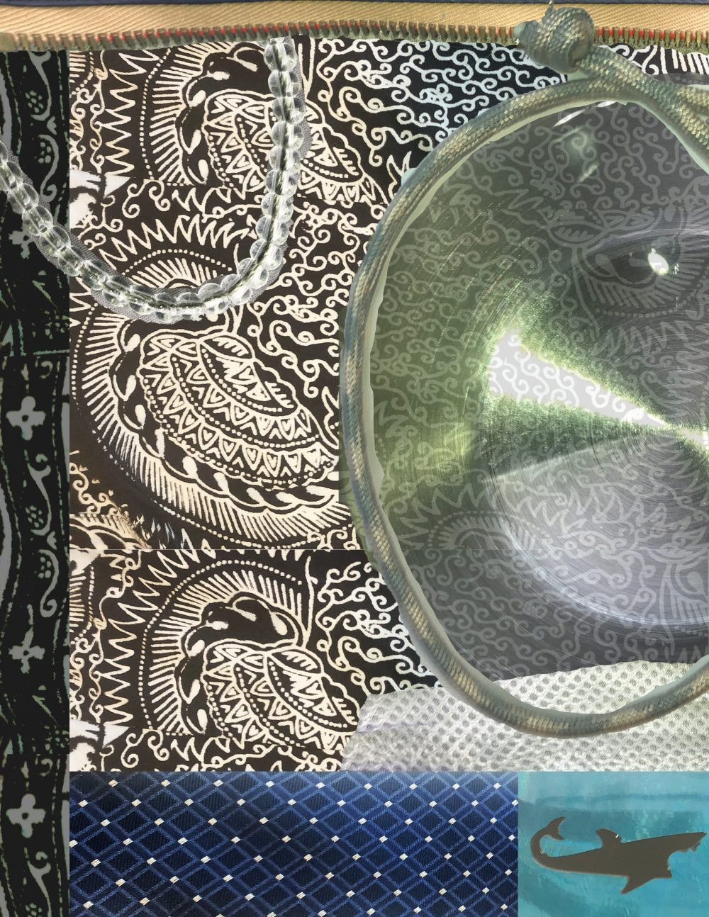
I decided to create a collage that focuses on positivity. My idea was for it to look like a note to self reminder to be yourself. I used a quote by Zen Shin that always brightens my day, the quote says “A flower does not think of competing with the flowers next to it, it just blooms”. I felt like this was a nice message about how even though it can be easy to be caught up in comparing yourself to others, that isn’t needed. I felt like this quote would be nice to pull together all of my images I scanned.

201 collage project

Photoshop collage project 1

This fits in with McCloud’s definition of comics because I feel like the visual message translates into the text chosen. John Lovett’s work helped me to incorporate texture and the unity of colors. I used an eyedropper and used the same color from my scanned images to put emphasis on the text. This helped me to create meaning to my collage. Although someone may not view it the same as me, I have always had a connection to flowers, and the jacket I scanned was a gift from my mom. This made the imagery aspect special to me and the perfect time to use the quote in which I live by. I wanted the center of my collage to just be my handwriting because the message was important to me. That way the more you look at it the more details you may see on my scans that surround the text.

This was not my first time using Photoshop, but it was my first time using it in this way. In the past I have had to fix photos for a class and haven’t quite had the chance to play with it in an artistic way. The lasso tool was very helpful in isolating my images and then I altered the lighting on them before placing them all onto one page. I also utilized the paint brush tool and used my stylus to write my text. I like the idea of my collage and where I placed my images I just wish I had a little bit more going on. I was trying to save space for my text but since I did it last I had over estimated the amount of space needed. I think it would have been cool to add in some scan of real flowers but because of the season I had a hard time coming across them.


Posted in Fall 2019 Archive (201 Blog), Uncategorized | Leave a comment

Final Digital Comic Collage: Joseph Gardner

DTC 201 Project 1REALWEB

Images scanned and compiled by Joseph Gardner in October 2019

My comic fits into Scott McCloud’s definition “Juxtaposed pictorial and other images in deliberate sequence, intended to convey information and/or to produce an aesthetic response in the viewer” (McCloud pg 9) because I told a story through the image alone.

The story that I wanted to convey is the change between this summer and the school year. I did this by arranging the pictures in a certain way, to draw the viewers eye to the colorful background first and then to the black and white part of the image.

I chose the money, the movie tickets, and the images of the beach specifically for the summer section of the image. These are images that virtually everyone has interacted with and has positive experiences with. For the black and white school section, I used personal items to tell my story.

I arranged my objects to look more organized and calculated. I specifically included the watch because time is less malleable in the school year. I also included the glasses because glasses are generally a symbol of knowledge. 

I used John Loveitt’s line design elements to construct my image. I used diagonal lines from left to right to direct the viewer’s eye from the summer side to the black and white side of the image.

I also incorporated direction, because people usually read right to left, and the images are displayed chronologically from right to left.

I also used balance in the image, making it purposefully off-balance. The left side is “heavier” than the right, with more images. I wanted to focus more on the fun aspects of summer than the more structured school year. 

I made the summer section bright and colorful, and juxtaposed it to the black and white imagery of the school year. I did this to create a stark contrast between the two. The organization of the two sections also helps with the juxtaposition. I made the summer side more disorganized and all over the place.

I was also aware of the materials I was using to create meaning. I used plastic, metal, and glass in the school/ black and white section because those materials are harder and less malleable, and usually have a colder connotation. On the other hand, I used paper, watercolor, and string in the summer section to contrast this. 

I did not use words in my comic. I wanted it to be more open to interpretation, but I chose my objects carefully to convey each season and my story in the collage. 

This is not my first time using Photoshop. I have used it before, and I learned a few things about downloading brushes.

I found a couple of websites and downloaded watercolor brushes for the background. I wanted to create a background that I could edit easily with the colors, rather than painting my own. The brushes actually did a pretty good job of emulating watercolor, but I had to layer it. 

I think the most important tools that were in the tutorials were the selection making tools. I didn’t find anything about the tutorials confusing. I used the selection tools to create my cutouts for each of my images.

I typically used the polygonal lasso to create selections for images with straight lines, and the quick select tool to create initial selections on non-linear images. 

I liked composing this image. It was more forgiving than creating a collage in real life, because I didn’t have to glue anything down and I could reposition my stuff.

Posted in Fall 2019 Archive (201 Blog), Sample Posts by Students | Leave a comment

Final Digital Comics Collage: Ruby Pitts-Cranston

Digital Comic Collage, Ruby Pitts-Cranston, 2019

For my digital collage comic I decided to use items that I brought back from places I’ve traveled to. I started scanning these items because to me they have sentimental value, and I find them visually interesting. I wasn’t really sure what I wanted the comic to be about though, so I started to think about why those items were meaningful to me. I ended up making the comic itself about sentimentality and why I have those items, and altered the text on the items to fit that narrative. My comic fits into McClouds definition because there is an order that the text goes in. It also fits because there is a deliberate message, and the items all relate to each other. Lovetts Design Overview helped me to think about the layout of my design, although for the most part my imagery is laid out based on the order of the text. Everything that’s a part of my comic came from a scan, and most of my imagery came from flat, paper items such as postcards and tickets. I did however include a scan of two bracelets that are more of a fabric/woven material, and I scanned my passport which has a unique texture as well. I also scanned an individual page of my passport so that I could use the stamps, and then incorporated those into the comic for additional visual interest. For the text, I tried to match the font, color, and texture as closely as possible to the words that were already on the items. I wanted the text to look like it was a part of them, as opposed to me adding it in. I have used photoshop a decent amount before, but my experience was mainly in editing photos, and I usually focused more on color and exposure than combining imagery. Since I did have a basic understanding of photoshop though, it was fairly easy for me to pick up the additional skills I needed. The hardest parts were getting the passport stamps right, and making the text on the passport look metallic. The photoshop tutorials were also very useful in reminding me of which tools to use, and I liked learning how to match colors in composite images. Although I didn’t really need to match colors for this specific project, it was something that I’ve tried and failed to do in the past, so I’m glad that I was able to learn how. Composing in the digital environment was very comfortable for me, since I do a lot of digital photography and am somewhat familiar with the software, so I enjoyed working on this project.

Posted in Fall 2019 Archive (201 Blog) | Leave a comment

Final Digital Comic Collage: Madison Roby

First, discuss creative motivations and the information or aesthetic experience you hope your reader/viewer will take away from your work, second, discuss your experience using Photoshop.

Digital Comic Collage, Madison Roby, 2019.

In terms of creating comics, it wasn’t until I was shown a definition of it that I realized that comics could be more than just paneled, hand drawn works of art; the idea of using collage to create a comic was daunting at first, and I had no idea what I was going to do. I had no plans and no idea where to start. Looking around my room all I really had was my messy desk, full of things I did for leisure, school, and work. Looking at my desk, I felt like I could use it to tell a story about my life and give a more personal look at myself to others; my desk was a window into my life at this point, so I chose to use it that way. I decided to scan and photograph various things that I could find on my desk, papers, coffee mugs, pens, etcetera. I used this to convey a message, however, it didn’t quite feel like it fit into McCloud’s definition of a comic, as the text didn’t seem to connect to the images, so, I decided to incorporate a “traditional” comic as well. I used the traditional comic to interact with the reader, somewhat explaining my collage as well as “breaking the 4th wall” by

Close up of the “traditional comic.”

drawing the collage itself in the comic. Alongside McCloud, I relied on Lovett to make my collage aesthetically feel balanced and easy to read/understand. His definition of balance helped me to keep the piece easy to look at, his definition of texture helped me to decide what to scan, and his definition of direction allowed me to create an invisible sight line to guide the reader through the work. Most of the text I decided to use was hand written: some notes, a note-card about poetry, and the words in the comic. I also used some scanned typed lettering, however, it is less relevant to the comic than the hand written words, as they are meant to show hard work, as, in my opinion, it is more difficult to write out things with pen and paper than it is to use a digital medium (as its more efficient and less time consuming).

In terms of Photoshop, this was my first time using the program, and many of the things within the program were new to me. I have used various digital drawing apps, so Photoshop felt very complex and not as user friendly as I had hoped, causing me to use techniques I was already comfortable with rather than trying to manipulate Photoshop tools. Overall, I mainly used masking to ensure my scanned objects didn’t have a border, clipping layers to recolor some things, and the history brush to fix any mistakes. However, using Photoshop’s drop shadow tool never gave me the results I was looking for, so I ended up doing those manually, as that was both easier and less time consuming, and I still have difficulty using the clone stamp tool. In general, I prefer creating art in a digital space, though I do not particularly enjoy using Adobe products to do so.

Posted in Fall 2019 Archive (201 Blog) | Leave a comment

Final Digital Comic Collage: Bailey Tompkins

When my reader views my digital collage comic, I hope that they are able to see the deeper meaning that I tried to implement into my work. When I started this project, I wanted to add scans of items that represented me and where I’ve been and what has made me who I am today. After adding all of these scans, I felt that I had just made a big clutter of objects with no meaning. I started brainstorming how I could organize these items with meaning and I finally came up with the perfect solution. I decided that I wanted to put the majority of the items into a basket as if I was trying to “clean up my clutter” just like you would do if you were cleaning up a messy room in real life. However, I also still wanted my collage to express my personality and story, so I included materials and photos of items that I thought best brought out my personality and taste. Finally, I included two quotes that best represented this deeper meaning of my collage comic that I am trying to portray.

Digital Collage Comic, Created by Bailey Tompkins, October 3rd 2019.

My digital collage comic fits into McCloud’s definition of comic because as I just explain, all these objects that I scanned into the collage hold meaning to the story that I’m telling. Each item represents a chapter or a memory of my life that has shaped me into the person I am today. Some of these objects were collected while traveling, given as gifts, or represent an importance in my life. Most of these objects convey a message through imagery rather than linguistics. I found myself implementing many of John Lovett’s design elements throughout the process of creating my project.  Texture and color played a huge role in the format of my collage. When scanning items, the texture and color of the objects would make a huge difference to the mood of the image. I also used the linguistics mode in my comic for two quotes. I decided to use linguistics to portray my deeper message of positivity and how it can help clean things up when times get clustered or overwhelming.

I have used Photoshop before in previous courses, but not in the same manner that I used it for this collage. I had experience in Photoshop with photo editing, but for this assignment I purposely stayed away from photo editing so that I could focus on learning different features of Photoshop. Over the time of this project, I became much more sufficient at embedding scans into my file, selecting the portion of the image I wanted, scaling and rotating the image, and adjusting the layers properly to find the right arrangements. The most useful tools from the tutorials were the working with layers videos and the make selections videos. Even the getting to know photoshop tutorials were great refreshers to the software to re-familiarize myself with the program. Overall, I enjoyed composing in a digital environment. It opposed challenges but was also very rewarding. I am proud of the work that I completed and very satisfied with the deeper meaning of the art behind it. I feel that I have not only learned a lot about comics through McCloud, Lovett, and Lynda Barry, but that my skills in Photoshop are not as narrow minded as they once were because this project has taught me to think more creatively.  

Posted in Fall 2019 Archive (201 Blog) | Leave a comment

Final Digital Comics Collage: Emily Bartholomew

This is my final comic

I decided to create my Final Digital Comic collage about things that you would find in a college students backpack. I created this collage like this because I thought it would be the easiest thing for people in the class to understand and relate too. Even though the majority of us are organized and have our stuff together there are times in the school years where we lose track of things and get a little unorganized with our stuff. Whether it in our room or in our backpacks. I wanted to add a lot of different types of textures into the collage with the crumbled-up piece of paper and the texture of the WSU scrunchies. I thought if I added texture to the collage it would add more of a realistic feeling for the reader by looking at the wrinkles in the fabric, you could somewhat imagine the texture of the scrunchie.

When I got back to my room, I decided that I should change it up and pick other things for the collage. But the one thing that I really want to add into the collage are items that have different types of textures. It could be from a hair scrunchie, edge of a quarter, to a crinkled piece of homework. Then when I got to the CDCS, I just started pulling out random things that was in my backpack and started to scan it. I was going to scan my water bottle in the scanner, but I had a hard time scanning it without letting int roll off the scanner and having a weird and blurry look to it. I tried it multiple times, but it ended up not turning out the way I wanted it to. So instead of that I took the scrunchie that I scanned before and put it on my collage in the places where my water bottle would have been.

Posted in Fall 2019 Archive (201 Blog) | Leave a comment

Final Digital Comics Collage: Helena Matheson

I really like the way that my Digital Comic Collage turned out. I feel that I had a vision for how I wanted it to look and feel and I think that I achieved my goals. One thing that stuck out to me as a challenge was placing my items in a deliberate sequence. I wanted my collage to look similar to a “What’s In My Bag” spread from Fashion Magazine, and so it was difficult to arrange in a sequence. I eventually worked with moving my items around enough that it now feels more deliberate.

My items that I chose to work with hold a lot of meaning to me personally, but could mean nothing to others who view it and I find that really interesting to think about. All of the items included have in some way been given to me by people that I love. Some of my favorite items I included were the tiny snippets of letters that I have been given by friends and family. My favorite one is one from my grandma, where she calls me the light of her life. I am really close with my grandma so that little quote means a lot to me. Another item is a locket that my boyfriend gave to me with pictures of us inside. This was probably the hardest one to remove from its background but I think the final look ended up looking really cool and advanced. I liked linking my items with the quotes to bring more emphasis to them and provide more meaning. Another one of my favorite items was my yellow hair scarf my mom got for me. I think that when I scanned it while it was wrinkled and folded on itself, it created a really interesting texture and looks like you could feel it through the screen.

My Digital Comic Collage

I have experience with Photoshop, but I believe that this project really strengthened my skills and provided me with more knowledge to move forward with. The tutorials really helped show me all of the different things you can do on Photoshop and opened my eyes to new possibilities. The tool I used the most was probably the quick selection tool, which after I became accustomed to, became very versatile and helpful. I enjoy composing in a digital environment, but can be frustrating when you don’t know which commands to do or how to fix something that occurred.

Posted in Uncategorized | Leave a comment

Final Digital Comic Collage: Ana Maria Alaniz Mendoza

Web_Digital_Comic

21 Things I’ve Learned in 21 Years By Ana Maria Alaniz Mendoza.

Even though I definitely took a more random approach to this project, I still utilized a numbered sequence that roughly goes from left to right and from top to bottom. As I was laying everything out on the page, I kept thinking my design kind of looked like those old “Eye Spy” books that I used to look at as a child. Some of the numbers are a little sneakier to find compared to others, but as a whole, they remain consistent and they all go with my theme: 21 Things I’ve Learned in 21 Years. All of the imagery is intended to complement the linguistic mode to an extent. My goal was to make the aesthetic response bright and interesting.

The composition on my page is very monotonous and a viewer will only notice repetition if they analyze the design closely. I consider each shape being numbered very repetitive, but all of the numbers also take on different styles/variations which keeps the design spontaneous. I included many textures, sizes, typography, and even some shadows in this layout because I did not want anything to look very similar. Like Lynda Barry explains, this design is alive in the way our memory is alive. One can scan this collage and have an idea about what each object might feel like.

I have used Photoshop before, but I was very limited with tools I felt confident with. The tutorials were extremely helpful and I’m pretty sure my life will never be the same now that I know about the Magic Wand Tool and the Quick Selection Tool. I definitely utilized those two the most for this project. Layer masks are fun, I did play around with them a little bit for this project and I have used them before. Grouping layers helped me stay organized; I didn’t use to care about grouping, however, this project was a lot bigger so it was 100% necessary. Designing in the digital environment is one of my favorite things to do! I love how fast things can be created with just a couple clicks of a button.

Posted in Fall 2019 Archive (201 Blog) | Leave a comment

Final Digital Comics Collage: Erika Epperson

Digital Collage by Erika Epperson

In the beginning I wasn’t sure what I wanted to do. After I decided to use the poster that I bought at WSU as an inspiration, that’s where I started to get an idea of what my theme was going to be. There was a forest in the poster as well as mountains in the background, and I thought it was great, in a sense where I can also use that to represent where I’m from, which is Oregon. There was already a sense of quirkiness in the poster, too, like the bear in the back, so I decided to play off of that and added more interesting, weird things to the collage. I would say I definitely took inspiration from this poster and combined it with who I am and where I come from.

I made my color scheme mainly green to represent the greenery of the Northwest. I had clear rounded pins in my room so I thought it would be cool to make it a look like raindrops because Oregon does rain a lot all year around.  I also wanted to add the map of the buses from the bus schedule book at WSU, and specifically chose the coffee route because I am a big coffee person. I added some quirks by putting in an easter egg, which are the eyes that I drew and scanned and put it in the sky because since this poster itself was already quirky, I thought why not add more weirdness to it. It also gives the audience to find something new in the collage. I also scanned a necklace because I thought it might be interesting to try to scan it even though I wasn’t planning on using it. Turns out it kinda looked like a vine so I thought it was appropriate for my theme.

I feel as though there is a lot of harmony in the collage. There is a color scheme of mainly greens and some grey, with other accent colors as well. I really tried to play off of the greenery of the Northwest by using many shades of green. Even if you look at the circles you can see that they are all different shades of green even though some look similar, like the two dark greens and the two light greens. I feel like that gives it more dimension to the collage. There is one image that is bigger than the rest where your eyes immediately go to, which creates dominance. Although the leaf below is as large in size as the word “express”, because the leaf is green, it blends in with the background. As for the word, it is a bold yellow color that is easy to catch the audience’s attention.

If you start from the word “express” your eyes flow down to the necklace, which directs you to the map and so on, giving it some juxtaposition even if it’s not a traditional looking comic. It still has that flow of juxtaposition even it seems like a clutter at first. In another sense it also tells a story, as well. If you follow the sequence it looks like a story of this guy who took a bus to the woods and brought his bike with him. That is another way of looking at it. I think collages are interesting because it’s not just one thing, there are many elements and dimensions to them.

Posted in Fall 2019 Archive (201 Blog) | Leave a comment

Final Digital Comics Collage: Jack Kay

For my collage, I looked into trying to blend in the different materials into one aesthetically pleasing picture. I started with the background being a buttoned down shirt that I had. The design on the shirt is very complex and set a unique tone for the rest of the

Digital Collage

picture. The deliberate sequence was not in the order of the objects themselves but as in the layering of the collage. One image being pushed over the other another being cut out to show the background layer. I thought of it as a way to extend the meaning of a comic to a different level. I used John Lovett’s idea of texture when bringing in a metal can bottom to contrast the rope like bracelet I put on top of it. Also using Lovett’s theory of dominance, I made the bracelet and the shark the top layers, while rotating the borders in and out of being the dominant layer. The list of my objects are all items I wear, except for the metal can bottom; that was just an interesting touch and looked cool when faded out. I chose items with different feeling to them and tried to bring that idea to life when digitalizing the images. the bracelet on the left looks like just a bunch of small, plastic beads, while the bracelet on the right looks more rough and rope like. I do appreciate that when digitalizing these bracelets, that they do not just look flat and 2-dimensional, but instead they look like that one could just pick them up. I did not use any words because I cannot really put words to this collage, it really is just one of those photos where the meaning is put up for the viewer to create.

This was the first time I used photoshop from scratch, usually I’m editing one of the photos I take with my camera, but this is really the first time starting from the bottom up and getting Total freedom. The resizing tool really helped and also the rotation tool helped with the borders. I used the lasso tool and quick selection tool frequently because this allowed me to fully bring what I wanted to the collage and cut-out any unneeded portions. I also just used the layering tab to my advantage, while picking out which objects would show dominance over the other. I like having the freedom to create in a digital environment, but I have only really made collages by hand in my life, so this was definitely a challenge for me to create.

Posted in Fall 2019 Archive (201 Blog) | Leave a comment