
Digital Comic Collage, Ruby Pitts-Cranston, 2019
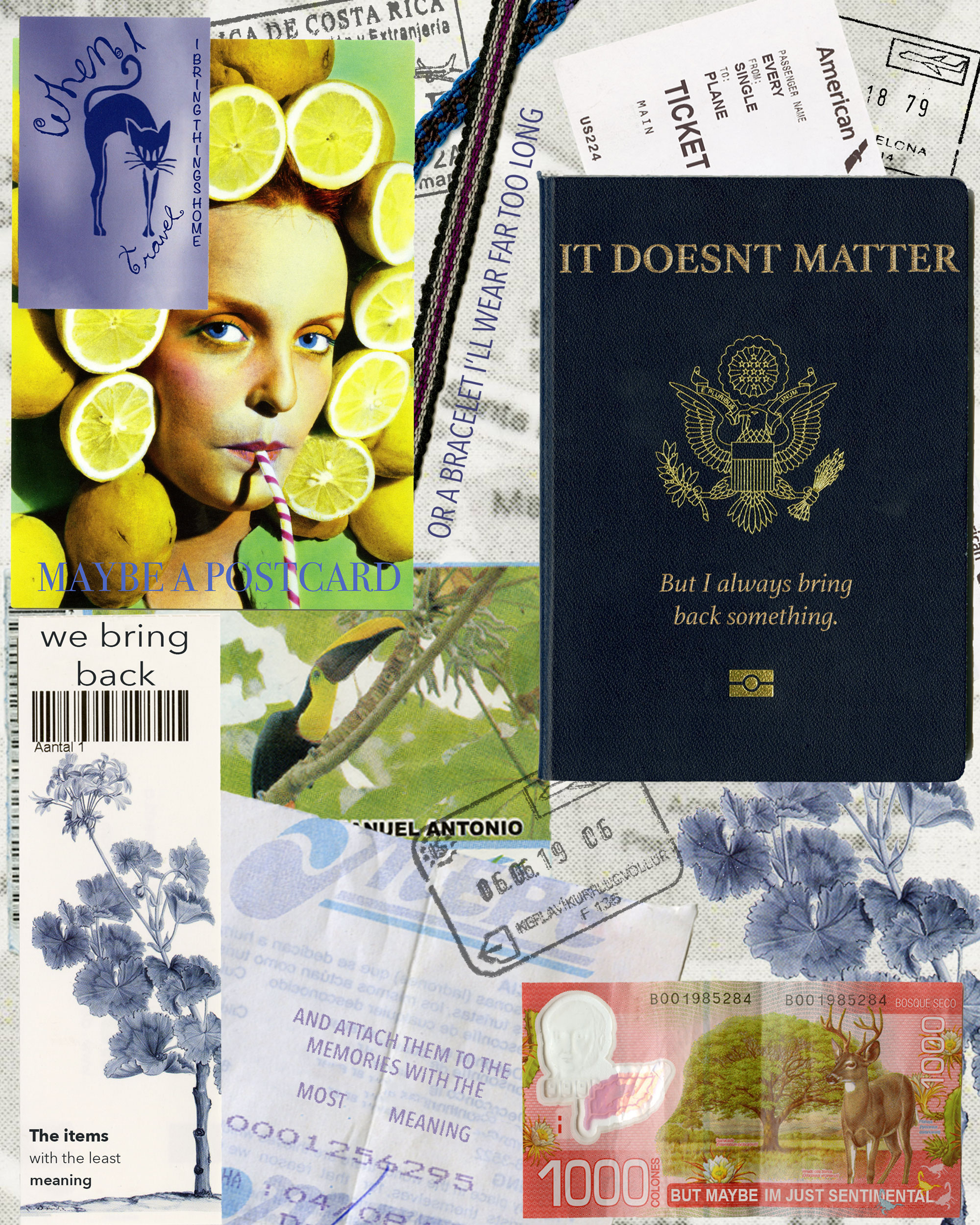
For my digital collage comic I decided to use items that I brought back from places I’ve traveled to. I started scanning these items because to me they have sentimental value, and I find them visually interesting. I wasn’t really sure what I wanted the comic to be about though, so I started to think about why those items were meaningful to me. I ended up making the comic itself about sentimentality and why I have those items, and altered the text on the items to fit that narrative. My comic fits into McClouds definition because there is an order that the text goes in. It also fits because there is a deliberate message, and the items all relate to each other. Lovetts Design Overview helped me to think about the layout of my design, although for the most part my imagery is laid out based on the order of the text. Everything that’s a part of my comic came from a scan, and most of my imagery came from flat, paper items such as postcards and tickets. I did however include a scan of two bracelets that are more of a fabric/woven material, and I scanned my passport which has a unique texture as well. I also scanned an individual page of my passport so that I could use the stamps, and then incorporated those into the comic for additional visual interest. For the text, I tried to match the font, color, and texture as closely as possible to the words that were already on the items. I wanted the text to look like it was a part of them, as opposed to me adding it in. I have used photoshop a decent amount before, but my experience was mainly in editing photos, and I usually focused more on color and exposure than combining imagery. Since I did have a basic understanding of photoshop though, it was fairly easy for me to pick up the additional skills I needed. The hardest parts were getting the passport stamps right, and making the text on the passport look metallic. The photoshop tutorials were also very useful in reminding me of which tools to use, and I liked learning how to match colors in composite images. Although I didn’t really need to match colors for this specific project, it was something that I’ve tried and failed to do in the past, so I’m glad that I was able to learn how. Composing in the digital environment was very comfortable for me, since I do a lot of digital photography and am somewhat familiar with the software, so I enjoyed working on this project.
