Type Anatomy: David Czyzewicz

Every time I start to look at fonts, I realize there are always more to a font than initially meets the eye.  Once you understand the concept we talked about in class how “typefaces are a form of art and that letters are socially excepted pictures meant to represent our language” you start to understand and appreciate typefaces more.

page1-1200px-1609_Doway_Old_Testament.pdf

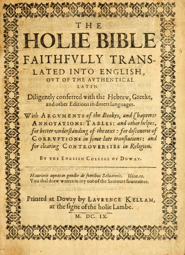
Title page of the Old Testament, Tome 1 (1609) of
The Holy Bible-Douay Rheims Version (https://en.wikipedia.org/wiki/Douay–Rheims_Bible)


When I first started looking at this type I noticed that it was a serif type and that it had consistency but then as I looked deeper I also notices discrepancies between different parts of the page.  The one consistency through the whole page is obviously the Baseline for the text.  Usually the cap height for the text is consistent and it is in the top and bottom parts of the page but in the middle of the page they utilize small capitals with regular capitals. I think this adds a nice variation to the text.  Another strange thing that they did was in the middle of the page they gave the capital letter C a descender below the base line, which I have never seen before.  Something else that I noticed was this text had narrow crossbars and thicker spines.

Posted in Uncategorized | Leave a comment

Type Anatomy: Allison Cissna

I have been reading a lot about fonts and how much detail goes into them. Fonts have changed tremendously over time from hand written to sans serif and serif to fancy letters created through objects and shapes. After reading through Ellen Lupton’s “Thinking with Type”, I was fascinated how much our lettering and grammar has changed over the time. We have almost become lazy and always searching for shortcuts to achieve things. The idea that we would write letters from ink and a quill amaze me especially when compared to how we create type now. We can manipulate lettering on software, we can just touch on letter on a keyboard and there it will display on a screen where you can also change the type of font from a scroll bar menu provided. Just amazing to think about how things used to be.

Our class recently went and visited the Manuscripts Archives and Special Collections office to observe some old manuscripts that have been held in awesome condition from the staff that work there. I found a prayer book written in Latin from the Catholic Church that was created in the early 1800’s. The type displayed on this particular page has a beautifully done serif style of lettering with a gothic or renaissance theme just like most pieces of literature contained back in those days. Throughout the prayer you will find the x-height of the lettering is very consistent and the terminal in the letter “F” is kind of exaggerated to the right.

Posted in Fall 2017 Archive (336) | Leave a comment

Type Anatomy: Steven McCracken

When it comes to fonts the most noticeable factors to me would be the width of the font, since it immediately sets the tone. Other aspects of the font affect the tone on a more subtle level such as the x-height and cap height. Scale also makes a major impact on the message of the type, making it seem louder or quieter. The piece I had the most interest in at the library was the collection of currencies from around the world. I’ve never really stopped to think about how different money was just a couple hundred years ago, things like bills for quarters and dimes seems like a foreign idea completely but were just used in America not too long ago. As far as the print on these bills the German examples look like they used the moveable type printing discussed in the Letter chapter. Some of the other types of bills looked like they used either Gothic or Egyptian font is my best guess.


Posted in Fall 2017 Archive (336), Uncategorized | Leave a comment

Type Anatomy: Joshua An

I chose to write about the sign warning people about the cattle thieves and offering a $500 reward. In the words, “CATTLE THIEVES BEWARE”, I thought it was interesting how balanced those letters were. They are all the same height and each stroke has the same amount of thickness. This text was also in red while the rest of the poster is in black. This gives off a sense of urgency and tries to gain the viewer’s attention. All of these letters have the same x-height, baselines, and cap height.

The next line brings up the $500 reward. This also has some height similarities. All of the numbers in “500”, are all the same height. However, the word “REWARD”, is made shorter and has a line above and below it. The cap height and the baselines of the lines do line up with those of the “500”. Another thing to note is that the “$”, is smaller than the “500”. However, it does line up with the cap height of the “500”, but not with the baseline. It also does not seem to have any type of relationship with the x-height. The bottom of the “$”, is between the x-height and the baseline.

The text then changes the typeface it uses when getting into the details. In fact, this poster has a few different typefaces on it. It looks like it changes to a Humanist Sans Serif. It was interesting to me how the poster started with a simple font and then changed to a slightly more complicated one.

My overall view about this poster is that it is straightforward with its message and an extremely comprehensive font.


Untitled-1

Posted in Fall 2017 Archive (336) | Leave a comment

Type Anatomy: Kim Santos

After reading through Ellen Lupton’s “Thinking with Type”, I realized that we humans have gotten so lazy with our handwriting, as well as our grammar. From the library’s Manuscripts, Archives and Special Collections, I selected this piece of a prayer book, Prieres Pour La Messe Confession et Communion. It dates back to 1770-1800. And to my surprise, the entire thing is a manuscript. I was impressed with the work.

I’ve always been interested in fonts that look more natural and organic, and well, basically handwritten. I was stunned to see that this is what “handwritten” looked like centuries ago. It’s interesting to think about the fact that more formal font these days was viewed as more simple and casual in this time. The type presented here is done in serif style and goes back to Geofry Tory’s series of “the anatomy of letters to the anatomy of man”. The fonts from the 1800s derived from the influences of this series and the engraving processes with copper that followed along after it. Writers before the 1800s rejected any kind of fonts that didn’t live up to their standard of classic Renaissance.

As someone who loves manuscript pieces and has a huge adoration of calligraphy, I am no heavily inspired to create a font in this similar style. I’ve also always favored serif over san serif, and am also an art enthusiast with much love for the Renaissance. I look forward to studying more about this era and topic.

Posted in Fall 2017 Archive (336) | Leave a comment

Type Anatomy: Zach Prybell

The key components to type anatomy are small variation that define what the type is, but every typeface has some constants, like a base line or a cap height. Some of the defining factors of typefaces are serifs, which give letters a nice endpoint that protrudes from the horizontal of the letter. Ascender heights and overhangs also are key components of a type face, they either break out above the cap height or dip below the bottom line to appear more proportional, without them some letters would appear smaller. The piece I chose from manuscripts archives is “First Lady of Printing” by Peter Blumenthal published in 1958. The typeface in this piece is a looks to be a traditional Baskerville with shaper serifs

First Lady of Printing

and a more vertical axis. The Baskerville typeface was introduce by John Baskerville during the mid-eighteenth century, at the time their sharp forms and high contrast were considered shocking. The reason I this type is because it almost looks like a blend with the Baskerville and soban typeface which looks sharp and clean like the Baskerville but yet has an old style feel to it with its large overhangs and ascender heights. I also liked how between almost every S and T on the page there is a ligature type things that connect the two, but these go very high above the cap height and really stand out. The descenders of the G’s and Y’s are also very unique, they both kind of reflect each other but the one on the g is a lot bigger and more extravagant compared to the y.

Posted in Fall 2017 Archive (336) | Leave a comment

Type Anatomy: Lloyd Proctor

Ellen Lupton’s “Thinking with Type” gave a lot of insight on just how significant type face is and how its evolution over the years influenced how we design and present messages. In her section of humanism and the body, she explains how the culture and individuals creating can influence the type of type that is used. Humanist Writers and scholars in Italy during the 15th century rejected gothic because it did not adequately suit the classical renaissance literature that was influencing forms during that time. I thought that the distinct differences in type based in the era was fascinating. The italic style that we consider to have more formality and sometimes elegance was considered to be more casual and simplistic and the upright humanistic scripts was held in a higher regard and were more expensive.

In the Manuscript Archives and Special Collections that we visited, I chose a Greek astronomy book from the 16th century written by Solensis Aratus. The font went along with what Lupton described in her book. The text during the 16th century was much more romantic and had matching weights and x-heights, which was prevalent in the book that I had chosen, there was a present of italic influence and the the font was fluid and properly sized for the information being presented.  The author was Greek and interested in astronomy, so I’m assuming her wanted his text to represent intellect and discovery and the font present displays that well.


Posted in Fall 2017 Archive (336), Uncategorized | Leave a comment

Type Anatomy: Sulaiman Ambusaidi

This book have a nice old look and it contains three languages which are Latin, Hebrew, and Arabic. (Matthias Friedrich Beck, Historia Orientalis, Augustae Vindelicorum: Sumptibus Laurentii Kronigeri & Theoph, 1688)

This book was written in 1649 by Matthias Friedrich Beck and translated by Jakob Koppmayer. I found this book interesting because it has three different languages. These languages will inspire me to make my type anatomy because they all have different shapes and different characters. During our visit to MASC, we saw a lot of type styles from different languages. I noticed that some languages are having the same letters but different typefaces and some of them have totally different way of writing and different shapes. Some languages I found are written in opposite side. For example, to write in English, you go from left to right. However, to write in Hebrew or Arabic, you go from right to left. Also, I found that some languages have capital letters and small letters and some of them they do not have. For example, Arabic language does not have different letter cases. Other thing I noticed that some languages you cannot write them in separate characters, you need to connect the letters to make a word. A good example of that is the Arabic language. To write a word in Arabic, you need to connect the letters together and you cannot separate them.

This page have different types and different languages. (Matthias Friedrich Beck, Historia Orientalis, Augustae Vindelicorum: Sumptibus Laurentii Kronigeri & Theoph, 1688, pg 48)

This page have about four different typefaces from different languages. I picked this page because it has different anatomy and style. It will help me build a unique shape of my type anatomy. by looking to different languages will help me combine different anatomy. In my type project, I will build a type anatomy for Arabic language and this book is going to be one of my Inspirational source.

Posted in Fall 2017 Archive (336) | Leave a comment

Type Anatomy: Rachel Bigler

This is from the book Hvg. Grotii Batavi Syntagma Arateorvm: Opvs antiqvitatis et astronomiae stvdiosis vtilissimvm written by Solensis Aratus

The one piece of typeface that stood out to me during our visit to the museum was one within Hvg. Grotii Batavi Syntagma Arateorvm: Opvs antiqvitatis et astronomiae stvdiosis vtilissimvm written by Solensis Aratus. This book, which was not in English, was about phenomena and diosemeia in Greek mythology. This book which is a manuscript shows very nicely hand-written lettering and has a lot of elements of typeface that were disused In our reading.

One thing that stands out right away is the ornaments on the beginning letter of each chapter. When I saw this I thought about the reading and how it says that ornaments are designs and patterns that interact with the letters. So, when I saw the “T” at the beginning of the chapter I knew that that’s what the reading was referring to. Another thing that I noticed about the anatomy of the letters within the text is that it is written in a serif style typeface, which can be seen by looking at the ends of each letter and how they have a sort of decorative look to them. This text also used bold capital lettering in its titles and even what seems like small capitals as a subtitle to the chapter. It also mixes typefaces and used bolds and italics, especially in the title. One last thing I noticed is at the beginning of new sentences the letters are not only capitalized but bolded as well.

Overall this typeface is definitely like the humanist and old styled lettering that was brought up in the reading. Not only because it was written in the 1500’s which is when a lot of printers were playing around with typefaces and beginning to put names to them but because of its basic anatomy.

Posted in Fall 2017 Archive (336) | Leave a comment

Type Anatomy: Mary Gerber

Roaming about the Manuscripts, Archives and Special Collections department of the library, I was exposed to beautiful, artistic fonts – both handwritten and printed. I was particularly intrigued by Mary Martin Rebow’s handwritten letter to her fiancé. Dated Oct. 25, 1771, the letter is reaching its 246th year in existence soon. I admire the intricate lettering Rebow must have patiently depicted all those years ago when writing to her beloved fiancé, Isaac Rebow.

IMG_7430 copy

Photo of the letter written by Mary Martin Rebow on Oct. 25, 1771.

In Thinking With Type, author Ellen Lupton describes the artistic elements behind fonts, and how each of these elements can vary highly in significance and meaning. In the nineteenth century, typeface stemmed from one of three different categories – humanist, transitional or modern. Rebow’s handwritten calligraphy resembles humanist, or old style letterform, as Lupton defines this category is defined as, “closely conntect to calligraphy and the movement of the hand” (46). The curves of each letter appear effortless in translation from handheld pen to paper. Although nearly flawless, the minor imperfections make for originality and authenticity in Rebow’s unique and personal calligraphic/cursive combination, just as letters to loved ones should be.

The loops which elongate from the ascenders above letters appear consistent amongst two of the same letters, but each loop differs between different letters. I particularly like her elaborate loops on the letter “D” throughout. Spaces between each line on the paper are perfectly even; the only element that disrupts the space are the loops that extend above the cap height of each letter, and the narrow loops that fall below the descenders of letters such as “F” and “Y,” for instance.

I admire Rebow’s handwritten letter, as it allows space for personal renditions in her own handwriting and ultimately makes the piece more special and unique.

Posted in Fall 2017 Archive (336) | Leave a comment