Type Anatomy: Kim Conway

20171010_141019

The inside cover from the Bible in Russian.

For the analysis of a typeface from Manuscripts, Archives, and Special Collections section of the library, I chose the Bible in Russian (synod version) by Nikolai Aleksandrovich Astafev that was published in 1912 by Izd. Britanskago i inostranngo bibleiskago. I chose this piece of type because I am part Bohemian (according to my Great Aunt) which is Russian Gypsy. In Ellen Lupton’s “Thinking with Type” specifically the section on letter, she offers many defining pieces of the text or typeface that is found important. She discusses sans-serif type as well as serif type. In my example of the Bible in Russian, the typeface has a very clear serif to it. She also discusses how type has changed over the centuries in both serif and sans-serif typefaces. In my example I believe that it has more of a humanist or old style type to it that has been used to make it feel more like it has been hand done in a certain way, almost like a manuscript of sorts. The typeface I have chosen from the MASC, uses a lot of ascenders and descends in its alphabet. Although the text is in Russian and far different from what I am used to seeing, I believe it is a good example of how these are used in typefaces. Following the fact that it is Russian also means that it will be different in other ways as well, like the fact that it uses a lot of small capitol lettering as well as lowercase lettering in the alphabet. The way these are arranged into words, appears to have no real patterning, but seems much more randomized. Quite a few of the characters used in this alphabet also have some beautiful filigree coming off of them as descenders or descenders.


20171010_141113

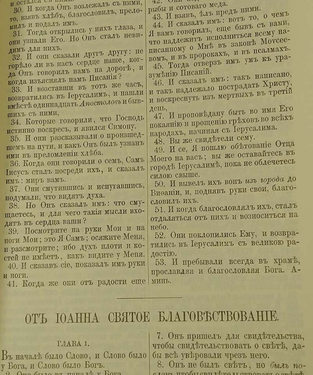
A closer look at one of the pages of the Bible in Russian.


20171010_140652

A close up of the typeface from the Bible in Russian.

Posted in Fall 2017 Archive (336) | Leave a comment

Type Anatomy: Katrina Bittner

I have always loved calligraphy and manuscripts. It is amazing how symmetrical, and balanced the typeface that someone creates can be. When looking at all the different texts available to us in the library, I noticed that most of the type was symmetrical in height, and width, and well as distance. Some documents featured different sizes and formats of text to emphasize a part of the document, or add artistic flair. I found it interesting that calligraphy and cursive is seen as something fancy and less common in our times, but in “Thinking with Type” Ellen Lupton mentions that cursive as seen as an easier type, and was no considered as fancy as it is today.

I greatly appreciate that we are fortunate enough to have such a rich collection at the manuscripts, archives, and special collections at our library. When browsing through the collection, several documents caught my eye. My favorites were the Alice in Wonderland book (because of its beautiful color), and the map of WSU from 1946. I decided to focus on the map because I felt like I could relate to it the most. I loved feeling like I could step backwards in time and get a glimpse of what our campus was like back in the day. The map, designed by Jolly Elmer Lindgren, featured several different type faces that helped divide the map in several different portions. A large banner on the top contains the title, featuring a retro style type with emphasized first letters. This retro text is featured throughout the map but in a smaller, less bold style. The map contains serif and sans serif type in different portions. Interestingly, all of the type is in all uppercase letters, and some are in italic. They all have consistent height, and about half have sharp edges and the rest have rounded edges. I found this interesting because the map had so many different type variations to look at, yet it remained balanced and felt organized.

Posted in Fall 2017 Archive (336) | Leave a comment

Type Anatomy: Patricio Orozco

The Cover for Queery Leary Nonsense. Its shows the typeface that I enjoyed when looking in the archives. (Lady Strachy, Queery Leary Nonsense, Mills & Boon, London, 1911)

Based on what I observe on all texts I could during the visit I noticed that in everybody of text there is always a height limit. Like in the reading talks about where the cap height limits the size of uppercase letters and any letters that have an ascender as well as a descender when its limited in the bottom cap. I also noticed that each body text keeps consistent by either using a serif type or a san-serif type, there can be no mix within the same body text. Of course, starting new bodies of text like paragraphs then you can change the font type and size. The type that got my attention is from a cover page of a book called “Queery Leary Nonsense” compiled by Lady Strachey. I like that way they did he text for it. It looks like it was scribbled in the last-minute but of course they took time to perfect it. Looking at it closely you will see that some of the letters are slightly different but for some reason it works. For example, the letter s in Nonsense has two different ways they drew it, one of the s has a descender when the finial should end. While the other stops where the finial is located at. The type face goes well with the title and the diagrams of the cover because it gives you a sense that this book will be humorous or each chapter doesn’t connect with each other in any way or even the text will be nonsense like in the title says. It also demonstrates that not all typefaces need to be sophisticated to be considered a type face. Some typefaces can break some of the rules that define a type interface.

Posted in Fall 2017 Archive (336) | Leave a comment

Type Anatomy: Lillie Williams

Ellen Lupton’s chapter, “Thinking with Type” gave an interesting idea at the beginning of the chapter. She talked about typeface having a tension of counter forces within the letters. I thought of this as a balance between different components, such as the hand vs. machine, organic vs. geometric, and human body vs. abstract system. I learned that in the eighteenth century upright humanist scripts were more expensive, while italic letters were cheaper. The chapter talked about cursive being a more casual writing style. Cursive started to be seen to calligraphers as saving time, while printers saw it as saving space.

Key components of type anatomy can include a lot of elements. There are many parts of a letter that are important including spine, x-height, stem, bowl, etc. However, the main elements that are possibly the most important can be size, scale, contrast, fluidity, and style. There are many parts of a letter that creates different interpretation for the overall typeface.

When I had the chance to visit the Manuscripts, Archives and Special Collections on our campus library a particular book from the 1800’s caught my attention. It was a manuscript by the Catholic Church that contained services and music. It was made out of parchment and was in Latin as well.

When I look at the typeface I immediately thought of the monster fonts from the chapter. The letters have exaggerated proportions and the kerning is set to have larger spaces. There are small serifs on some of the letters if you look closely as well. There is also color in the text and I think it signifies the next main part, important names, or even the next paragraph in the manuscript.

I noticed that since it is not cursive, then this wasn’t seen as a casual object. Since, the author was the Catholic Church I’m guessing that this manuscript was important and it was meant to be seen clearly, which is why the size is large.

      Author: Catholic Church Picture taken by Lillie Williams from Manuscripts, Archives, and Special Collections on the WSU campus

Author: Catholic Church Picture taken by Lillie Williams from Manuscripts, Archives, and Special Collections on the WSU campus

Author: Catholic Church Picture taken by Lillie Williams from Manuscripts, Archives, and Special Collections on the WSU campus


Posted in Fall 2017 Archive (336) | Leave a comment