Graphic Novel Review: Jasper Contreras

The graphic novel I chose to read was Nimona by Noelle Stevenson. Going in, I’ve read a fair bit of graphic novels before (works such as Saga and Y: The Last Man which are both written by Brian K. Vaughan with Fiona Staples as the artist for Saga and Pia Guerra for Y, as well as Fables by Bill Willingham and Mark Buckingham to name a few), so I’d like to think I’m pretty well-versed when it comes to these kinds of books. 

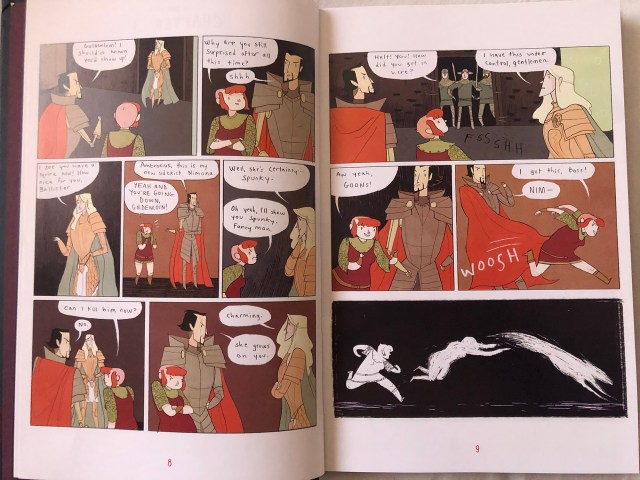
Nimona is a graphic novel that takes fantasy and science fiction elements and tells the story of a shape-shifting girl — named Nimona — who becomes the sidekick of mad-scientist supervillain Ballister Blackheart. Ballister and Ambrosius Goldenloin were once friends turned enemies and then Ballister become a villain but with a moral code which Nimona doesn’t necessarily understand. The two work together to kill or bring down the Institute of Law Enforcement and Heroics, which is what Goldenloin is a part of. 

Overall, the art style isn’t overly detailed, some frames are more simple than others and it definitely has a more cartoon style. The style the characters are in, lean more towards icons than realistic. Their facial features are quite simple and it’s up to things like their clothing styles, hair, body types, etc. to define them further. This book started off as a webcomic on Tumblr before it was ever published into a full-length novel, so I think the style it’s in had a lot to do with how it originated. Since it was written, sketched, inked, and colored by one person, I think the simplicity of the art style was necessary. 

Looking at what Scott McCloud says in the “Living in Line” chapter, Nimona wasn’t necessarily an over-emotional story. It was quite wholesome, even if there were battle scenes and character loses their arm, it was mostly about friendships and kind of dealt with issues on morality. As a whole, the drawing style was pretty clean, but in times where Nimona’s character was shifting between forms, the lines became harsher and more of a “sketch” style than smoother lines. 

Nimona by Noelle Stevenson pp. 8-9. Example of line style changes.
Posted in 201 Blog, Graphic Novel Review | Leave a comment

Graphic Novel Review: Daylon Hicks

The book that I chose to read was a Naruto Manga Volume 27 by Masahi Kishimoto. A manga is a style of Japanese comic books and graphic novels, typically aimed at adults as well as children as defined from Google. The overview of the story is Naruto, Sasuke, Sakura that (the main characters from the show) left to train with separate sensei in order to become stronger. The type of iconography that was used by Masahi Kishimoto was more visual because manga is full of pictures and in manga, pictures are essential. The drawing style that was featured was Shonen. Most of the Shonen Manga are mainly about sports and mystery. Naruto is mainly about mystery especially from this specific volume.  

Obito’s eyes on the bottom right shows how the drawing style is based off of Shonen. Naruto: Volume 27 by Masashi Kishimoto.
Posted in 201 Blog, Graphic Novel Review | Leave a comment

Graphic Novel Review: Daniel Blanchard

Blue a graphic novel by Pat Grant is a story about 3 friends, Christian, Verne, and Muck set out to find a dead body that is rumored to be on the railroad tracks. This story starts off with a mixture of getting to know the characters and their everyday life, to have a scenario of immigration through their town. This town is Bolton Australia, and due to Australia being a place dealing with immigration and racism that follows, Grant wanted to incorporate something that he has observed throughout his life. But in the stories the immigrants aren’t human, instead, Grant made them blue aliens, ugly ones with the long bodies and spider legs. By separating the town into 2 kinds of beings, the blue alien creatures and whites, this makes way for a very heavy amount of division and discrimination throughout the story. Once again this is a way of Grant showing the viewer how immigrants are seen and treated in Australia and many other places around the world. For example, on the 3 friends’ journey to the railroad, they see a blue alien kid who was adopted by white parents. After crossing paths and the 3 confused on what they just say, Verne says, “They’re from some other country like, near Africa or some shit. Sadly, this is not an uncommon thing to be heard, even in the real world and I think that was Grant’s goal with this graphic novel, connections. As you journey through this book it takes you on the 3 friends’ expedition, skipping school to see this dead body that has been rumored throughout the city. As they stop at multiple shops and other destinations along the way it starts to tell you how these stereotypical “surfer” teenagers and Pat Grant grew up in Australia. Taking side quest to climb up to a balcony to steel Christians fathers pack of cigarettes, their teenage life was not healthy in any aspect, to say the least. Once they reached the part of the railroad track that was supposed to have the dead body, they found instead a harsh wave coming into the banks of the east coast beach. This explains how the immigrants go to Bolton in the first place, not by choice but by a bad storm that only happens a couple times a year. As they come upon the scene, before they see anybody, they see a puddle of blue blood, alien blood, with drawings on the rock cliff that is next to the tracks. They decide to call the mission off their, wondering if they made the right decision but forever remembering the day where they learned a lot more through their journey rather than just possibly seeing a dead body.  

The Iconography and drawing in this novel are like no other, only using the colors blues, white, black, and grey, this book definitely sets a mood right from the jump. Using great use of space, Grant has a wide variety of box sizes and images throughout this book. The whole book reminds me of a lot of what Scott McCloud’s living in line talked about, giving the viewer a sense of emotion and senses. Having the whole book be filled with the color blue gives off an emotion itself, a sad emotion. I believe Pat Grant did this on purpose, seeing some of the things that Pat saw growing up in Australia, he wasn’t going to pretend that Australia, was perfect. His home has its flaws just like any other country does, and Pat wanted to show that in his Novel.

Posted in 201 Blog, Graphic Novel Review | Leave a comment

Graphic Novel Review: Kirk Brown

The graphic I chose to review was Captain Marvel Adventures volume 1 issue 5 by Fawcett Publications. I will give a summary from the comic “Captain Marvel Solves the Swamp Mystery.” The story begins with radio reporter Billy Batson who visits a very rural community on the edge of a large swamp, to cover a story. The swamp is expanding, and ruining farm land, despite the efforts of some government engineers, and also, a mysterious “swamp devil” is rumored to be terrorizing the local people, some of whom seem to be extremely superstitious. The first people he talks to are Pappy and Mammy Sims, at their farmhouse; they fear that the devil can hear even a whispered mention of his name, and very shortly, the caped green lizard-like Swamp Devil does indeed show up at their farmhouse door, to interrupt Billy’s interview. Captain Marvel gets called in and punches him way out into the swamp, into which the terrible creature escapes.

The next morning, Billy interviews the government engineer, who characterizes the “swamp devil” as being just a crazy superstition, but admits that the swamp has been expanding and he hasn’t so far been able to stop it. Meanwhile Pappy Sims rallies up a hunting party (himself plus 3 guys) to deal with this Swamp Devil once and for all. They encounter a cloud of hypnotic gas, and the Swamp Devil shows up and orders them to follow him, which they do. Billy arrives shortly later, and is almost overcome by the gas, but turns into Captain Marvel, who can resist it; Cap finds and disables the gas-spraying machine, then rescues the hunters from being drowned by the Swamp Devil, who escapes again into the swamp. Cap then explores the swamp, and finds a dam where there shouldn’t be one, and a beaver-house-style hideout, and also gets attacked by the knife-wielding Swamp Devil. That fight is only one punch long, and the dam is quickly broken, which begins the process of draining the swamp.

The chief engineer of the swamp-drainage project, Mr. Woggs, turns out to be behind all the mischief. He was flooding the farmland in order to come back later and buy it all up cheaply. The clinching piece of evidence was that the eyepieces in the Swamp Devil’s head gear were ground to the same prescription as Woggs’ glasses, as Captain Marvel could tell just from looking at them.

The iconography and style of the artist displays creates thriller of a story. Captain Marvel can be seen making many actions in this comic. As stated in Scott McClouds chapter titled “Living in Line” we know that lines can define emotion and tone in graphic novels. While I read the adventure of Captain Marvel I felt like I was on a never ending roller coaster of emotions because the stories had many highs and lows. The artists lines also display a lot of smoke clouds insinuating multiple movements and actions in the story.

In my opinion, I believe the Captain Marvel Adventures is a great read for someone looking to get into super hero comics. The stories have great reoccurring themes and characters, plus he is a lesser known superhero so if you’re like me all of it will be completely fresh and new.

Captain Marvel Adventures Volume 1 Issue 5 pg. 41 and 42 by Fawcett Publications

Posted in 201 Blog, Graphic Novel Review | Leave a comment

Graphic Novel Review: Dean Janikowski

The graphic novel I chose to read for this class was “Maus” by Art Spiegelman, the story goes over the life of Spiegelman’s father growing up in Poland during the Holocaust. This is a story based on real life so the entirety of the book itself is definitely more serious than any other comic I have read. The entire book is in black and white which I think gives a good feel to the story and leads to a more serious tone. The drawing style by Spiegelman is supported by words, but also his movement he was able to create in the pictures added a lot to the story, especially during times where it was more intense and there was a lot of action.  As a whole, the story follows Vladek (Spiegelman’s father) as he goes through the experiences of being a Jewish man in World War II. The fun spin on this story is that all of the characters are drawn as animals, the Nazis are represented as cats and those who are Jewish are represented as mice, giving a weird spin on the whole Cat chases Mouse idea. There are countless different examples of iconography within this story, from Scott McCloud’s chapter about “Living in Line” and the different ways feelings can be provoked from drawing styles, this book, as one could imagine, shows many different emotions throughout the entirety of the story. From moments of intensity, grief, and even joy, Spiegelman brings out all of these emotions through his drawing styles and brings it directly back to the reader. I can say that while reading this book there were moments where I was sitting on the edge of my seat, waiting to read what happens next, thanks to Spiegelman’s talent for telling this story. I believe all of his tactics used in this book were placed specifically and tactically to bring out the most from the reader. It is a book I will definitely recommend to others. 

“Maus” by Art Spiegleman
Posted in 201 Blog, Graphic Novel Review | Leave a comment

Graphic Novel Review: Ruby Hopkins

The graphic novel I chose to read and write about is Persepolis by Marjane Satrapi, the story tells of the young author Satrapi growing up in Iran during the revolution and the struggles she and her family had to endure during that time. The whole graphic novel is in black and white which I think immediately sets a tone for the book. When there is color to a graphic it brings warmth and life to the images, where Satrapi’s monochrome style leads to a more serious tone. The story starts off as Satrapi being a young girl, facial expression and word use is very important throughout this story to ensure the reader can understand and feel the emotions each character is having at that time. For young Satrapi, there are many moments where she is imagining scenarios and even talking to God. The figure Satrapi drew in her book that is “God” to her lets her speak to him about her emotions freely, as she self-narrates her life story and everything she feels from a young girl to a young woman at the end of the book. From Scott McCloud’s chapter “Living in Line” I took to the book again to look back and try and find moments where emotions were evoked from the drawings on each page. There are many moments of chaos, whether it be during bombings are frantic moments where she had to flee from the conflict. And at other moments there was more warmth to the images whether it be families hugging, children playing outside, or a celebration, from facial expression to the drawing styles, it was clear those moments were moments to rejoice in. I believe Satrapi’s choice to draw the story how she did was very wise, since the story was of past events, the choice to do black and white felt like we were looking back on the past, just from the color choice. The way she displayed her life on the pages was an excellent and compelling way to tell her story and bring it to life to those reading. 

Persepolis by Marjane Satrapi

Posted in 201 Blog, Graphic Novel Review | Leave a comment

Graphic Novel Review: Edgar S. Martinez

A picture indicating the start of a new chapter

The graphic novel that I chose to read and review is called Daytripper by Fabio Moon and Gabriel Ba. The premise of this graphic novel is what really got me into the novel as it follows Bras de Olivia Domingos. Bras is an obituary writer living in Brazil and Daytripper follows him throughout his life. However each chapter is a different point of his life and each chapter ends with his death and his obituary. Daytripper is about what it means to live and the different things he has learned.

The drawing style and iconography of this graphic novel is very colorful and realistic. The colors are what you would expect from the real world but every once in a while the author uses vibrant colors to contrast certain things from the backgrounds. The line work and style of the graphic novel add some sort of depth and weight to the tone. The scratchy lines add realism to the art style which is what this graphic novel is going for. Color is used very well as it is one of the most colorful and beautiful graphic novels that i have seen, as even mundane environments and scenes are filled with color. The image above is a good example of how vibrant colors are used to contrast the duller backgrounds.

Another Picture of Daytripper. The end of a chapter

Posted in 201 Blog, Graphic Novel Review | Leave a comment

Graphic Novel Review: Jennifer Engelke

For this semester I chose to read the graphic novel Maus I: My Father Bleeds History by Art Spiegelman. I was not sure where to start with my search in graphic novels, however, this book was mentioned in class and caught my attention. The book tells the story of Artie, a mouse who is writing about his father’s stories during World War II. Artie tells the story by interviewing his dad, he switches from his view to his father’s view as he reflects. The book initially starts with Artie as a young mouse, then jumps to him as an adult visiting his dad. As the novel progresses Artie’s father recalls meeting his son’s mother, his beginning of first son’s life, and his time within the war. Within the pages, Art uses many scene-to-scene panels. He tells a story in multiple places that are all occurring at once. 

Since the novel tells the story during times of war iconography is applied when the main characters are visualized as mice and the Nazis as cats. When using these symbols the reader sees the characters as enemy vs ally. Such as how cats and mice are viewed, cats are the hunter while mice are the prey. This is used as a tactic to make sure the reader understands who is good and who is bad. The book plays into the good guy vs bad guy stereotypes. Creatively, Spiegelman applies a twist to the normal way Nazi Germany is portrayed, as they are now prey and predator animals.

Example of lines representing “madness” from Art Spiegelman’s Maus

When applying this graphic novel to the 5th chapter of Understanding Comics, living in line. The deep dark lines in this specific example represent madness. Scott McCloud mentions many examples when giving examples of what lines can represent. Madness can be seen within this panel of the book. It focuses on Nazi cats, giving them the visual of being bad, or in this case, mad. The lines are thick and dark making the panel with the cats seem “scary” and “bad”. Elsewhere in the book panels are seen with the mice are light and thin lines, such as in the left panel. Again the iconography and lines play a role in the good guy vs bad guy stereotypes.

Posted in 201 Blog, Graphic Novel Review | Leave a comment

Graphic Novel Review: Sophie Dimry

“The Last Man: Unmanned” by Brian K Vaughan, Pia Guerra, and Jose Marzan Jr., pg. 38

The comic book I chose to read is called “The Last Man: Unmanned” by Brian K Vaughan, Pia Guerra, and Jose Marzan Jr. This book was the first of “The Last Man” series. The story follows a man named Yorick who is the only surviving male left on planet Earth after a mysterious plague hits the population, killing every male species. After Yorick discovers he is the only man left on Earth, he attempts to understand the events that happened and teams up with a team of women to try to bring back the male population.

In Scott McCloud’s “Understanding Comics” chapter “Living in Line” I noted his explanation of how using elements like backgrounds, line types, and font types can evoke different emotions or experiences. The iconography used in this comic book is centered around detailed scenery to convey emotion and different lettering styles to capture different sounds. The detailed illustrations are important to the story because the story is meant to be very dramatic and apocalyptic, so the scenes must convey that effectively. I also found that the use of lettering in certain frames can determine the mood, as Scott McCloud mentioned. The harsher lines and bigger, all capital letters invoke a feeling of intensity so that the reader understands that the situation is meant to be dramatic.

Overall, I thought this book turned out to be very interesting and entertaining. The story was fun to follow and the writing included some humor to keep the reader interested. The illustrations were also very well done and detailed which made it more enjoyable to read.

Posted in 201 Blog, Graphic Novel Review | Leave a comment

Graphic Novel Review: Zackary Reynolds

Made by Sean Knickerbocker
Found in Holland library
Page number 59

The graphic novel I chose to read for the semester was RUST BELT from Sean Knickerbocker. The graphic novel is about negative things in life like frustration and disappointment. The first example of disappointment is in the first chapter where the character Kurt likes another character named Ashley. Kurt was planning on telling Ashley that he likes her but when he was about to, she told him that she is moving. The reason I think this is an example of disappointment is because he was disappointed when he found out that she was moving, and he was not able to tell her how he feels. 

An example of frustration Knickerbocker showed in the comic could be seen in chapter two. In chapter two there is a character named Tim and he is an assistant manager at a company. But he finds out there will be a new CEO and the assistant manager job will no longer be a thing. Instead of that job there will be something they called a shift leader which is the same thing he is doing but with less pay. This is an example of frustration because Tim is frustrated about him getting less paid but supposed to do the same amount of work. Tim even shows his frustration on his way home by yelling “FUCK” in the car. 

In the graphic novel he used a lot of different iconography and drawing styles. But the example I am showing has intimacy and anger iconography. I think this because two of the frames show having the character Dave in a private area all alone which shows intimacy. The way the comic shows anger is by having a character knock hard on the door with a big “SLAM!” To show sound. The lines used for drawing could often be characterized as savage and deadly or honest and direct. 

Posted in 201 Blog, Graphic Novel Review | Leave a comment