Graphic Novel Review: Trent Madison

graphicnovel

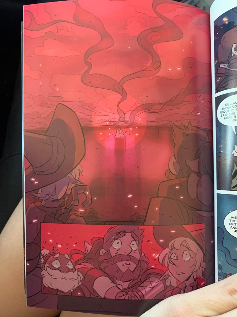
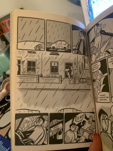
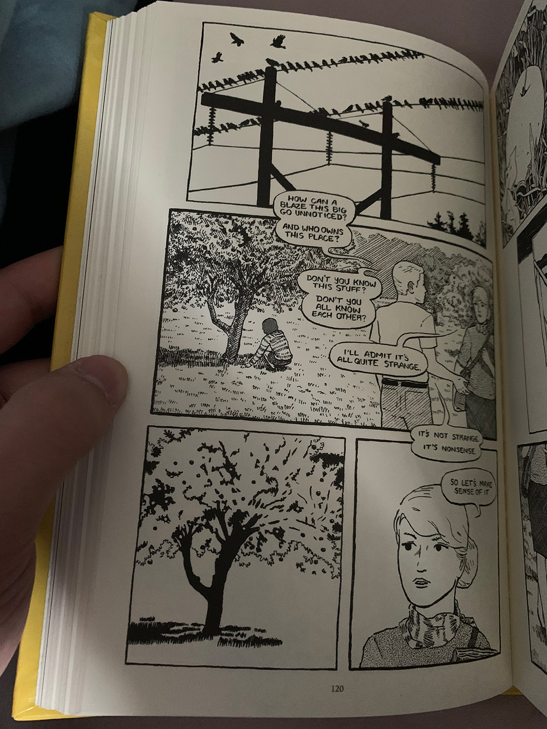
The teens investigate the scene of a fire that they find to be suspicious. (Page120, Bertin, K., & Forbes, Alexander, 2017)

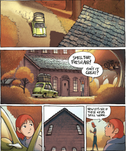
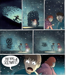
I read “The Case of The Missing Men” By Kris Bertin and Alexander Forbes. This book was about a group of teens ( Dana, Denny, Sam) in a teen detective club, who try to investigate different mysteries. Throughout the book the teens are going through their conspiracies trying to figure out what is happening in their town and why there are missing men. As they investigate to try and solve the mystery they run into other crimes and obstacles along the way, for example when Sam finds out the lunch lady was found dead (page 90, Bertin, K., & Forbes, Alexander, 2017).  one other detail of the story I though was interesting is that Sams father ended up being the sixth man to go missing  (Page 44, Bertin, K., & Forbes, Alexander, 2017).

I would describe The iconography used in the book as traditional realism. The reason I think they chose to go with style over a more cartoon style because it is supposed to be taken more seriously than a comic that is meant to be funny.  They may have also chosen this style to objectify the characters. It seemed to follow Jack Kirby’s model of story telling, however the illustrations were more in depth. There is mostly subject to subject and scene to scene panel transitions. Another reason they might have used detailed realistic illustrations was to make clear that there was one thing that was happening and to leave little room for readers to have to imagine or infer what happened. The novel also uses a lot of speech bubbles, that sometimes overlap the frame of a scene. It also makes good use of lines, for example on page 113 they use line to show Sams sense of panic while he is on the phone by making thick lines on the left of him. The novel was refreshing, since it was more pleasing to read than a book with no illustrations.

Citation: Bertin, K., & Forbes, Alexander. (2017). The case of the missing men : a Hobtown mystery #1 (First edition.). Wolfville, Nova Scotia, Canada: Conundrum Press.

Posted in 201 Blog, Graphic Novel Review | Leave a comment

Graphic Novel Review: Erin Rockwood

For the graphic novel review I read The Adventure Zone: Here There Be Gerblins, which is the first book in the series. I had this novel in my room before we were assigned this blog, but I hadn’t read it yet.


The art style is halfway between realistic and simple, there is room for the artist, Carey Pietsch, to exaggerate their features for emphasis in some parts to make the story fuller. I think they used this art style because they needed to be able to jump from realistic to outlandish in the dungeons and dragons world this is based on. The podcast that this graphic novel derives from is a comedy podcast, but they take the story very seriously. Their fans are die hard and had very high expectations for the novels, and the art in the book is semi-based off of what the fan artists would draw of the characters.

The characters in the novel at the end, in the AdvetureZone: Here There Be Gerblins

The artist uses colors in a really cool way all throughout the novel, there is some different settings that the characters traverse through in the first introduction of this world. A big part of the podcast was that they never really described characters further than their species and gender, so bringing them to life was a big interest to fans.

Posted in 201 Blog, Graphic Novel Review | Leave a comment

Graphic Novel Review: Yanir Govrin

Hiroya Oku, Gantz, Dark Horse Comics, 2007

For my graphic novel I decided to read the first two volumes of the manga Gantz by Hiroya Oku. I decided to read this because my friend owns it and really wanted me to read it. It is about people that are saved from the brink of death and have to kill aliens to regain their freedom and return to their normal lives.

The art in this manga is more reminiscent of other manga or Japanese comics as it is all in black and white and has solid lines outlining everything with gray-scale style shading.

An example of the use in lines is how distinct and chunky the onomatopoeia are in this page. They are meant to be very obtrusive and loud to the characters so as such they are shown to be very big and obvious. This gives it a louder tone without any actual sounds playing. This gives it more weight as obviously you can’t have a distracting sound in a graphic novel so instead the text is distracting and grabs your attention in place of the sound it represents

Another example of lines is the lines for the text boxes. When showing thoughts the outline for the text box is a rectangle but when the characters are talking it has a more standard rounded text box. Not shown on these pages is when the characters yell. When the characters are yelling the text books have a jagged outline to easily show that they aren’t just talking but actually yelling.

Posted in 201 Blog, Graphic Novel Review | Leave a comment

Graphic Novel Review: Ethan Miller

The book I choose to read for this semester was Maus 2 by Art Spiegelman. The book is about Art talking to his father about his experiences in the holocaust as a Jew. His father is a little distracted at times and it’s clear it is getting harder for him to take care of himself. The stories he tells of his experience are terrifying, sparing no detail in the pure brutality of the Jew’s life in one of Hitler’s death camps. In his father’s case, he mostly spent his time getting by as a shoemaker for a long time, he didn’t have to do the forced labor that most Jews were subjugated to. He kept trying to find ways to get little pieces of bread or messages to his wife to let her know he was okay and that she should keep fighting.

               The unique thing about how this book is written is the Jews are drawn as mice and the Nazis are cats. This works to convey the idea of how the Nazi’s saw the Jews, as rodents, as well as play the dynamic that the cat is chasing the mice, just like how the Nazi’s pursued the Jews.

               There was a moment in the story that really stood out to me when Art’s father was trapped in a train car filled to the brim with fellow mice. They are stuck there for what seems like weeks and people die trapped in that train car, it really is a horrific scene and Art draws is with these very dark and layered shadows of the what seems like hundreds of people stuck in there. A concept of Scott McCloud’s book in chapter six that I think this moment encapsulates well is additive, where the scene’s words elaborate on an already well drawn out scene. The reader can tell what’s happening in the scene without the words, the mice are trapped in a train car and things are going horribly, but when Art adds the narration and some of the dialogue of the mice, it both elaborates on the specific troubles and amplifies how the reader perceives their suffering.

Train Car Scene, Maus 2 by Art Spielgelman
Posted in 201 Blog, Graphic Novel Review | Leave a comment

Graphic Novel Review: Feifan Li

The Graphic Novel I chose for this assignment is Gene Luen Yang’s “American Born Chinese”. This is a very famous Graphic Novel that has won many awards. This comic contains three-chapter stories, the first one Uses the story of the most famous Chinese mythical story, the Monkey King, as an introduction to attract people to watch. The second article is that the author used his own experience as a background to create a child, the family moved to a strange place, and he also entered a white man. He is still the only Chinese in college. He is not in a group and is bullied. It wasn’t until he met a Taiwanese teenager who appeared later that he became friends with him before he gained friendship. But other people’s humiliation towards him made him give up his friends and chose to join them who humiliated him. The third chapter is to describe his humbleness from the side, and another story shows that after he joined others, although he lived very comfortably, he lost his national self-confidence.

The style of this comic is very distinctive. The author uses three stories to show the reader a daily story that resonates and associates with the reader. Through the description of the character’s face and the use of the background color to tell the reader the idea of ​​the protagonist in the comic. Just like the point of view mentioned in Scott McCloud ’s book “Understanding Comics”, this picture I chose is to show the meaning of listening through the mirror and using the side of the character. The change of the background tone and the symbol tell the reader the psychological change of the protagonist. The author also found himself by completing this comic and understood what he needs to know about what to do.

Gene Luen Yang,American Born Chinese,2006,Pg.15
Posted in 201 Blog, Graphic Novel Review | Leave a comment

Graphic Novel Review: Sabrina Hoenes

The graphic novel I decided to review is the manga Beastars written and illustrated by Paru Itagaki. Beastars is an ongoing series, that is currently on its seventeenth volume. I, however have only read the first one. The overall plot of Beastars is a high school that is divided into two groups, predator (carnivores) and prey (herbivores). Volume one is specifically about the murder of an herbivore, causing distrust and unease throughout the herbivore student body, the prime suspect is a grey wolf named Legoshi. During this time Legoshi befriends a dwarf rabbit named Haru. This developing friendship causes a lot of inner turmoil for Legoshi with his predator instincts.

The style choice is simply that of what is typically seen in manga. Like Scott McCloud said in Understanding Comics, manga is a form of art. So through out the volume, there are a good portion of detailed and in-depth panels. It allows the readers to have a more immersive and “cinematic” experience as they go along. It also follows the aspect to aspect closures furthering the reading experience. As for iconography, there are a lot of school related icons. Such as the uniforms, the desks, and the school building itself.

As I was reading I noticed there there were a lot varying lines. Much like the ones Scott McCloud discussed in chapter five of Understanding Comics. The author uses this technique mostly for the speech bubbles and occasionally as a background or a “cloud” that surrounds the character.

Paru Itagaki, Beastars, Akita Publishing, 2017,
149 -148

An example of this can be seen in these two pages. The scene is after the main male protagonist chases down the female protagonist and is fighting against his predator instincts. The speech bubbles are no longer the typical circles, but are now lines that signify the male protagonists fear and anger. On the right page we can also see a swirling effect happening in the background, indicating that the giant figure is not really in their real world, but in the male protagonist’s head.

Posted in 201 Blog, Graphic Novel Review | Leave a comment

Graphic Novel Review: Edison Soliman

For this semester, the graphic novel that I chose to read was Amulet Book 1: The Stonekeeper by Kazu Kibaishi. The story dwells into this family of a mother and her two children. Her oldest being Emily and youngest being Navin. The book starts off with a backstory on how they lost their father in a car accident and now the mom, Karen, needs to find a way to support her children by herself. It goes back into present time as Karen, Emily, and Navin are driving to their new house, but it turns out it’s a mess. They go on a huge cleaning spree and that’s when Emily finds the magical amulet that was supposedly passed down to her from a great grandfather. A turn of events follow as their mother gets caught by a mysterious monster and the children try to get her back. They find themselves lost in an alternate world like Earth but inhabited by different creatures. There, Emily and Navin run into their great grandfathers assistant as he guides them to shelter. There they find their great grandfather who quickly passes after he grants Emily as the new stonekeeper. She utilizes this new power along with her brother and the assistant to get her mother back. The finally rescue her but she gets poisoned in the process and the book ends with them traveling to find an antidote.

The iconography of this graphic novel is represented in varying amount of curved lines. This type of line style very appropriate due to the context of the book being a very heart warming tell about family. In chapter 5 of Scott McClouds book Understanding Comics, he goes on about how lines give representation to many things that are invisible to us in reality. He states of line could be expressive in the direction it goes. In this sense, he talked about how curved lines give a “warm and gentle” feel. The iconography is also very expressive in the author’s color choices throughout the story. At the start, when they are moving into the new house, the colors are very bright and warm. But this all soon transitions as soon as they find themselves in the alternate world and the colors give a cold and dark sensation. The shift in color helps provide symbolism that the story has taken a turn and brings in tension to the reader.

Warm colors at the start of the story. Amulet by Kazu Kibuishi.
Cold colors indicating a shift in story. Amulet by Kazu Kibuishi
Posted in Graphic Novel Review | Leave a comment

Graphic Novel Review: Chloe Brusseau

The graphic novel that I chose to read for DTC 201 is titled Breakfast After Noon, written and illustrated by Andi Watson. The novel explores the life of a young british couple, Louise and Robert, as they plan to marry, start a family and life together. Right off the bat, at the beginning of the story, we see Robert become hesitant and unsure of the direction of his life. He is unhappy even though he seemingly has it all. He soon is laid off from his job which he enjoys, and is somewhat in denial. Louise, unemployed as well, returns to get her college degree while Robert won’t give up on his old job. The rest of the story explores the stress put on their relationship as they try to navigate through these tough and trying times. Andi Watson used fairly simple and cartoon-looking figures as opposed to more realistic figures which I find interesting as the subject matter is quite heavy. I think he does this to emphasize the idea that this is in fact a graphic novel, not a non-fiction book.

One concept that stood out to me was the idea of making emotions appear visible. In chapter 6 of Scott McCloud’s Understanding Comics, this idea is explored. Breakfast After Noon often goes back and forth from Louise and Rob’s relationship going well, to not so well. There are some parts that the backdrop and overall feel of the panels play a part in the feeling of what is going on and piecing together the story.

Photo taken of page from Breakfast After Noon, by Andi Watson

In this particular scene, it starts raining heavily. The page starts out with establishing that, and goes into Louise and Rob bickering again. The wind and harsh-lined raindrops provide a feeling of tension, and the reader can almost feel the cold. McCloud discusses how comics contain images that can “evoke an emotional or sensual response in the viewer” (121). After viewing this page, without even reading further, the viewer can sense the overall feeling of what is about to happen. I find this to be one of the most interesting and compelling parts to reading a graphic novel/comic as opposed to a traditional novel.

Posted in 201 Blog, Graphic Novel Review | Leave a comment

Graphic Novel Review: Devon Anderson

Thin Thighs in Thirty Years by Cathy Guisewite depicts the life of the title character and the thoughts that run through a typical woman’s mind. It begins with Cathy and a friend trying on swimsuits and the lack of confidence Cathy has in her body. As the story continues we meet Cathy’s friend Andrea who professed all her life to be against having a relationship with a man. This quickly changes and Cathy feels left in the dust when Andrea meets a guy online and quickly marries him. The rest of the story shows how Cathy deals with the absence of her best friend and the internal dialect of a woman in her thirties who is in a discombobulated relationship and has tried, and failed, dieting multiple times, all the while having a high demanding career. 

I believe that Cathy Guisewrite used this type of imagery/drawing style so that a larger number of readers could connect to the main character. If the author were to have put more detail into Cathy’s facial features than readers would have a harder time relating to the character because now it is more likely that the character could not resemble the reader. This style of drawing is also easier for the reader to interpret and does not make demands on, or cause the reader to work hard to understand the strips of drawings laid out before them. There is no question that one panel follows the other and the story is easy to process. 

Cathy Guisewite’s comic book Thin Thighs in Thirty Years illustrates that emotions can be depicted by symbols and images within a comic. (Thin thighs in thirty years by Cathy Guisewite
page 5, Published by Universal Press Syndicate 1986)

Starting as early as page 5, and reiterated throughout the comic, you can see how the emotions that the author wants the reader to register in the story are visible. In one image, you can see the water droplets spraying away from the character Cathy’s face, this portrays to the reader that Cathy is nervous about the idea of walking out of the dressing room in a swimsuit. Throughout the story many different emotions are expressed through images that are easily interpreted by the reader. These images could be the sweat droplets, or angled brows coupled with lines surrounding a yelling face depicting anger. These are the symbols Cathy Guisewite uses to render emotion that a reader would easily understand.

Posted in 201 Blog, Graphic Novel Review | Leave a comment

Graphic Novel Review: Korie Cedre

The graphic novel I had chosen to read during this semester is “The Imitation Game, Alan Turning Decoded,” by Jim Ottaviani and illustrated by Leland Purvis. In summary, I enjoyed the story as it was a recognizable one, and the illustrations were in soft colors which I thought was a nice detail as it matched with the setting of the graphic novel’s story. I also thought it was neat that food items and the technology being worked one throughout the graphic novel were used to represent something, such as a situation or time. To continue the discussion of the iconography in my chosen piece, I believe they chose to do drawings that seemed hand drawn then digitally scanned so that it matched the tone and setting of the story, being a serious one and within the 1950s. At times the frames were all in a shade of gray, to either represent a sad remembrance of a moment, as well a past time. The iconography was also more detailed than cartoon style, perhaps used to portray a more “cinematic” and “serious” perspective when reading. Referring back to the fruit and technology used to represent a variety of things, the artist and author were able to set different senses of closure. One is action-to-action and they are often working of the technology themselves within the graphic novel or having a conversation, and the other is to represent the passing of a long period of time, being scene-to-scene. When discussing the lines in this graphic novel, I believe the decision to keep the lines rational and conservative was made to keep a consistent tone and show the severity of the ongoing situation. However, there are accidents that do happen within the novel that involves electricity or currents inn which when these moments happen, the decision to make the word balloon with sharp edges is made to show the static of the situation, or to raise volume to the character’s reaction to the situation. Similar static appearing symbols can be seen as well for moments like this. Unfortunately, due to the current situation, I had chosen to turn in my graphic novel into the library before break and the closure of everything, so I am now unable to provide a new photo. With this, below is an image which can also be seen in my blog post #5, chosen to represent the earlier mention of fruits as symbols.

“The Imitation Game,” a graphic novel by Jim Ottaviani and illustrated by Leland Purvis about the life of Alan Turing (Ottaviani and Purvis, The Imitation Game, Abrams Comic Arts, 2016, pga 220-221).
Posted in 201 Blog, Graphic Novel Review | Leave a comment