

Conrad Atkinson uses a wide arsenal of different textures, colors and mediums to portray an abstract opinion of contemporary issues
I chose this example because the centered focus made it very apparent and eye-catching for me. The colored pencil border highlights the black and white image as the acrylic paint tops the image to add even more focus to the photograph. The acrylic paint also acts as a transition from the the colorless photo into the colored border. Also, the corners and and middle parts of the border act as pointers to the middle of the piece.
The audience’s eye are forced to the center of the piece and the photograph. However, the eye movement quickly switches to the text as the contrast of the text makes it stick out. There is a clear connection between the text as the football player in white puts his hand on the football player in black. However, it’s still obscure and abstract what exactly Connon Atkinson was trying to say.
Perhaps, it’s an appreciation between the passion he has and the Post-Modern art styles he’s come to adapt. In another scenario, the player in black might have lost to the player in white and then it shows an admittance to defeat by his passion to Post-Modernism and if that’s the case then the theme is changed entirely. The Border of the piece also makes it seem like this took place in the past, but the font and jersey’s are so simple that it doesn’t give a clear distinction of when this took place.
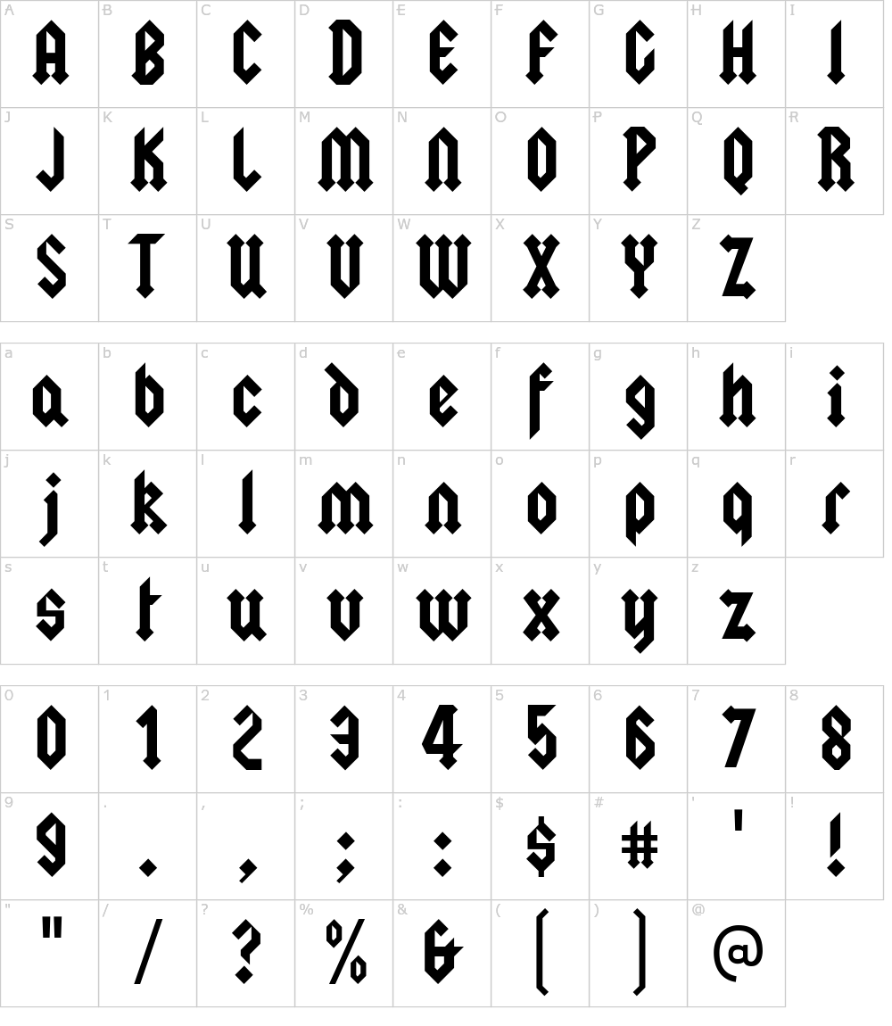
Originally, I was gonna go with the AC/DC Squealor font, but I really like the thickness and the blocky shapes of these letters because it would be a good inspiration for the long lengthy block shapes that I want to make. With some changes to angular direction and sharper endings, I would feel more comfortable using this as a basis for the outcome I’m trying to make.


 In this image, there are a lot of different examples of typefaces, where some letters are with a normal geometrical shape but others have almost like a italic way to see it. The final and the terminal in some letters have a little circle and others are just a straight line. Also the fonts goes from being pretty big to descending to the bottom at being almost impossible to read unless someone with a perfect vision. The typography looks were clean and clear, even thought it is an old book, it was conserved pretty good to maintain the quality of this. There are also differences between lower case which ends up eat the x-height, and upper case, which ends up at cap height.
 In this other image, there are some examples of the designs the first letter of a new paragraph is, in this one image, in the top middle, there is a pretty detailed design around an I that complements with the N next to it, years ago, this was the trend in books. As our eyes can see, all the different paragraphs are in the same style, starting with a pretty design in the very first letter. The styles change every time even thought they are the same letter. Also, the font is like a cursive way where it shows a lot of descenders and ascenders being pretty long and curved.


