
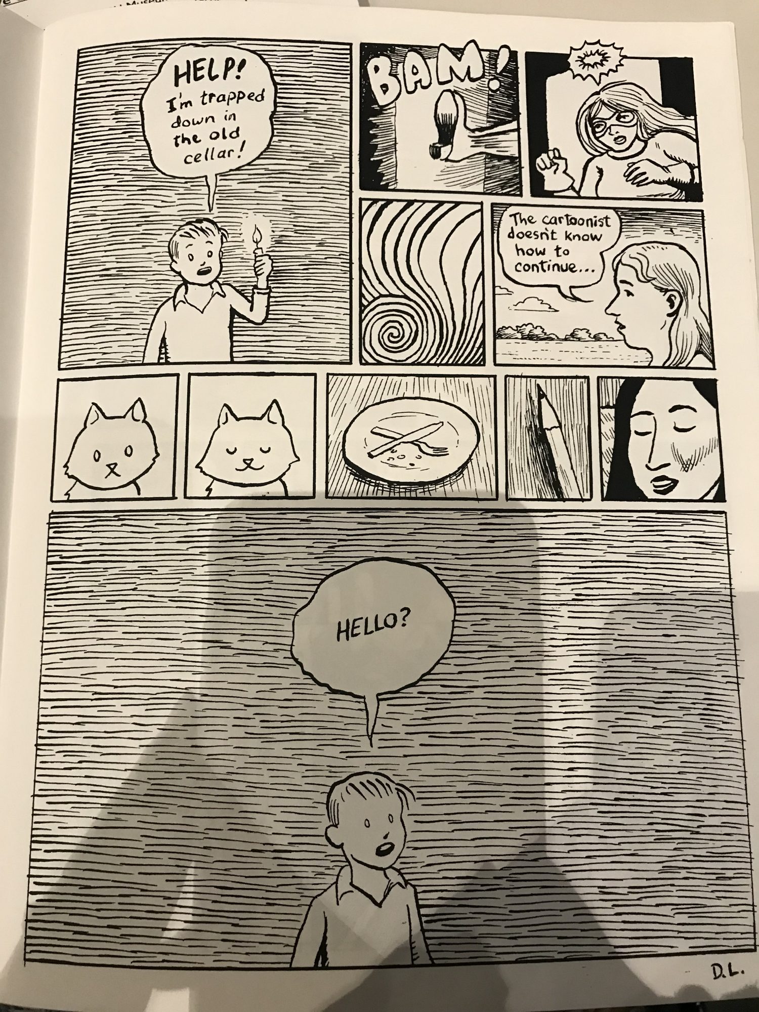
The comic I chose to observe was from David Lasky’s Manifesto Items no. 5. This specific comic I chose does not have a name as this book is composed of the artist’s pieces of work throughout the year. This was my favorite book to look at because it simply had a lot of different visual arrangements and complexities. The comic uses Non-sequitur panels as the cat, plate, and pencil do not fit in. Non-sequitur is when the panels do not always seem to go together, except they do to create a sequence. Most of the comic does not seem to fit together in one piece however it is still defined as a comic by Scott McCloud’s definition. It applies sequence as the reader reads it left to right, and applies to juxtaposition. It is up to the reader to visualize and conceptualize why the cat, plate, pencil, and other panels are included within the comic. In addition to this, David Lasky’s comic includes demonstrations of many types of design elements within its panels. The comic demonstrates the importance of size. The first panel has a character yelling for help as he is “trapped down in the old cellar.” The final frame is much larger and the character believes he is alone. With the bigger size, it makes the character in the foreground seem much more alone in this big empty panel, and that he is not receiving much help. Using more design elements there are many lines involved in the illustration of this comic. While the main character has lines behind him to create a visual as if it is dark, yet the artist does not color in the background completely. However, as seen in a different panel (the one towards the middle) there are lines in which are guiding direction in a spiral. The lines guide the reader’s eye to the center of the panel. Balance can also be seen within the comic. There are two darker panels in the top right, and lighter ones in the middle left. Having these panels creates a balance within the panels that have lines across the entire panel.
