
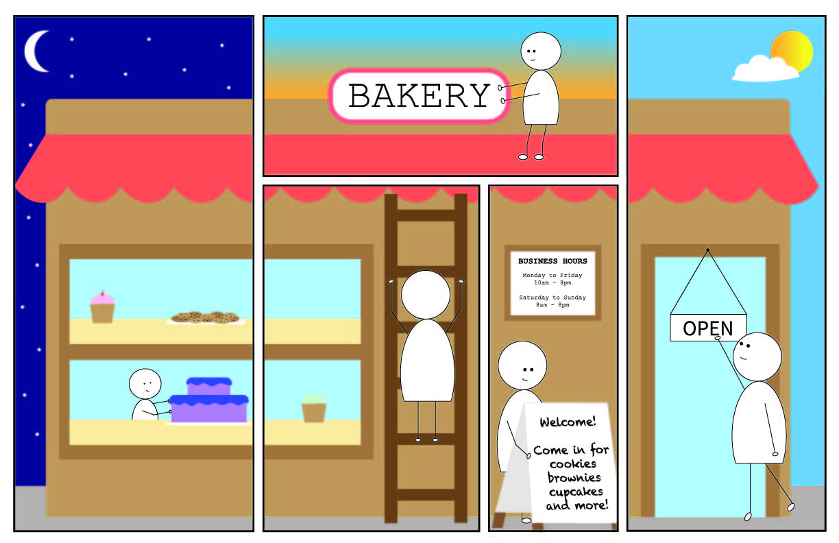
I really wanted to create a comic that showed the transition from night to day. The idea that I came up with was someone getting ready to open up their business (a bakery) for the day, starting from the break of dawn to the daytime.
My Poster Comic
My comic has a layout that guides the viewer’s eyes both up and down and left to right, as opposed to just left to right like the typical comic. The viewer first sees the left-most panel, where the character is putting a cake on the window display. The window display then continues into the next panel, which then makes the viewer look to that panel. In that same panel, the character is climbing up a ladder that presumably leads to the roof of the bakery. The viewer’s gaze will follow where that ladder leads to, which is going up as the next panel is on top of the previous panel. In this next panel, the character is fixing the sign. In the next two panels after that, it shows the character finally getting ready to open the store and start the day, with the character setting out the sandwich board and flipping over the open sign.
I did use a bit of text in my comic, although not for dialogue or action words. I typed the business hours, welcome sign, and open sign to show that the character was about to open the bakery. I think this further shows the passage of time.
My comic describes the passage of it time due to the sky changing colors in the background, as time goes on. In in the left side of my comic, I showed that it was nighttime by adding a dark blue sky, stars, and the moon. In the middle portion of the comic, I used a gradient to create a sunrise effect. On the right side, there is a bright blue sky with a sun and cloud, representing daytime. In addition, the actions that the character does is in a chronological order and shows the passage of time, starting from getting the window display ready, to finally opening up the bakery.
I did have a little bit of experience with Illustrator after using it in a different class. However, I was not well versed on the variety of tools that Illustrator contains. After reading and watching the different tutorials, I felt like I acquired a lot more skills that I could use to create my poster comic. One of the things that I learned from the tutorial was using the pathfinder effects to experiment with different shapes.
For my iconography, I chose to use pretty simple shapes and muted colors. I wanted a calm feeling that matches the mood of a bakery.
Like I said earlier, I learned about the pathfinder effects from the tutorials, which really came in handy when it came to my comic. I used the “minus front” pathfinder effect to create the crescent moon, as well as to create the body of my character. I also used the shear tool a lot to make certain objects more slanted.
