
First I had to decide what I wanted my comic strip to be about. I accounted for the fact that our comic strips were supposed to challenge readers normal left-to-right/ top-to-bottom. I thought alot about what would fit this challenge. I thought alot about it and the
Created by Jon Klaveano for DTC 201
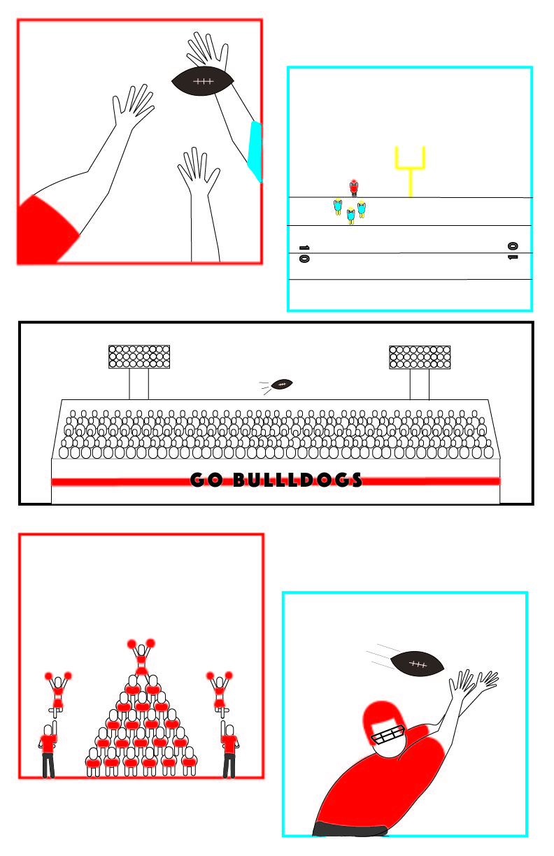
fact is action is the best way that I believe to challenge a readers traditional reading style. That being said I then choose to pick a topic that is very action packed and I came up with “Football.” I choose to offset the the comic frames as too inhibit a person’s natural reading style. I also focused on using the actual football itself as a tool to make the time between frames seem obscure. Three of my five frames include the football traveling. I think the traveling of the football is what guides the viewer through my comic strip. My comic features two styles of closure: Action to Action and Aspect to Aspect. The Action to Action is represented by the football traveling and the players attempting to receive it. You can tell multiple people are in pursuit of the ball. I think it is important that I left it up to the viewer to decide who is on offense and who is on defense because it changes the story either ways. The Aspect to Aspect is represented by the frame of the players, the frame including the crowd, and the frame including the cheerleaders. I believe that my comic strip does a great job of having an obscure timeline. You could look at my comic diagonally and it would still make sense. I think that the football driving the timeline is what sets my comic apart. Additionally, my comic doesn’t feature who threw the ball which makes it possible for the viewer to interpret it in many different ways. I have use the Illustrator software once before in Com 210. That is the extent of my experience with the software. The tutorials taught me alot. Most importantly though it taught me how to organize my work in the illustrator software. The iconography I used varies from somewhat realistic to bubble people. I did this to express that my frames were either up close or far away. I think that viewers will pick up on this because only two of my frames feature somewhat realistic figures. Whereas the other three feature bubble people. I would also say that viewers will interpret my iconography as being very organized and precise. I think my limited experience with adobe illustrator was my only limitation when it came to this project. I found myself using the anchor point tool and the arch tool to create the shapes and figures I wanted. I also used the layers panel extensively alongside the properties panel when it came to my figures, color splotches, and shapes. Creating the figures was quite challenging.
