
Final Poster Comic
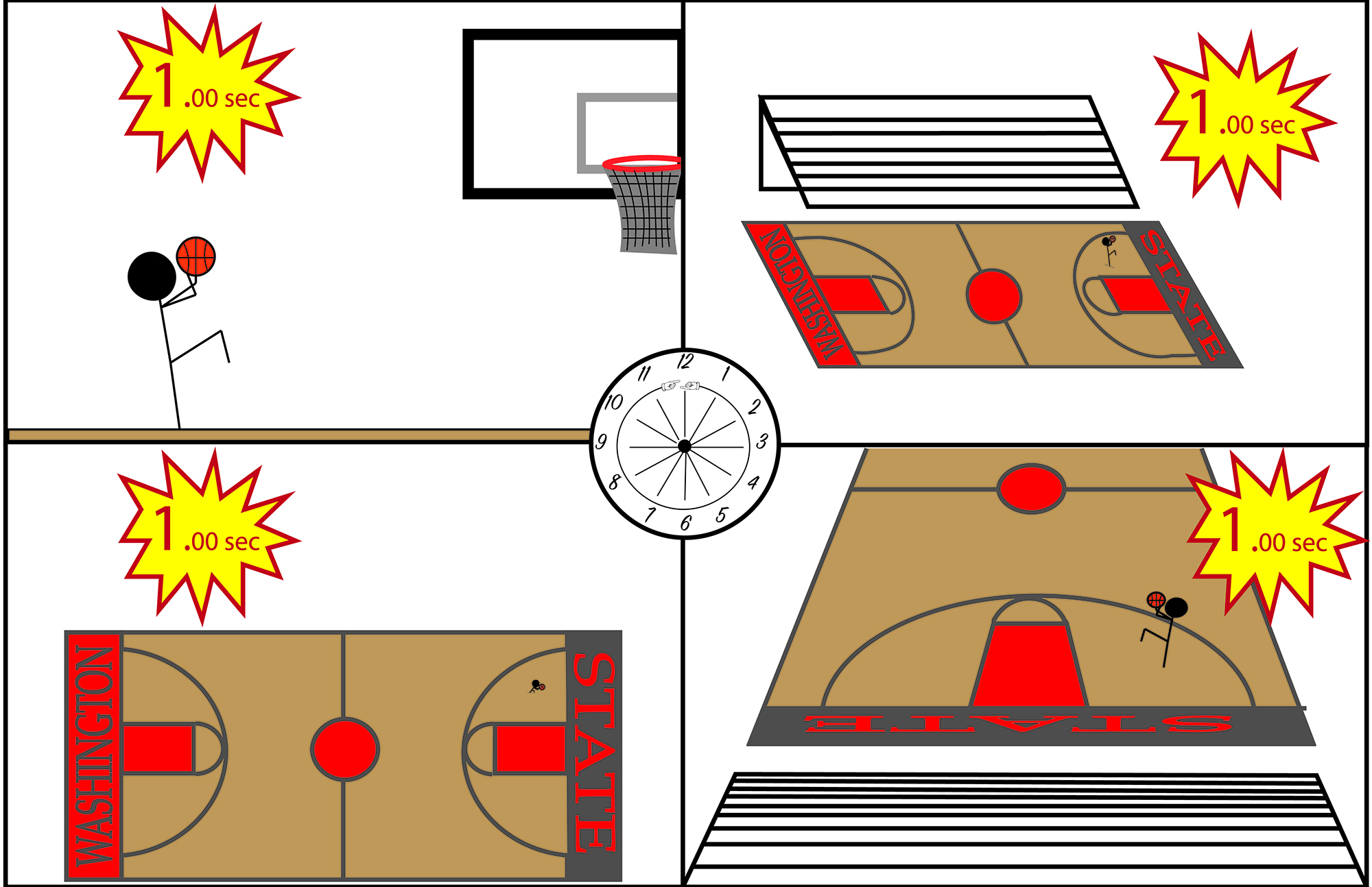
For my comic, I wanted to convey an action scene, but in each frame, I wanted no time to have passed. I wanted to show a moment in time, relayed at 4 different viewpoints that all have different suggestions with it. I chose to include a clock in the center with hands pointed at every hour symbolizing time has stopped or that this scene can be at any hour of any-day, or every hour of everyday, if it continues to be still. Although there are 4 distinct panels, no matter which panel one chooses to focus on, no time will have passed from the panel prior. A typical reader might still read this comic left to right, however, they would realize the lack of time throughout this comic, making it a depiction of one single moment in a scene. I think my comic conveys closure by allowing the reader to view it as a whole, rather than frame-to-frame. Because of the different perspectives, it makes one view it as one whole image, rather than 4 separate ones. I used the linguistic mode to show the amount of time left on the shot clock. I did this to reinforce the fact that no time is passing, for once someone sees the time is the same in every frame, they will be able to decipher the one single moment. I thought this strategy was cool because basketball is such a fast paced and quick game, that not many people are able to stop for one moment and look into the different perspectives. This comic allows one to see viewpoints, including court-side, of something like a game winner with one second left.
Fortunately, this is not my first experience with Illustrator. I was introduced to this program in my Editing and Publishing class this semester, and have been able to practice with help from my instructor. This slight experience helped me with this project because I was already aware of most of the functions and tools, and the abilities they obtain. As for my comic, I tried to make most things simple, yet still give off realistic and artistic qualities. I chose to use stick figures to have this simplistic effect, however, with the court design I tried to make it look more realistic. I think this allowed the reader to focus more on the surroundings and the setting, rather than the main character. I also used bright colors for the more urgent and important parts of the comic to make it easier for the reader to see. I think creating outlines with text was the most useful because it allowed me the change the degree of text and place it in different spots that I was not aware of previously. Ultimately, the tutorials provided assurance that I was on the right track, while still informing me on some things that were unknown to me before, and turned out to be greatly beneficial.
