
For my graphic novel I chose The Authoritative Calvin and Hobbes. I chose this book in particular because I grew up reading the newspaper everyday and was always excited to read the comics. It gives me a nostalgic familiar feeling, it stuck out more to me in comparison to the others. I liked how some pages are in color and there is a lot of variation in the size and kind of frames. (This is something I had notices as a kid reading these comic strips.)I feel like it puts an emphasis on what is happening within the story. The images I chose show how some pages, panels or even just frames can appear in different sizes, shapes and in color. I also wanted to show how sometimes the frames could be absent from the page but the scene continues (like in the black and white page).
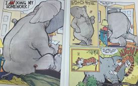
Calvin & Hobbes pg 8-9
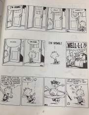
Calvin & Hobbes pg 17
I can see a good amount of motion, it is shown by using lines (to act as wind). I feel like the movement is represented well and shows step by step what is happening. I can tell from frame to frame the type of movement that is supposed to be represented. Since the characters Calvin and Hobbes are well known they are easy to identify and see from action to action. The identification o characters also help for subject to subject because I can also tell what characters are interacting. Since the frames and panels are always changing it brings an element of action to each scene, it lets the reader have a chance to intemperate it a certain way. For aspect to aspect my eyes are always wondering, although there is limited detailing there is always something eye-catching to look at. The non-sequitur element is not as present, I never really seemed to be confused by the order in which I should be reading/looking at things.
