
The film Helvetica, is a documentary produced by Gary Hustwit about typography in general; but also about the Helvetica as a typeface itself. In this film, many influential typographers and graphic designers provide their opinions on Helvetica and how they have seen this font/typeface explode to such a wide audience. Lastly, this film also explores the differences between modernist and post modernists and why the revolution and evolving of fonts has presented such a dispute in typography.
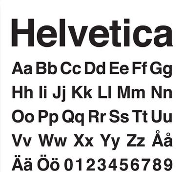
So, why is Helvetica so widely used around the world? What is it about this typeface that makes it so appealing?? Plain and simple, Helvetica is not overly complex and gets the point across in a clear and legible manner. The characters that make up the Helvetica typeface (as displayed to your left Fig. 1) are organized just like the structure by which the typeface was created. Straight forward and always horizontal and vertical strokes on its ends, never slanted or diagonal. Also, Helvetica’s use of white space below letters makes this typeface
more adaptable for a wide array of different projects one might have. This gives the typeface a more contemporary and polished look that is easily legible, as seen below in Fig. 2.
When it comes to Helvetica there are really only two outlooks to this font, Those who hate it and those who love it. Designers for example, choose their font based on the message they want to convey. But in some cases designers struggle to find a font to use and play it safe by using Helvetica as a reliable back up option. You will also find commercial companies use Helvetica for their logos, advertisements, and marketing materials to capture the consumer’s attention while not confusing them with the message you are trying to get across. An example of this would be the old American Airlines logo that uses two capital “A’s” next to each other in Helvetica. American Airlines used Helvetica because it was simple and easily readable when it is in motion. Fig. 3.
I would have to say this documentary was very informative and made me realize that Helvetica is used on pretty much everything from street sign to billboards to words on buildings! One interview that stood out to me in this film was with Erik Spiekermann when he was talking about his obsession with type and that made me think that the time designers have to invest just exploring different typefaces is very prominent in a designers success on a project. He also goes on talking about how Helvetica has no rhythm and no contrast like if we were to just write letters on a paper our self. This was really interesting and made me think about what my hand writing would be categorized as. This got me thinking about how I can change the way I write to present myself in a more creative way. This combined with my love of travel music and soft studying music that I listen to on YouTube, made me come up with a typeface that resembles my own creativity and modernist point of view.
