
Leaflet from MASC at WSU
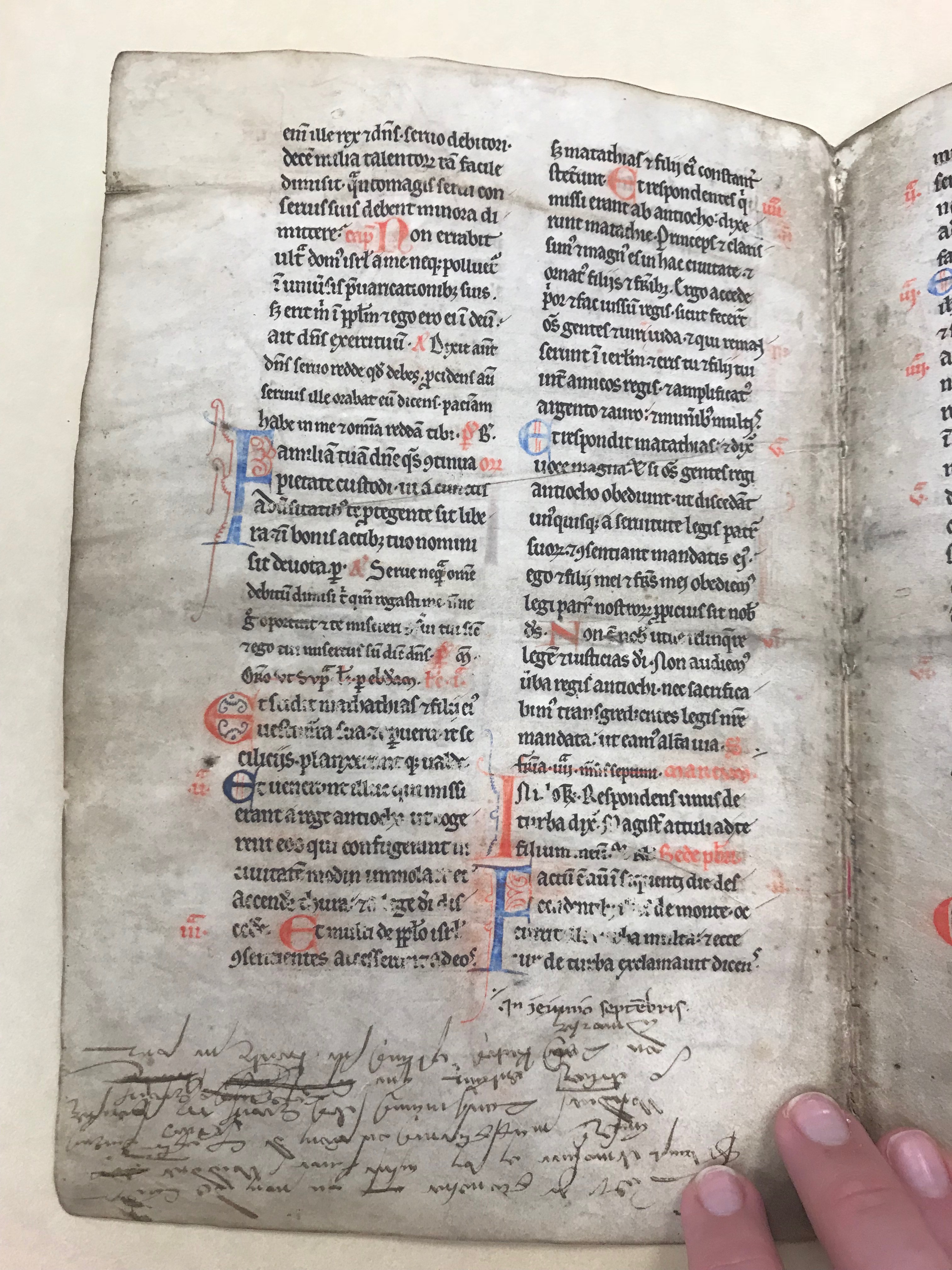
I thought this leaf from a book was interesting because of all the care that this page has seen. The calligraphy is very uniform and the x-height of the lowercase letters is remarkably even. There are no ascenders or descenders written in black. For every uppercase letter, the scribe used either a red or blue ink along with enlarged the size to make it stand out. Letters at the beginning of a paragraph are even larger and have added linework for decoration. The lettering is definitely in a humanist style and is very upright. There is a little bit of contrast because of the way the pen is moving on the paper, if it is moved at a certain angle, the line will be thinner or thicker. The letters sit very evenly on the baseline, making it hard to believe that the text isn’t printed on the page. There is a part of the page that has words crossed out with a red ink and I’m very curious if that was a mistake by the scribe or if it is intentional.
Another thing I thought was interesting with this page was that there was handwriting on the bottom of the paper. There are definitely some similarities between the handwriting and the calligraphy. The writing is very angular instead of rounded just like the text above it. I think this was due to the way the pen works. The x-height is very uniform, however, the ascenders and descenders are much longer than in the text above. Unlike the slight serif in the text above it, the handwriting doesn’t have any serifs on its letters.
