
Author: Olive Simon; Julius Rodenberg, 1884-1970; Beatrice Warde, 1900-1969. Publisher: London: Peter Davies Ltd. ; New York; Harper and Bros.
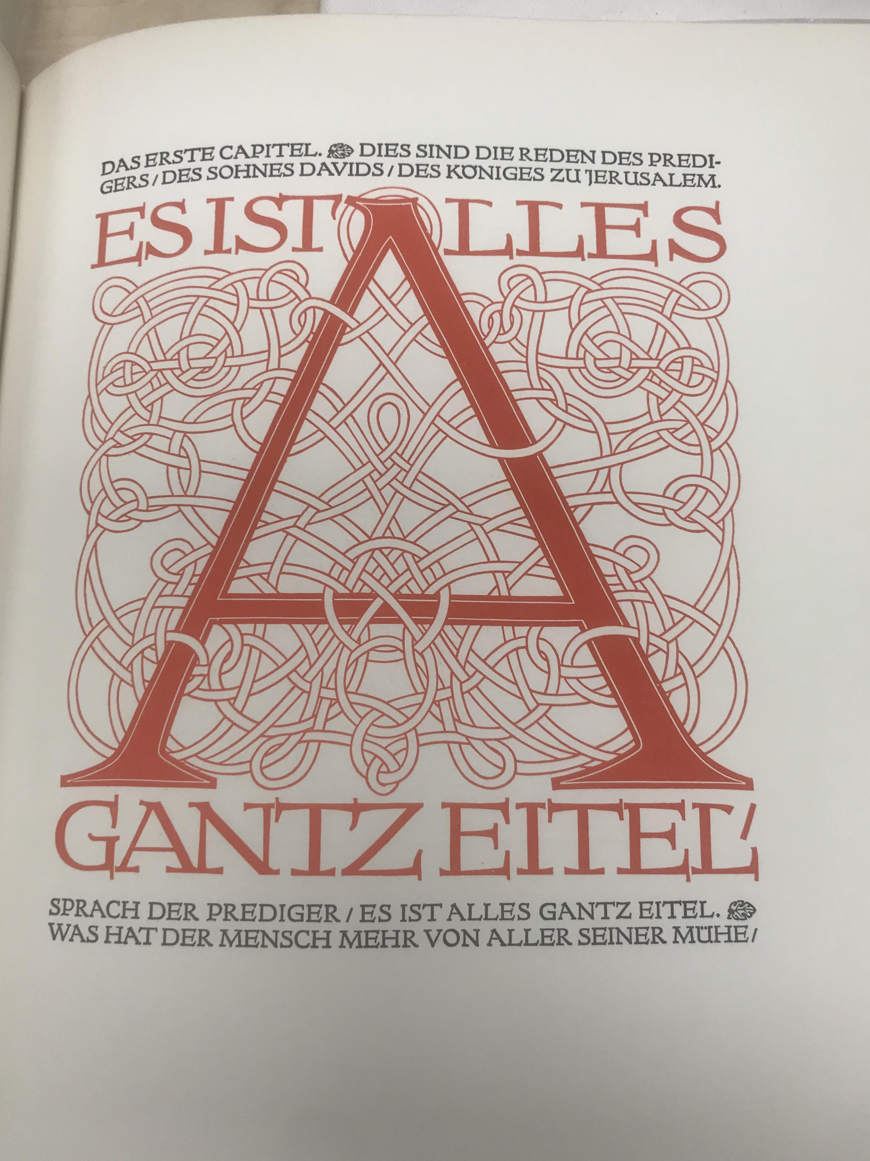
I think that the example that I chose has the presence that it does because not only is the normal letter itself different from a general serif font like times new roman, but it also creates a more medieval atmosphere to the text. The wording and lettering above and below the main letter frame the larger one showing it in an almost grid-like context. It is an all capital type font so there aren’t any visible ascenders or descenders that I can see. The roping or artistic design around the main letter almost resembles Gaelic knots. Which adds even more to the old or ancient aesthetic that the type gives off. If I was to use this font in anything I think that it would likely be for either a medieval or mythical setting. It looks similar to Tolkien’s fonts within the book The Hobbit. Looking back again at the roping it is almost like netting, an organized mess of a design. The design around the type most definitely adds to the overall image, it created a context for the typeface; without the roping, the type almost loses it’s emphasis and begins to almost look like an old style of handwriting. The serifs of the type are very exaggerated while the stems/body seems to be a consistent weight creating a very neat collection of letters. The lettering has a curve to the bars and serifs, this is likely why it might seem to be similar to a handwriting or organic font-style. I decided to choose this font for the blog post because it really stood out to me right away, I have always been fascinated with medieval-style art or inspired items. This type was one of the few more modernly created styles that reminded me of older penmanships or written styles.
