Out of the many examples of the Helvetica typeface to choose from, I chose the cover of my Geology textbook as an example. The title, Essentials of Geology, rests along the rocks in capital letters with a high x-height. “Geology” looks as if it is a sign sitting directly on the land, the baseline hiding among the rocks. Observing the history and purpose of Helvetica, I believe the designer of the cover used the typeface in capitals to create a very strong, grounded message that relates to the field of geology, while also creating a sense of accessibility to students.
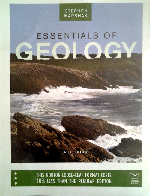
Geology textbook Essentials of Geology by Stephen Marshak
Helvetica was created during WWII by Max Miedinger in 1957. He wanted to create a fresh typeface that would represent a new era and standard. The type classification is transitional sans serif, meaning it is more sharp and vertical than other typefaces. This creates a modern look, yet it succeeds in acting very neutral. This is why it is seen everywhere. Typographer Erik Spiekermann says that “you have to breathe, so you have to use Helvetica.”
The scale that Helvetica is in seems to be larger than average since all the text is in capital letters. This also helps present the grounded message I believe the designer was trying to achieve. The smaller text at the bottom seems more informative in the capital form as well. The scale of the word “Geology” is larger than the rest overall, looking like an actual landmark on the ground. The type family also adds to its superiority. “Geology” is bolded while “essentials of” is in roman form. It creates a sense of time and space, which are important factors in geology.
Helvetica also suggests accessibility. Media writer Leslie Savan says that “Using Helvetica can seem more accessible, transparent, and accountable.” Since it is a college textbook, these attributes are very important when observing the typeface. By using Helvetica, the textbook seems to be more accessible to everyone, rather than to just a certain group of people, such as geologists.
