
This sign is for the McDonald’s drive-thru. “McDonald’s” and “Drive-Thru” both use the type face Helvetica. Helvetica is the typography that focuses on the white space in between. After the war in 1950, typography designers changed their styles to more modern, which introduced Helvetica in 1957. Designers wanted to do away with details and wanted a more neutral typo-graph. Helvetica is a clean, legible, and universal font. McDonald’s uses Helvetica because it is a universal brand. They want a legible, efficient font so everyone can read it. McDonald’s already stands out with its golden arches so it doesn’t need a destracting font, instead it uses a simple, clean font. Since, everyone knows the golden arches, “McDonald’s” doesn’t have to be big, instead the “Drive-Thru” is on a bigger scale so people can see that it has a convenient drive-thru. McDonald’s is all about being convenient and fast, so this simple font helps promote that.
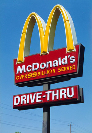
McDonald’s Drive-Thru sign
