
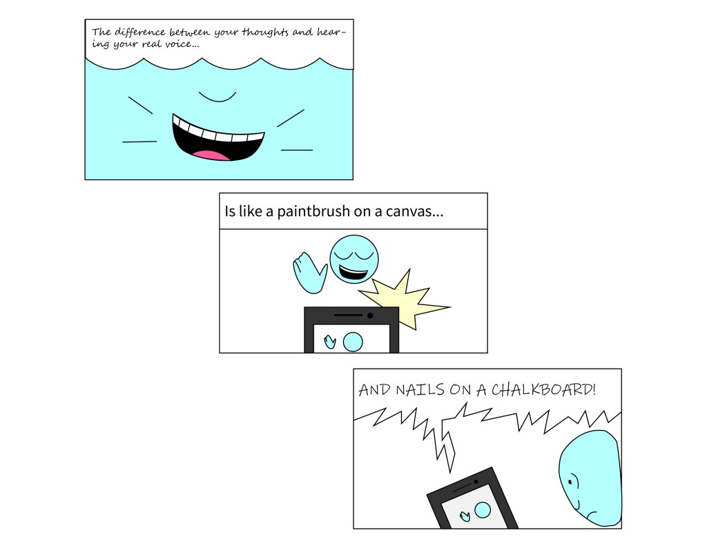
For this word specific assignment I wanted to test some new techniques and tools. I came up with the idea of the joke of hearing your own voice when I learned that this project should focus on word scripture and text. I also wanted to show a clear downfall in the quality of the text. From elegant and nice, to basic and ideal, down to erratic and unpleasant, just like my voice. I also show the decline by having the panels go from top left to bottom right to keep the left to right reading pattern but also a panel display of dropping.
I first drew a mock up visual to make the Illustrator process easier and with guidance. I minimized the the colors in this comic because I wanted to let the narration or text be the main focus. I used the eyedropper, pen, ellipse, and swatches to create the images. For the texts, I used the pen tool to make the two different text bubbles. I also changed fonts and different bold lines. The fonts I used in order of top to bottom were: Segoe script, Source Sans variable, and Ink Free.
the assignment was cool and I had a good time changing the focus of the comic from the visual to the text and making use of the joke about talking.
