
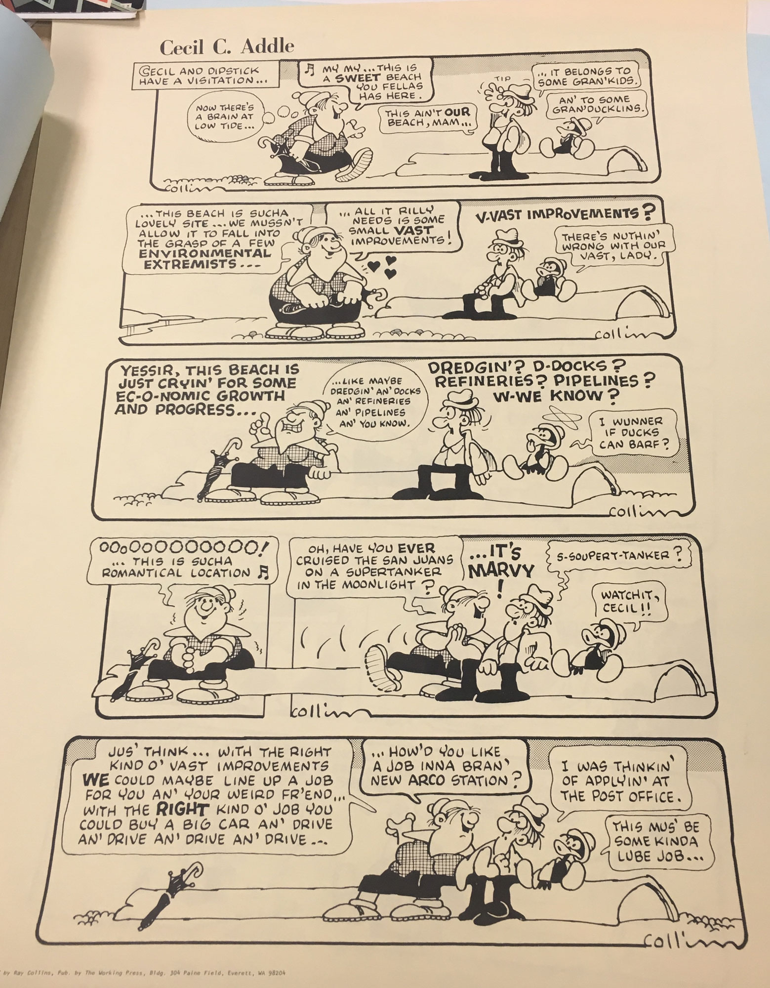
This photo is of a comic called Cecil C. Addle by Ray Collins.
In chapter 5 of Scott Mcloud’s book titled, “Living in Line” he discusses the significance line styles play in the visual of a comic. While visiting the MASC, I really enjoyed analyzing all of the ways Ray Collins utilized lines in his comic series named Cecil C. Addle.
The lines presented here are solid and bold, similar to that of Scott Mcloud’s illustrations in our textbook. I personally tend to find these solid and bold lines more pleasing to look at because they are clean and cartoon-like. In the second panel of this example, three small dashed lines are indicating that hearts or loving nature is coming from the female character.
In the second panel, short and crescent-shaped lines are made to represent anxious shivers coming from the male character while the same lines are coming from the female character in the third panel which represents excitement. The expressions on the character’s faces allow the viewer to make sense of the lines in apposing ways even though they are the same when it comes to design.
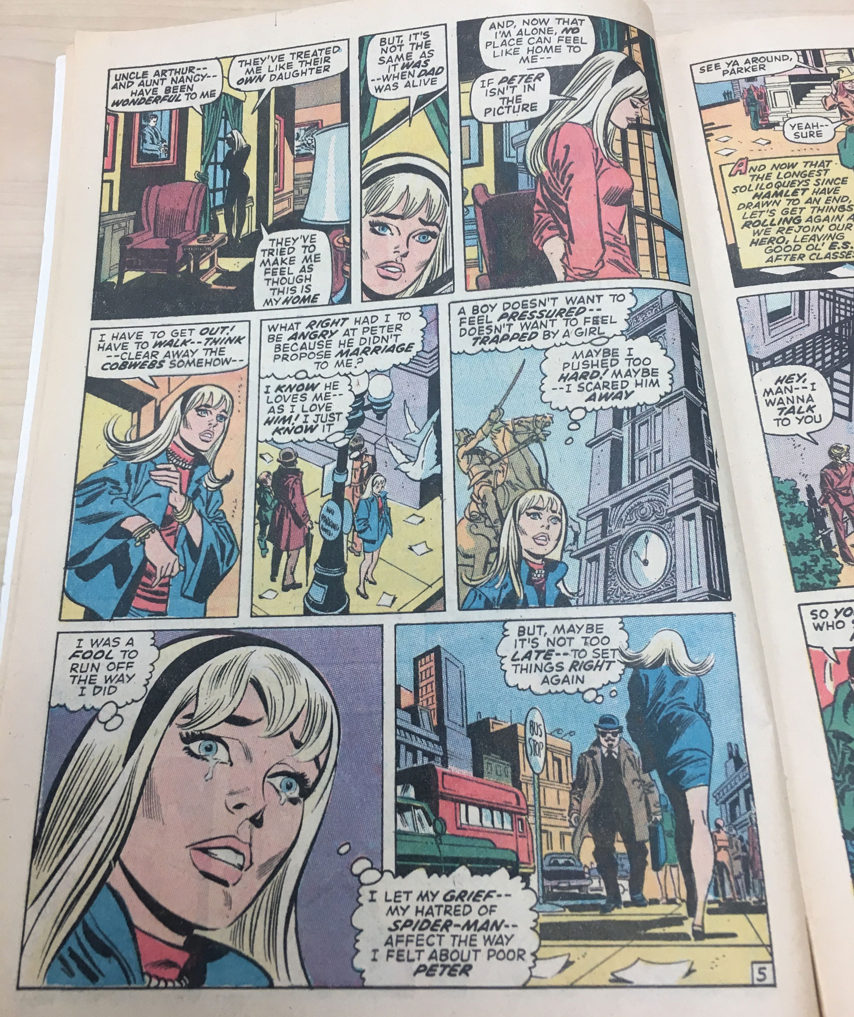
This is a page from The Amazing Spider-Man: The Goblins Power Comic by Stan Lee. Published in 1971.
In chapter 6 of Scott Mcloud’s book titled, “Show and Tell” he went over the amazing ways image and text can complement another. While looking through The Amazing Spiderman comic by Stan Lee, I really loved the way this page conveyed the emotions this female character was feeling, however, the world bubbles provided an additional set of context that allowed a reader to see exactly what she was feeling and why.
In the first panel, the female character is gazing out of a window in deep thought, as many dramatic thinking scenes have shown on many creative platforms before. The visual in the first panel sets an obvious tone, but I would have had no way of knowing that the character was contemplating running away because she wasn’t happy with her relationship dynamic. My imagination could have taken the image in a totally different direction. The word/thought bubble coming from the female character explained that she was upset at first and then by the end of the page, she is more hopeful.
