

A frame from page 39 of Scott McCloud’s ‘Understanding Comics’
Spreads from McCloud’s Understanding Comics are effective in showing Lovett’s element of design in lines, shape, size, and as well as showing Lovett’s principle of design in Gradation. When looking at Lovett’s definition of lines and how they add elements to a drawing or painting, hatching lines can be used to show tone. McCloud’s uses this technique when drawing a man’s tuxedo in his fifth frame on page thirty-nine. By using tone where he did, it allows the viewer to get a better sense of what Kinde of tux the man has on.
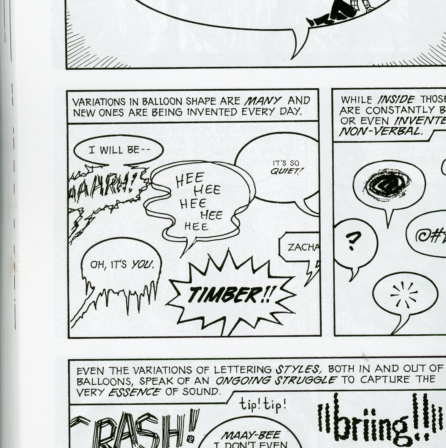
A frame from page 134 of Scott McCloud’s ‘Understanding Comics’
Shapes in elements of design are central when creating a drawing or painting. It is what brings an object or idea to life on a page. Lovett describes abstract shapes as being used to trigger a response when used. Each speech bubble in McCloud’s frame (from page 134) is drawn a certain way for the viewer to read it depending on their response to it. For example, the speech bubble with ‘Oh, it’s you’ can be read as if the individual was severing because the shape of it suggests that it’s dripping with icicles.
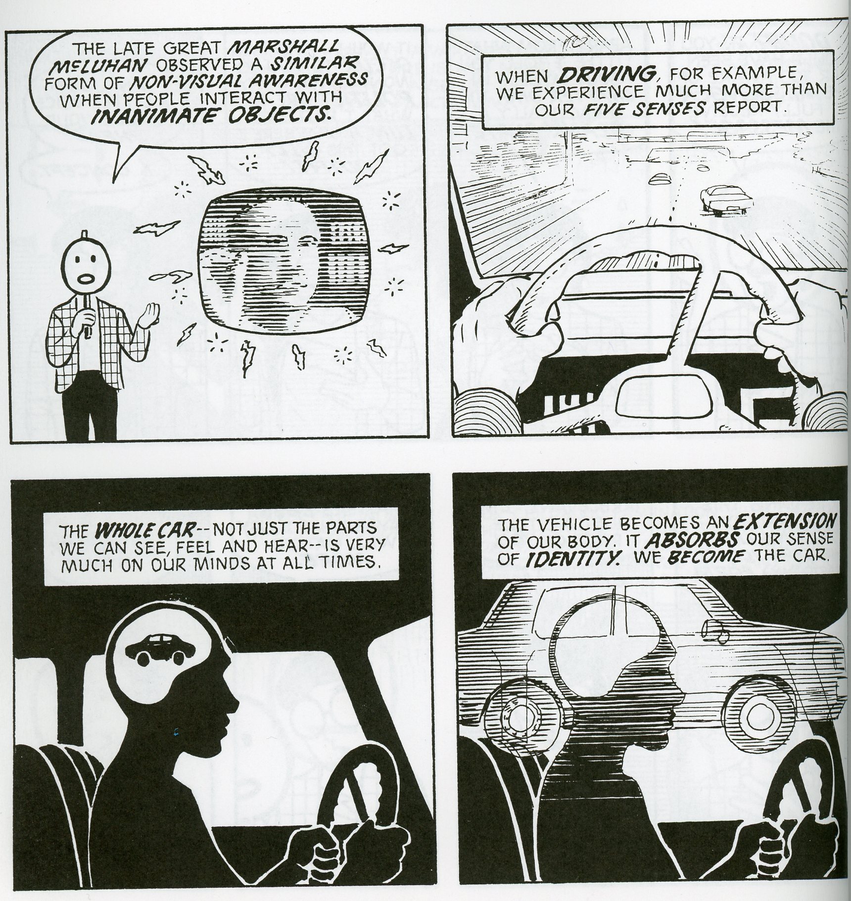
A frame from page 38 of Scott McCloud’s ‘Understanding Comics’
Lovett places the sizes of objects as what it is compared to other objects. When looking at a painting or drawing, your eye tends to first look at the biggest object in the painting. In Understanding Comic’s our reading is narrated by the same guy (McCloud). Even though we are used to looking at our narrator in Understanding Comics, the size difference in the first frame on page thirty-eight draws our eye to the lined photo of a man. This is because the little size difference commands your eye to look at the dominating shape.
The design principle, Gradation, is what Lovett refers to as an element in a drawing that applies to the gradual change with movement and direction. Gradation is being used by McCloud in the seconded frame on page thirty-eight to show linear perspective. The lines in the penal give the illusion that the car is moving in a forward direction and ahead of them looks smaller because it is further away.
