
In Scott McCloud’s understanding comics we see that he uses different designs in every part of his book which makes it way interesting to read through. I also feel that Lovett and McCloud had the same idea and goal into how a comic should look like in terms of the design they used thus making it easier for the reader to understand what the comics are all about.
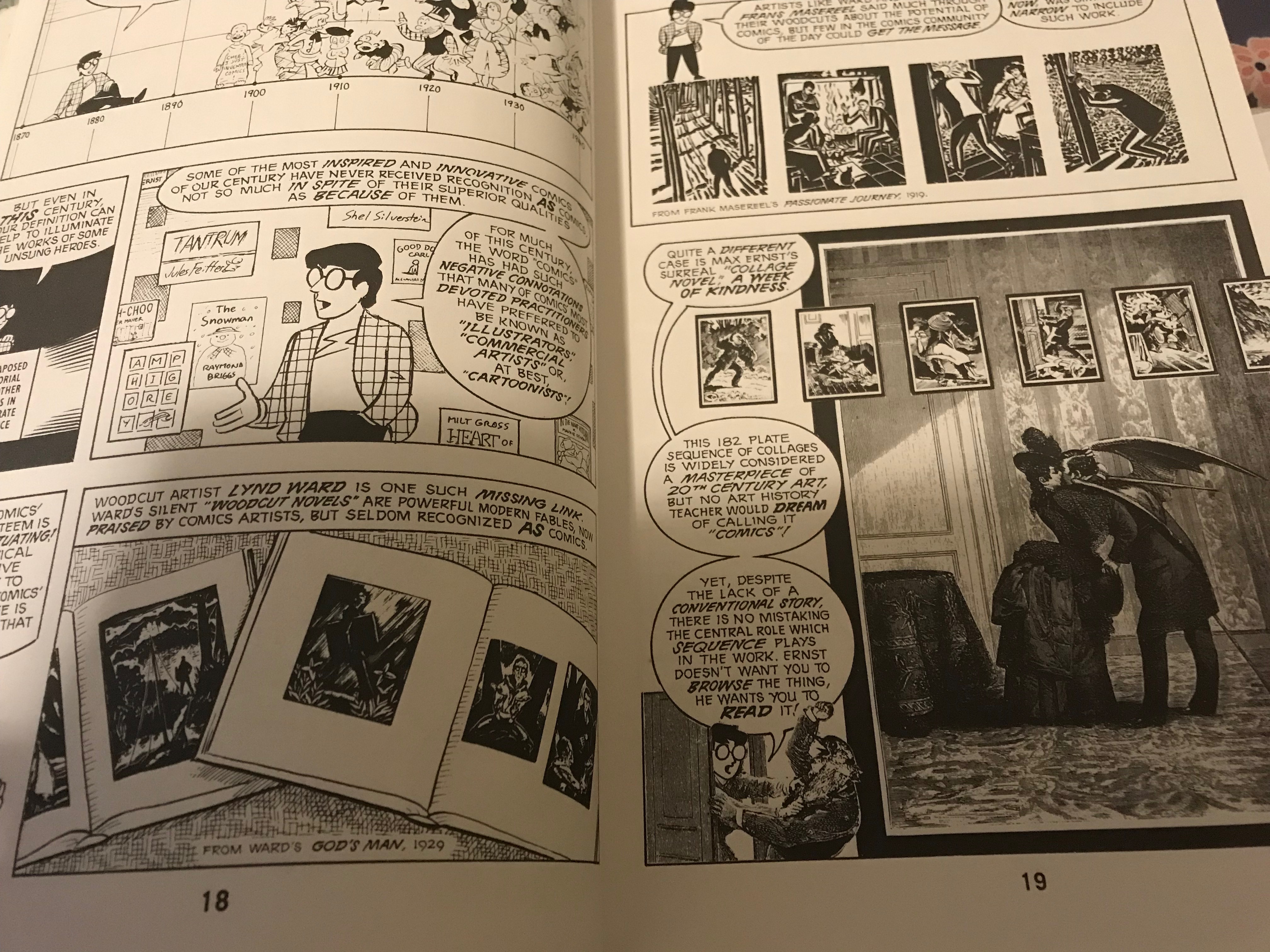
Understanding Comics By Scott McCloud pg 18-19
I came across 2 pages in the book that caught my eyes that are page 18 and 19 where we a different design being used in terms of the images used that seemed to me that some real pictures were used to show the activity that was taking place in the story. and also the use of visual mode where use of images are seen by the reader via use of color, the size of the images, the flaming and the size. McCloud clearly used all these to keep the viewers entertained in one way or another.
The text in these two pages are written in an artistic form where McCloud uses dark text to emphasize something in the story. it is interesting how he catches our attention by visualizing thing in a more creative manner. We can also see some pictorials taken from a book and the line up he uses make it easier to follow and this is something new to me since i didn’t know that a comic writer could do this to be able to give more details in as much way possible to the readers. It does make it more appealing .
