
Scott McCloud Book
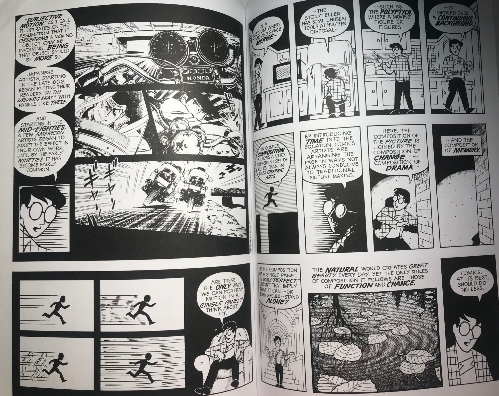
There are a bunch of design principles that McCloud uses for his comics but there is two pages that I thought were very interesting. I like the lines that are being used in the bottom left corner, it shows movement, and it makes the photo more realistic. The lines also show direction because the lines are showing that the figure is running to the right of the page. The other principles that he uses are shapes and size. He used big leaves that take up a full-frame and he also uses one big box to put three pictures in them (top left page). His shapes are also perfect but messy at the same time. For this comic, Scott does not use color and prefers to use only black and white. He only uses color towards the end of the book. The principle of color is huge for these two pages because on the upper left page, you see that there are two people riding a motorcycle and you can see the texture of the street. The texture is also used in the bottom-middle right-hand page with the leaves. Scott wanted to make the leaves look like they are floating on water and that the tree is a reflection by using texture. The texture is key for a lot of comics to make them look more personal. There is also a lot of unity in these two pages. Almost all sections are united into creating a story and they are all saying something. For example on the top of the right page, all four frames are united and go together. Finally, a big part of these two pages is tone. There are some frames that are lighter than others or more shaded to add more effect in the design.
