

Designed by Joseph Gardner, August 2019.
I was excited to hear that we would be making comics in this class. However, for my first post, I wasn’t sure of how to make a comic. I thought of comics as they traditionally appear in comic books and in newspapers. We talked about it in class, and I realized that they could be more.
I wanted to challenge myself while creating my first drawn comic. I couldn’t decide what to draw at first, but I eventually settled on recreating a photo of Edward R Murrow. The original photo is in black and white. When I made the image, it started out monochromatic as well. I ended up adding the blue in the end, because it looked kind of flat.
Designed by Joseph Gardner, August 2019.
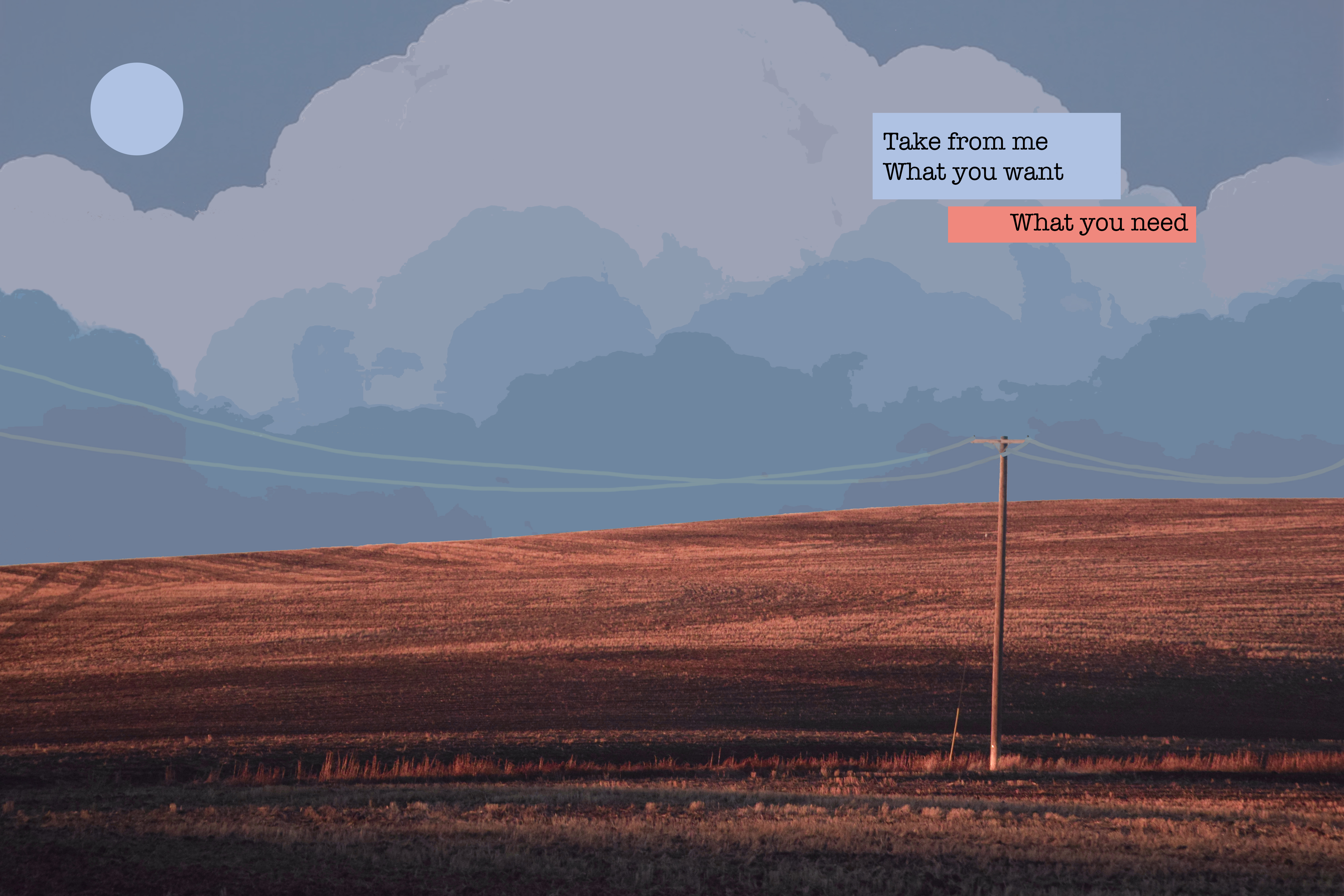
For my second post, I edited a photo in Photoshop and drew in a cloud background. I also added some song lyrics in a text box. I feel like this comic is a lot more personal to me, because the photo was taken during a very emotional time in my life, and the text was chosen to reflect that.
Creating the digital comic was easier for me. The physical drawing took a lot longer, and I’m not exactly happy with a lot of it. I wanted to put text under the photo where the black box is, but I didn’t like the way it looked so I filled it in black. With photoshop, I messed up just as much or more than the physical copy, but I could undo and erase things a lot easier. However, Photoshop makes things a lot less organic in my opinion. There’s a lot more flat colors, and straight lines, which looks good if you want something simplistic. However, it’s harder if you want to create a complex art piece. I had originally wanted to create a completely digital art piece, but I wanted to keep the texture of the hills to make a more mixed media look.
I think the biggest difference between reading a comic on screen versus in a book is that it’s easier to display a bigger story on print. With digital art, you only have the confines of the screen to tell your story. You can always scroll down or move on to the next web page, but it’s not the same as in a book.
After reading the first chapter of Scott McCloud’s “Understanding Comics”, it gave me the idea to insert text boxes. In the first chapter, McCloud discussed how comics are comics and not exactly just an art piece because they tell a story. In my first comic, I don’t feel like there was that much of a story. I wanted to change that with my digital comic. I added text and created juxtaposition through a contrasting color pallet and a mixed media feel.
Overall, I’m much happier with my digital comic. It looks more polished and shows a lot more of what has happened in my personal life.
