
Created by Vecteezy
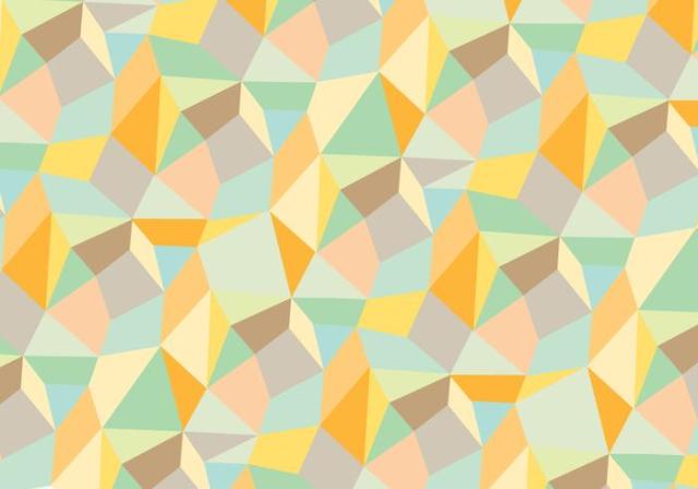
In this photo we see multiple colors working together to create a pattern that leads your eyes. We see the darker hue of brown intensify the the yellow hues in the pattern. In the opposite we see the light blue get less intense because of the lighter shade of green which has low contrast. The colors all have a pretty low value of intensity except for the dark hue of yellow/orange. Lastly , the colors are in fact complementary, but lack high contrast.
