
Color interaction is what can create the most emotion when it comes to design and composition. That is one of the primary reasons behind design, photography, etc. A black and white photo compared to a full color photo can create an entirely different mood and appearance. When it comes to patters, color selection can determine how the pattern shapes together.
 In this image I took, I will be focusing on the detailed pant ribbing this model is wearing. A close up look shows a stripped pattern with fiber detail to create even smaller patterns within the horizontal ones. Because of the slight wash on parts of the denim, it c
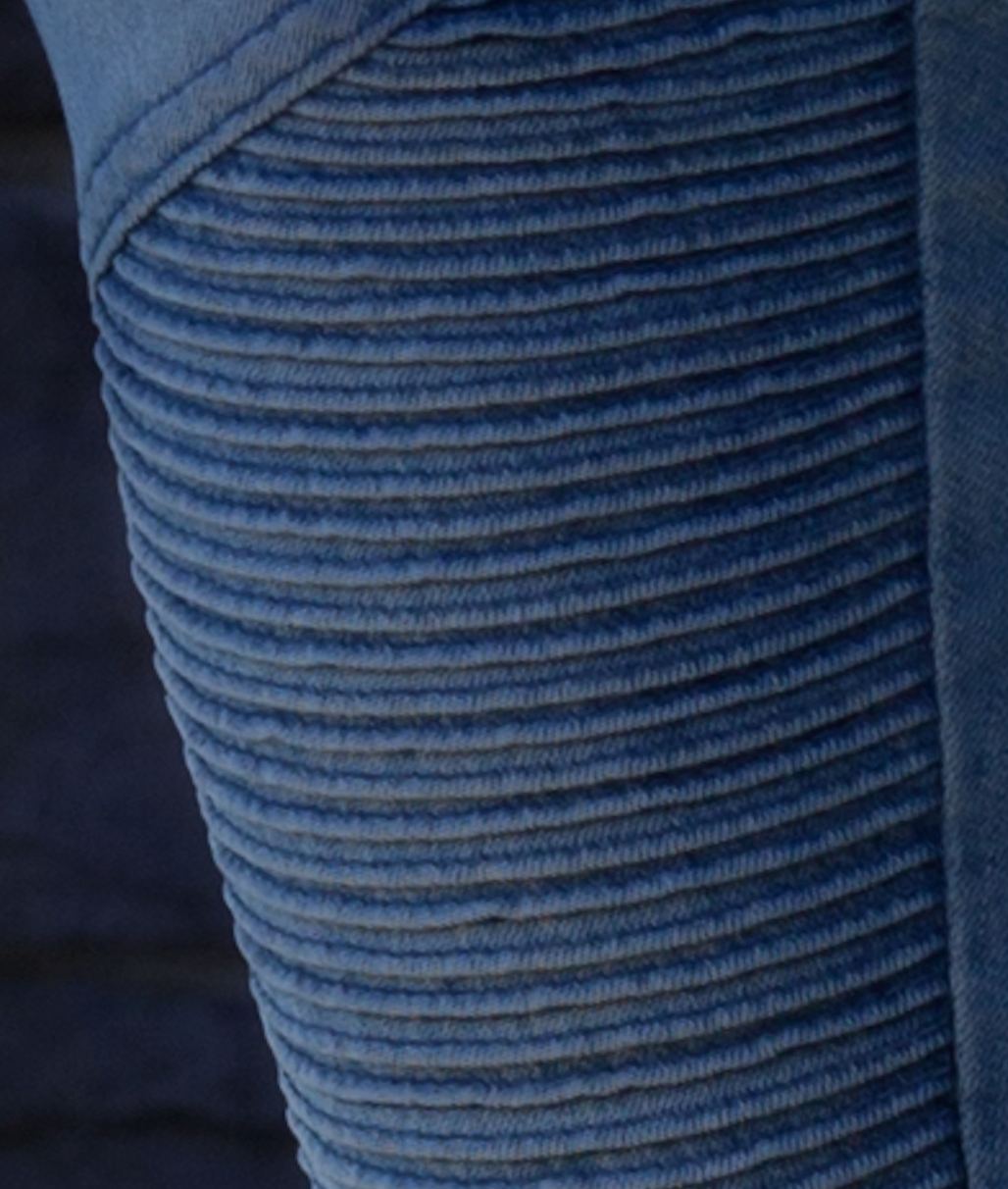 reates a darker line in-between the lighter ones, giving it only a slight contrast. The pattern looks very smooth and does not have much conflicting with each other. The lighter pieces stand out just a bit more than the darker ones because they look like they are layered in front of the darker ones, bringing it the attention.

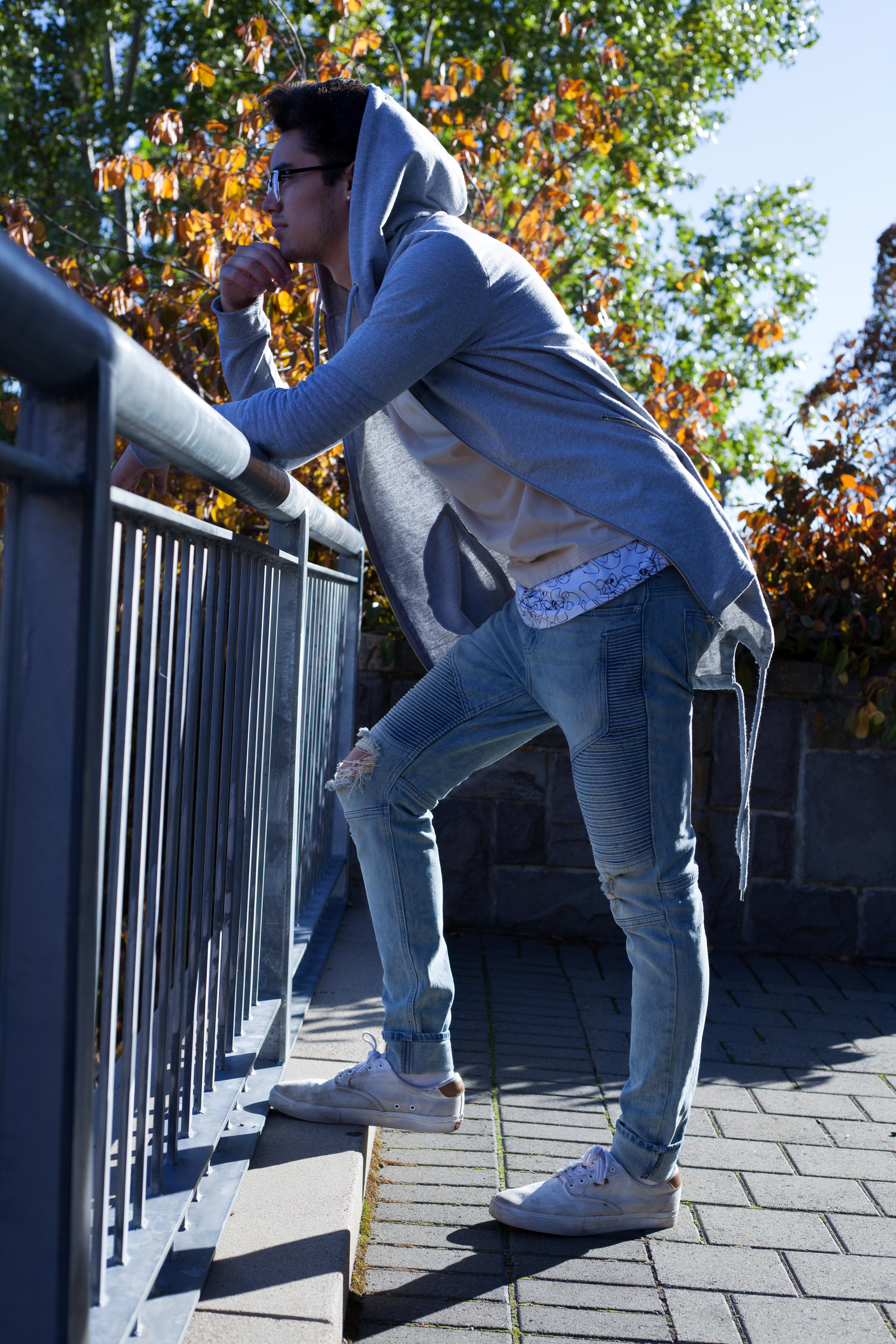
The pattern in this image from a fashion lifestyle blog shows how cool colors interact with each other. The color pallet creates a particular mood from the ow saturation and high contrast. The selection of how the colors are placed in this pattern bring attention to the very dark line in blue. The colors start much lighter on the outer parts, and darken very gradually as they come to the center (the blue line). The major contrast of the individual blue line to the rest of the shirt bring attention to the value as well. These colors all fall under blue, green and yellow hues, making the color scheme analogous, while still creating a major contrast. It is what helps create the gradual flow through the shirt as well. The asymmetry of the pattern is what helps the selective emphasis.
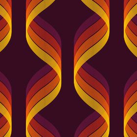
This paper pattern is an example of how triadic selection of colors on the color wheel play well together. The colors chosen bring a warm feeling to the viewer. The shade of purple cis normally seen as a cool color, but put with the other ones gives it a warm tone. The tapering of saturation throughout the paper helps guide the eye along the pattern. It has an organic shape the way the lines move, but create a geometric feel all together because of the symmetry.
