
Walnut Street Grill Menu, Cincinnati, OH form http://www.underconsideration.com.
This is a good example of using hierarchy in a menu design. I noticed in this menu they used weight, color and different fonts to convey the hierarchy of the menu. This is a very good way to make the customers see different part of the menu and being comfortable with it. The hierarchy helps the customers finding their order in a fast way. Also, this menu is aligned very consistently. It kind of following a grid that splitting the page in a half and aligning all contents in this grid. The headers are very clear and they did a very good job on them. They emphasis them form other content and make them clear by using different font and color.

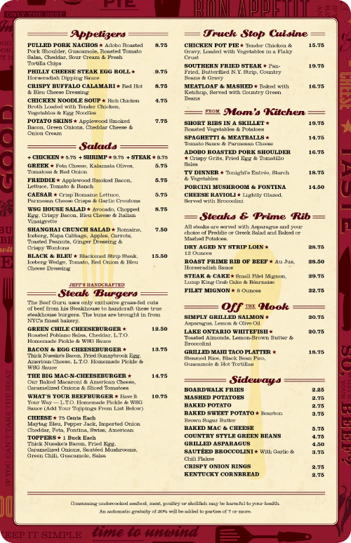
Menu design for Paradise Creek Brewery, Pullman, WA.
Comparing this menu with the first menu both did very good job of making the menu easy to read and easy to navigate thru. However, I think first example was more easier for me to navigate thru the menu because they used colors and two types of fonts. On the other hand, this menu has too many fonts makes it harder to know where are you at in the menu. I think if they used two fonts on this menu it will make it much clearer and more consistent. For example, they could use a font for the headers and another font for the contents. This will help the costumers choose their order faster. Also, in this menu, they used a center alignment to align the text. This alignment is enough for a menu with this much of contents.
Over all, the first menu has a better design and it is much cleaner than the second menu. The designer did a very good job of making that menu easily navigable with consistent alignment and hierarchy.
