
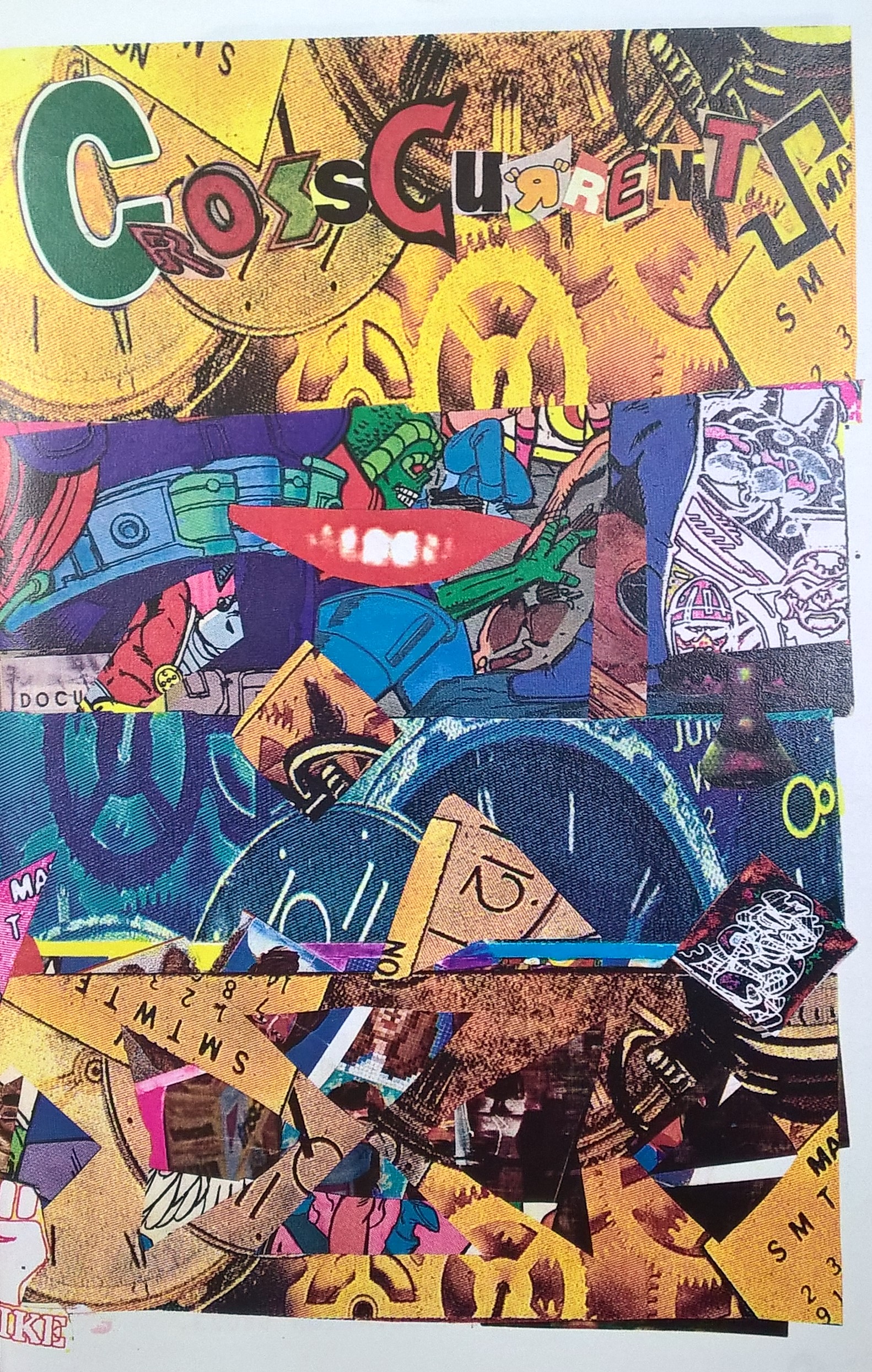
“Cross Currents” Comic from out visit to the archives and special collections.
This particular example really caught my eye when we visited the archives last Thursday. I liked how it looked like someone physically cut out different pieces from other comics to make a new one. I think this is an excellent way to have a lot of texture in our own works. The use of cut out text was the most unique to me, no other comic in the archives had this.
Hierarchy is really important in this particular comic book cover, there is a lot going on so the creator needed to emphasize the right parts so the reader does not feel overwhelmed. I will try to do the same by adding some depth to my comic by adding small drop shadows to each layer.
