
Page 43 from Lynda Barry’s “What It Is”
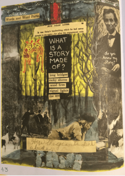
In “Graphic Design: The New Basics” by Ellen Lupton and Jennifer Cole Phillips, they describe texture’s purpose to “exist as an optical effect and representation” for a given variable. In Lynda Barry’s “What It Is“, we see that very thing being portrayed in page 43.
The trees are done in a texture that appears very much like water color (even though its a printed book). In addition, as explained in “Graphic Design: The New Basics” this page uses five squares and ten inches to change up the font across the page so that it represents the desired mood of the picture. Specifically the font at the bottom appears to be handwritten which contrasts with most of the remainder of the page. She uses surface manipulation to give the yellow notebook feel in the back in addition to helping achieve depth within the illustration.
Lynda Barry definitely took the time to apply texture on this page so she could create an ominous feeling to the entire passage. Visually, the page looks very eerie and she manipulated the fonts and the page using texture to give us that sought out feeling.
