
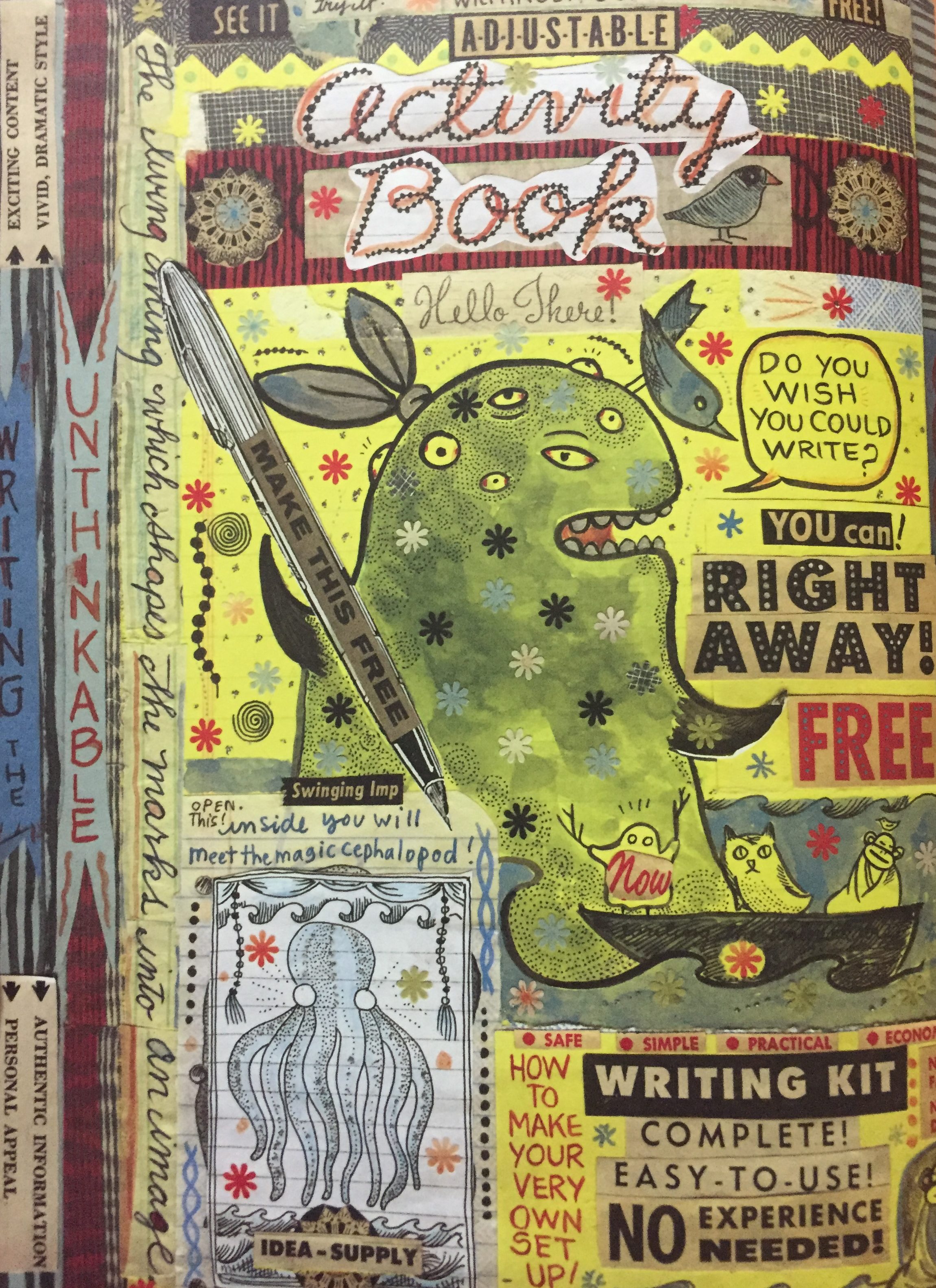
Page 137 from Lynda Barry’s graphic novel, “What It Is.”
While reading through Linda Barry’s graphic novel, it is very difficult to ignore the child like illustrations. This particular image I chose seems to be composed of layers, which create a texture that, the readers could feel. However, since the image was digitized the actual texture disappeared, leaving behind the illusion of the texture, while creating a connection between virtual and physical texture. As for the actual illustrations, judging by the scale, and positioning the middle one seems to be the main subject of the page. The main illustration is created by a combination of different textures, used as design elements to provide a correlation to the visual function they have been assigned by Linda Barry. The most obvious of the textures are the dots that create a pattern that decorates and adds detail to the character. The second texture I noticed was the splashes of what seems to be some sort of liquid/oil painting; this texture creates the illusion of a rough surface. Both of these textures seem to reinforce the mood and point of view of Linda Berry’s graphic novel, which basically speaks to the child within us.
