
The text I chose to inspire my alphabet’s design is a paragraph from the novel The Beautiful and Damned by F. Scott Fitzgerald. The novel is set in New York in the 1920’s, and the passage is describing a night scene in the city. I wanted my typeface to show characteristics of the city (buildings, architecture) as well as the 20’s Art Deco style. The text has a graceful, romantic tone to it that I want it to reflect as well.
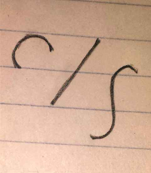
Chosen basic building blocks
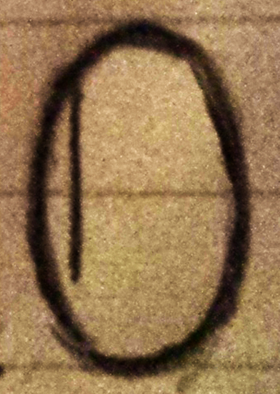
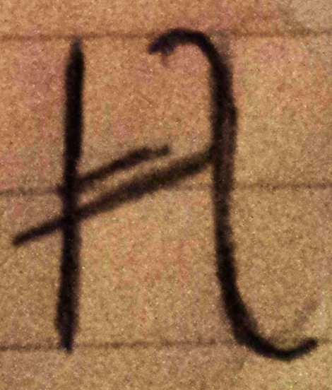
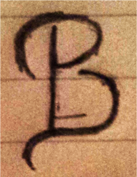
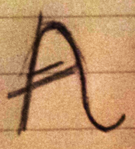
To build the typeface, I will be using a modular method, with a module of 4 by 3 units. I want the letters to be slender and tall like the skyscrapers of New York. The typeface will have a high x height to add to the overall height of the letters. I am using three basic units to build the letters, a half circle, a straight line and a curved, s-shaped line. Details like high, slanted cross bars, decorative smaller lines inside the letters and flourishes that create serifs give the proud and flamboyant style of the Art Deco movement. So far, I have chosen to build capital letters. Depending on how those go, I am thinking about lower case letters as well.

Kelsey: This is a strong start. I recommend using a few solid visual sources for Art Deco as reference. Your rules are specific, but also give you some flexibility, which is nice in this case. For example, the way you use the s-shape seems somewhat variable, which is important for fluidity, depending on the letter. How will the final version of the letters be executed? What will the line quality be?
LikeLike