
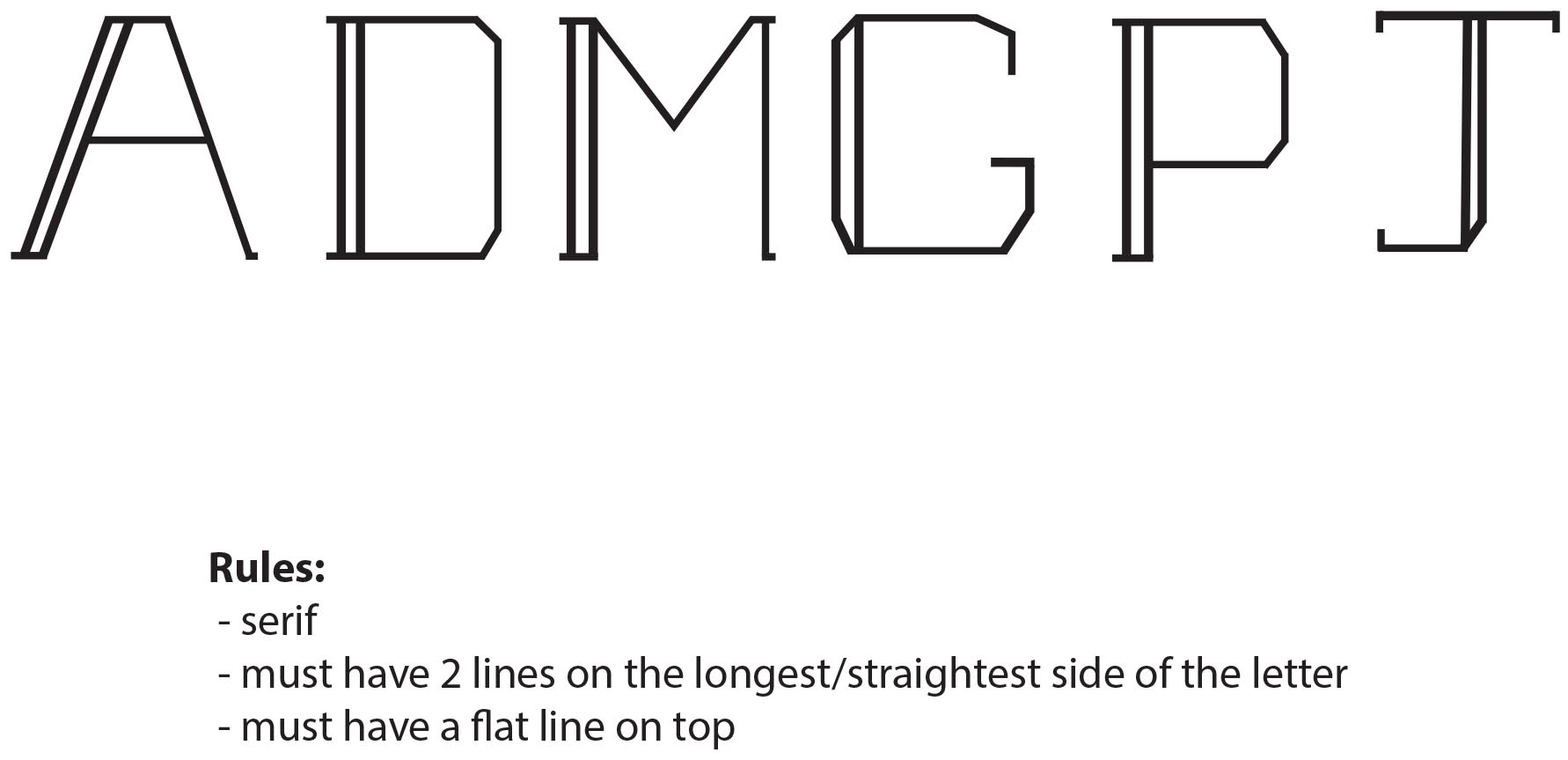
For my alphabet design, I wanted to create something that was simple, yet still had character. The rules I set for my design are 1. the letters will all be in a serif typeface, 2. each letter must have 2 lines on the longest/straightest side of the letter, and 3. each letter must have a flat top. I have designed six letters, trying to use letters that have straight edges, and letters that typically have more curved features. The letters D, G, P, and J all consist of both straight edges and curves. I chose to do these letters first to show how my a rules can apply to all letters within the alphabet. The letters must also fit into a 1″ x 1″ box–to ensure this, I went into “view” and clicked “show grid” as also turned on the ruler tool. The letters I have designed are quite thin, but I think by adding a double line on one side of each letter helps provide contrast between the elements of each letter. If you look at the letters A and M, you can see how I implemented rule #3. Instead of having pointed tops on these letters, I added a small line to create a flat top. I think this letter design is fairly modern and would work well as for text in a headline. I am excited to continue working on this design and finish creating the rest of the alphabet!

Danielle: So far your rules have helped create visual consistency with this alphabet design. You should consider addressing a few more questions for specificity, such as: What happens when you have more than one longest, straightest sides, as in an A or an M or a W? Is it always the left side that receives the double line? That is what seems to be happening so far. Also, if your letters all conform to a 1×1 unit box, some may actually feel larger than others at the end of the day. If this becomes problematic, consider revising your rules slightly. Finally, and most importantly, why is this method creating a visual impression that is well-suited to your text?
LikeLike