
My text is the Artificer Infusion list from the Eberron Campaign Setting Book from Dungeons and Dragons 3.5 Edition. It is a “futuristic” setting for DnD it takes place in a world where technology has developed leaps and bounds beyond the typical fantasy setting, at times mirroring or exceeding modern technology, but at times lacking, because it is a world shaped by magic. Cars exist, but they are powered by elementals from magical planes. Things we take for granted exist in a new ways, and things such as giant airships exist that we can’t build with our modern technology. It is in a lot of ways reminiscent of Harry Potter’s universe. Artificers are like the engineers of this world, building and inventing all sorts of items by applying a scientific/engineering minded approach to magic as opposed to the more traditional fantasy approach.
Infusions are to Artificers what Spells are to Wizards. They are magical in nature, however they are applied in a different way. I wanted to capture this feeling, so what I’m going to try is to take old norse/celtic runes and give them a modern printed feel.
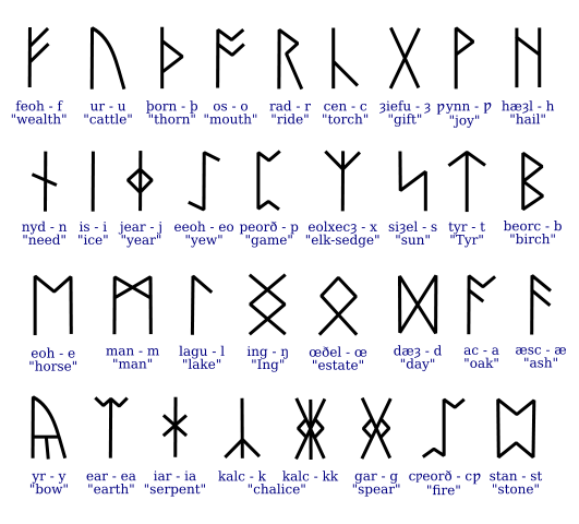
What I noticed with the runes was that nearly all have a strong vertical line. I’m going to take that idea and exaggerate it.
The Rules I’ll use as I see them now are as follows:
1) There will be a 3 wide by 4 tall grid
2) Between columns 1 and 2 will be a BOLD line as part of all capitals (if I do lowercase later I’ll have to adjust this) that stretches from the top to the bottom
3) All lines Right of the line will be thinner, (50%? 75%? I’ll have to experiment) All lines left of the line will be thinner than those to the right by the same difference (for example if I do 50% the ratio will be 1:4:2)
4) No curved lines (If this looks ugly, plan B is to allow half circles where necessary)
5) Cross bars will be at 1 square from the bottom. “Curves” (Such as P) will be half height
6) All Lines will start and end at a vertex of the grid
I had a radical change of approach late in the game, so I don’t have my sample letters done, as written I’m imagining the letter S will give me the most difficulty rules wise. So that’ll probably be the third letter I try (Get a couple to work before I tackle the hardest)

Brian: It sounds like you might want to combine a concrete material-based reference with your modular model. It might be better to use a historical source for runes (perhaps in which they are actually carved) rather than the reference here, which is already quite modernized and streamlined, as it appears to be computer-generated. Also, runes, of course, are not actually letters from the Roman alphabet, so how will the rules used to make runes relate to the rules you develop? You need to start making some letters so you can develop your set of written rules for Tuesday (along with at least 10 letters).
LikeLike