
My alphabet design follows a materials-based method as well as a modular method. I am using thread wrapped around nails that are nailed into a board. The nails are in a sort of grid that creates the modular part of the alphabet while the string and nails create the materials. After creating the letters I put them into illustrator and then image trace them. This keeps their organic feel but also gives them structure. The rules for this alphabet are that each letter that has a curve should be as curved as possible while wrapping around the nails. The x height is 4 nails high and the cap height is 6 nails high. Each part of the letter should be two strings thick, not just on one side of the nail, and when possible not overlapped. If the letter needs to be taller than the x height then it should reach all the way to the cap height. This typeface fits the text I chose because it looks very nostalgic and homemade. I want to use an old Christmas carol for my text and I think that the red thread on the wood looks very festive and cozy. This typeface will make a great headline with its blocky look.
Here is an “a”, a “d”, and an “n”.

letter a by: Hannah Croskrey
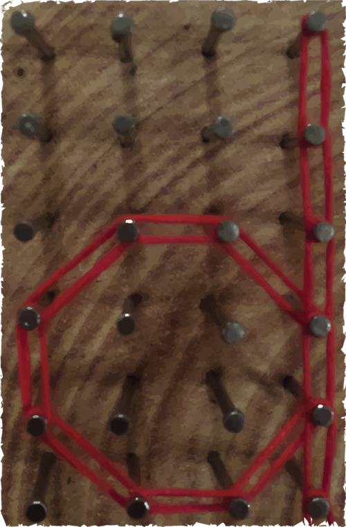
letter d by: Hannah Croskrey

letter n by: Hannah Croskrey

Hannah: Nice combination of materials-based and modular method. Your rules are very specific, which is great. As discussed in class, consider how much you want the letter itself to stand out as opposed to the grid you have built with the nails and the rough-cut edge of the wood. Could you use imagining in Photoshop to draw the viewer’s attention to certain parts of the image? Also, did you try various levels of image trace in Illustrator? What if it became somewhat less photographic? Might be interesting to compare the two options.
LikeLike